We've got an awesome look into the creation of the United in Stormwind card pack today from the creator, Tiffany Chiu.
There were three pieces posted for the card pack:
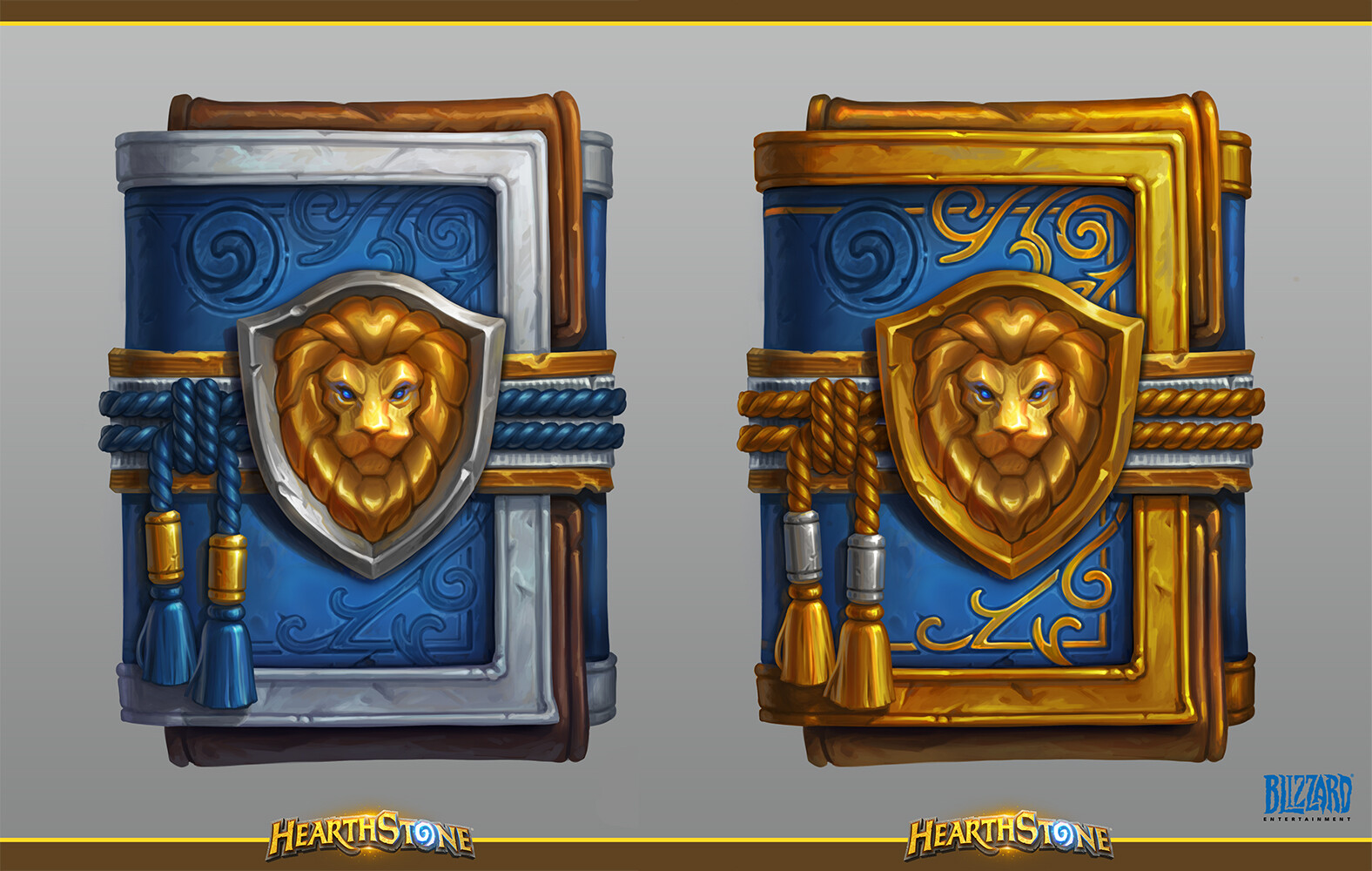
- The final packs for normal and golden;
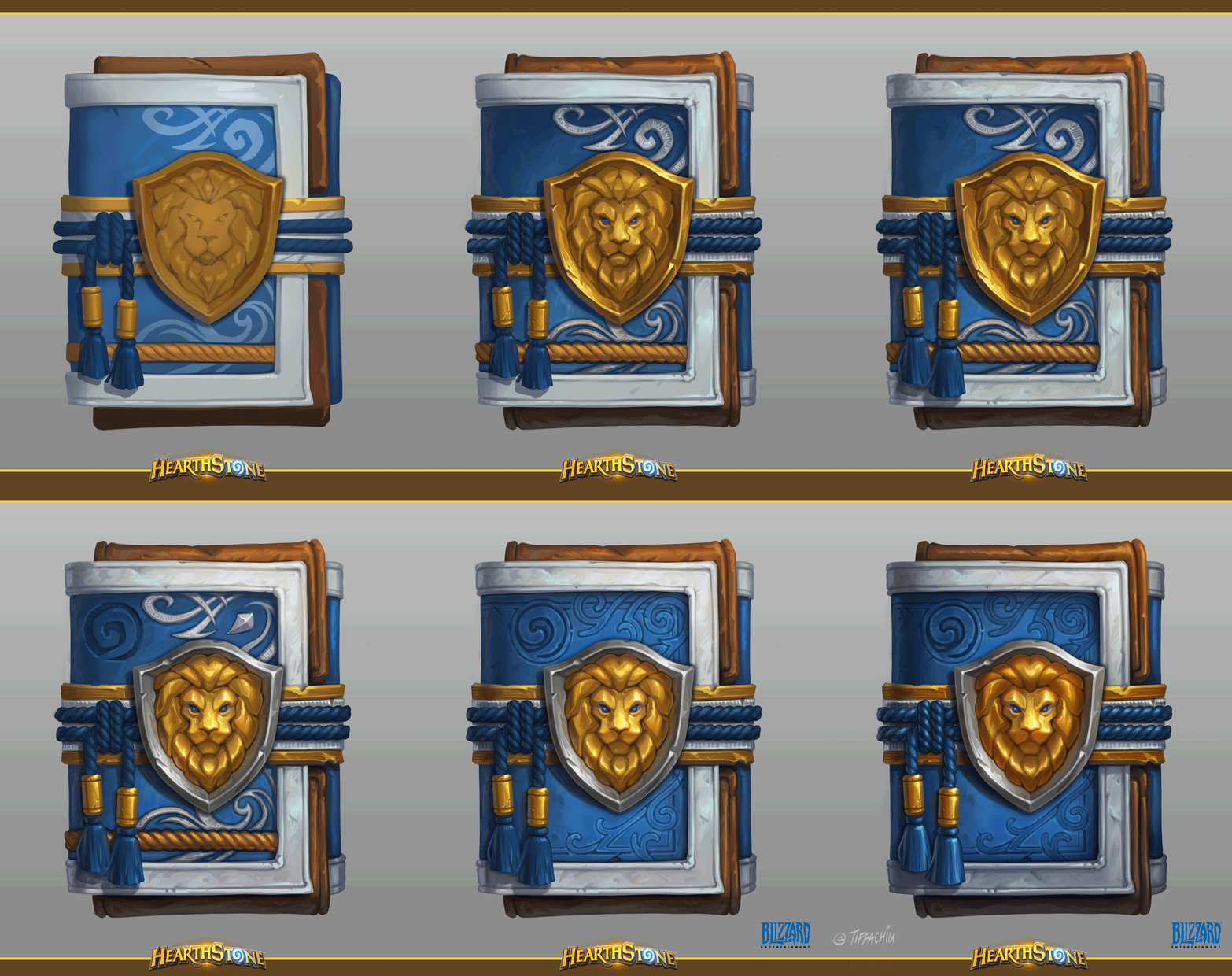
- A process GIF;
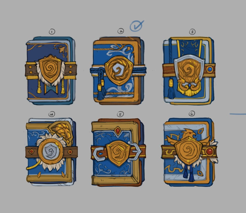
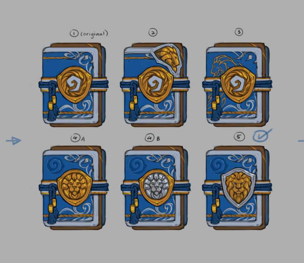
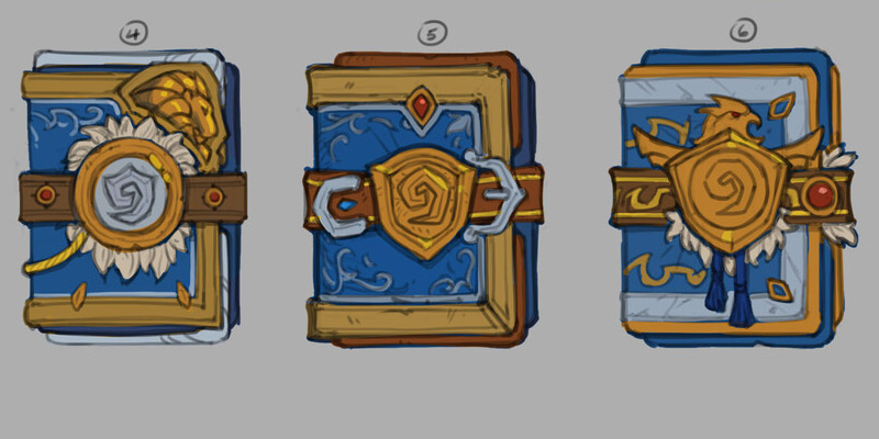
- Explorations of where the design could go.
What is quite interesting about the process images is how the pack evolved from having the Hearthstone swirl in the middle of the pack, a common trait with card packs, to the Alliance lion with the swirl in the corner instead. This feature being changed on the card pack shows that Blizzard is no longer limiting themselves to forcing the swirl in the middle which might give us some crazy designs in the future.
You can give Tiffany a follow over on Twitter, check out their website and ArtStation. You can also check out some previous work from Tiffany we spotlit - Concepts and Progress of Hearthstone's Sideshow Glow & N'Zoth Card Backs.
United in Stormwind Card Pack Final
United in Stormwind Card Pack Process
United in Stormwind Card Pack Explorations
This was originally one image. We divided it into two for formatting.

Leave a Comment