I'd like to take a moment to remind anyone interested that we do have a feedback thread in the forums for the WCDC. Feel free to leave any suggestions you have for the competitions there - we'll definitely read and discuss all of them, even if we don't respond right away. Any and all thoughts help!
Conversation this time gets a little artsy.
Mother's Day
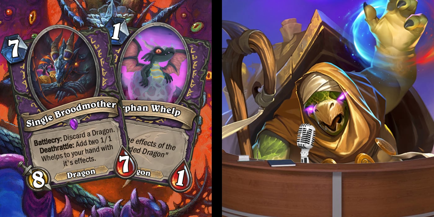
We begin as always with a congratulations to the winner of the latest WCDC, MrRhapsody and their Single Broodmother!
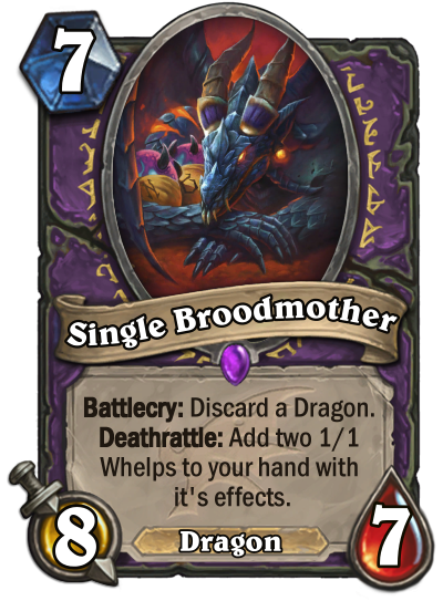
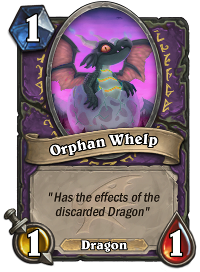
They'll be giving input for the next theme, so look forward to that!
Snack Time
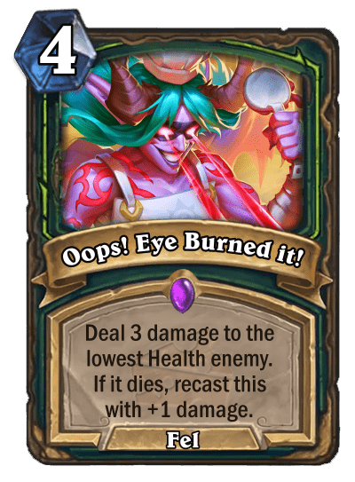
Been feeling a little peckish lately? The Fan Community Spotlight has you covered, as the latest showcase is an entire custom expansion based around food from Mr.Stupid! "Food Fight at the Feastorum" is a full 135 card set that takes its cues from Hearthstone's lighter side. Not every expansion needs to be doom and gloom or the next step in an overarching narrative - sometimes you just need a bit of spice!
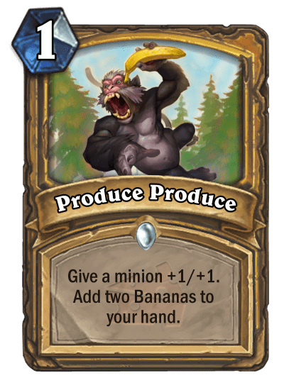
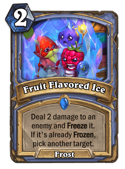
The overall tone of Hearthstone is an interesting aspect of the game, and one that gets discussed a lot. I find that it especially comes up when talking about the art of cards; earlier in Hearthstone's life before they commissioned new art for the vast majority of new cards you'd be able to find very different art styles between cards in the same set, whereas now there's a much clearer direction that cards follow.
This relates to tone, of course, because these older cards often depicted characters in a more serious or grim way, while the current art style of the game could be described as more light-hearted and cartoony. These are generalisations, of course - many of the original cards fit in seamlessly now, and there are plenty of ways to make quite dark art even with the overall lighter tone.
In custom card creation the consistent art style can be both a blessing and a curse. Being given what is almost a guide to work towards can help you create cards that truly feel like Hearthstone cards - Oops! Eye Burned it! above is a great example of this - but it can also leave you floundering with a great concept but no appropriate art to match to it, or a fantastic piece of art that you'd love to use that just doesn't end up feeling like it fits.
Of course, at the end of the day you're not designing actual cards. You can swing towards the sillier side as Mr.Stupid has done excellently in this set, or go all in on some of your favourite dark fantasy and just accept that you'll have to go a little off-piste in the art department.
Make sure you click the link above to see the full interview, as well as a link to the full set!
More... MORE!
Sometimes you just can't get enough - even when you have more than you need! Click the banner below to find out more.

Leave a Comment