If you thought the current Steam store pages looked a little small, then it seems that you weren't the only one because Valve has officially rolled out an update to the Steam client with tons of visual overhauls:
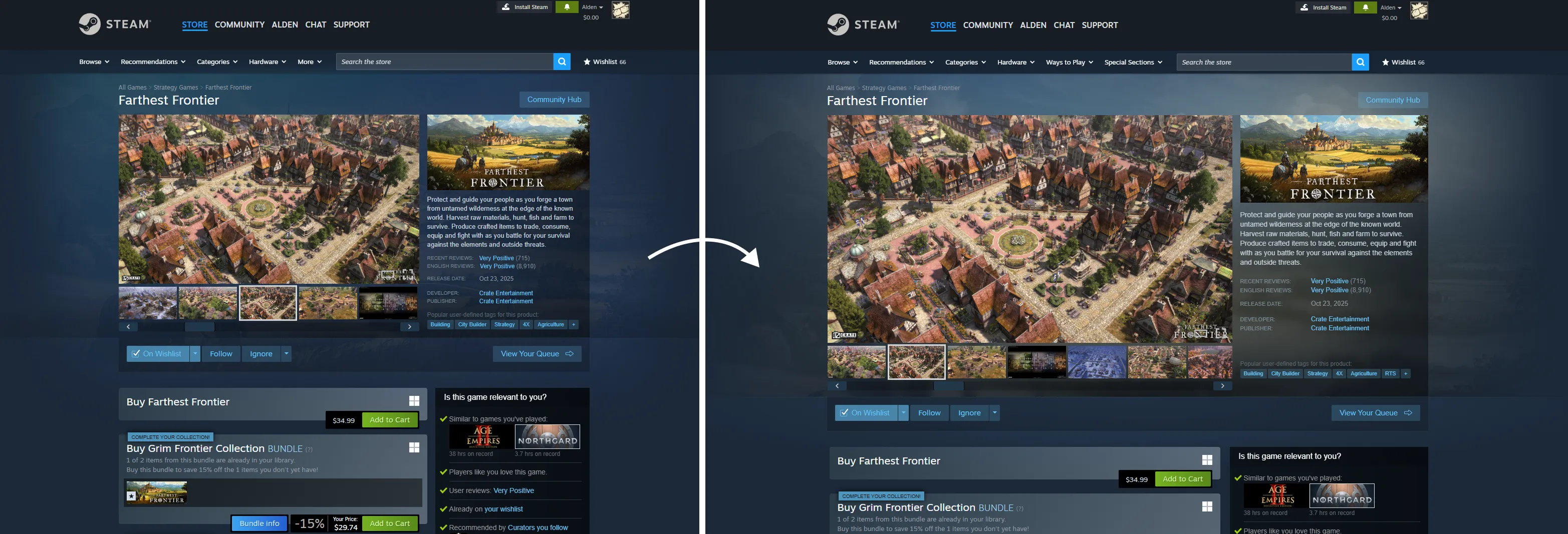
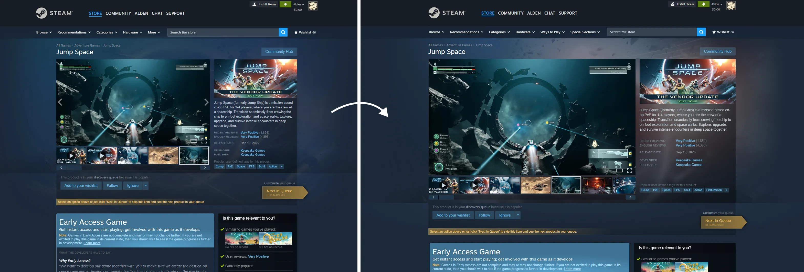
- Widened store pages from 940px to 1200px to make use of better monitors.
- The trailer/screenshot carousel for each game now supports theatre mode and full-screen mode.
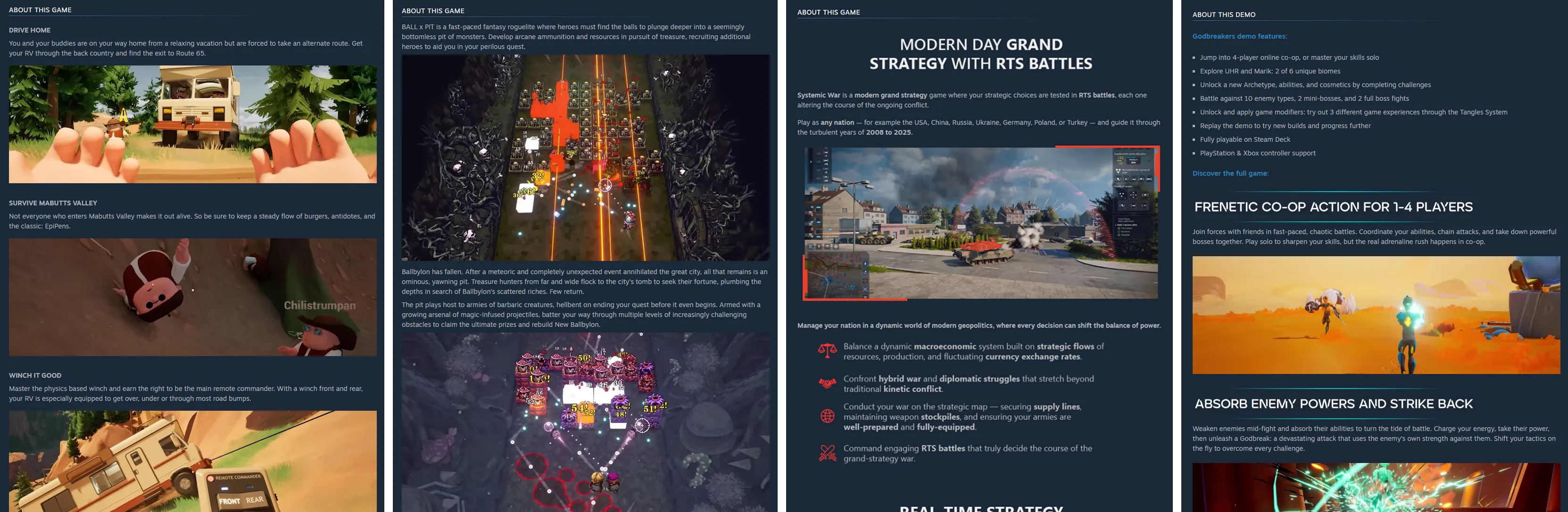
- Given developers tools to improve the descriptions on their games.
- Background images for game store pages will use the image you upload in the Graphical Assets tab. If you don't upload one, it will instead use a random screenshot from your store page.
- Search UI has been improved - The results are now wider and taller.
- Bundle detail pages now have a more colorful background and the list of contents now feature larger artwork.
- Some pages, like ones for individual game tags, Steam Charts, News Hub, and Recommendation pages have had their width changed to all be the same width.
Full post from Valve down below:
Quote From Valve With today's Steam update, you'll now find that many store pages throughout Steam are wider, making better use of your larger monitors and better organizing some of the information on screen.
Many of these changes have been visible already when previewing your own store page, or if you've opted into the Steam client beta.
Today's update officially moves these changes out of beta to be fully public, widening most pages from 940 pixels to now 1200 pixels.
Overhauled trailer/screenshot carousel
The trailer and screenshot carousel now supports three different modes (default, theater mode, full-screen mode) with the same functionality. All modes adhere to your preferences for whether to auto-play trailers and whether audio should be on or off by default.
Higher resolution images - Since the page is wider, we can now show off more of the game detail represented in screenshots and trailers.
New modes for even bigger viewing - In the lower-right corner of screenshots, you'll see two buttons for theater mode and full-screen mode.
New theater mode - Pop open a view that covers most of your browser or Steam client window and flip through screenshots and trailers.
New full-screen mode - The same functionality to flip through trailers and screenshots, but in full screen.
More robust game descriptions
We've also expanded the tools and options that game developers can make use of when explaining their game and showing off the features that make up their game. On many newer store pages, you'll see bigger and higher-quality images and more interesting formatting in the "About the Game" section. If you're curious about the improvement to the tools for game developers, you can read our Steamworks blog post, Beta: Wider store pages; Video support for written game descriptions
Refined background imagery
You might also notice some subtle updates to the backgrounds of game store pages, allowing a little more of the color and texture of the game artwork to come through and give the store page a little more personality from the game.
Your page's background image comes from the image you upload in the Graphical Assets tab, or if you don't provide a store page background image, it will load a random screenshot from your store page.
Minor updates across the Steam Store
Along the way, we also widened a lot of pages across the Steam Store. Here are a few examples:
Search results are wider and each row is slightly taller giving a little more room for the game artwork to increase in size.
Bundle detail pages also now have slightly more colorful backgrounds and larger artwork in the list of contents.
Recommendation pages like the Interactive Recommender and Popular Among Friends are wider.
Store hubs such as for individual tags (eg. Supernatural) have always been a little wider than game pages. We updated these now to all be the same width.
Steam Charts and News Hub were both slightly different sizes and even different sets of colors. These have been consolidated some to bring them more inline with Steam platform colors.
You can explore all of the pages that make up the Steam store by visiting the site map.
Frequently Asked Questions
Q: Why 1200 pixels wide?
A: We know many of you have 4k monitors with lots of pixels to spare (we can tell from the Steam Hardware Survey), our research shows that most players don't run the Steam client or web browsers full screen. While we experimented with different proportions, we found that 1200 pixels wide felt like a good balance where we can show more content on screen without overwhelming the page and making it hard to navigate.
Q: What about the homepage? It doesn't look any wider.
A: We've got some similar adjustments coming in the near future for the homepage, but they aren't quite ready yet. Stay tuned.
Q: What happens if my browser or client window is narrower than 1200px?
A: Steam store pages are designed to shrink appropriately to fit well within smaller size monitors, browsers, and Steam client windows. It also adapts in size to fit on tablets, Steam Decks, and mobile devices. We've even been testing on a tiny old iPod that someone had laying around (It mostly works, but things get pretty small).

What do you think of these changes? Let us know your thoughts in the comments below.
Comments
It's not a huge overhaul but definitely one that needed to happen. It's was wild at how small the Steam interface has been all these years.