Just one more day until Ashes of Outland releases! We got a lot of very Fan Creations-esque designs this expansion, so I'm excited to see what becomes the next idea to make it into the game.
This week's Conversation will be taking a look at our Transparency Report, and how it can help you become a better card creator.
Redeeming Demons
First order of business, congratulations to linkblade91 for their winning entry to this week's WCDC, Lothraxion!
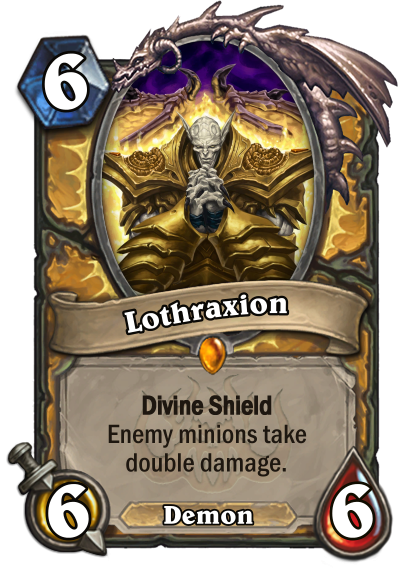
They'll be in charge of next week's theme, so hunker down and prepare for that!
Data Check
All the way back in our very first Card Design Conversation, we took a look at the Transparency Report.
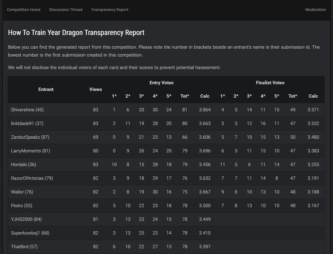
This is the same image from that first competition. Reduce, reuse, recycle!
Naturally, the main purpose of the Transparency Report is to provide as much behind-the-scenes information as possible to you guys, so that you know the competition is being run fairly. In that vein, if you're ever confused by anything in the Report, don't hesitate to PM me to ask what's up.
However, the Report also has other uses!
One of the most obvious ones, of course, is to check how you did! You can see how close you were to getting into the finals. You can also use this to compare your submission to others - look at the entries just above and just below you, for example. Sometimes you might not notice a flaw in your own design, but looking at others who scored similarly could help you realise where you went wrong - or where the winner went right!
Let's take a look at this week's winner and runner-up, linkblade91 and Inconspicuosaurus.


Linkblade's entry on the left, Inconspicuosaurus's on the right.
The first thing to note that's of interest - the final result was very close. This means that on average, you could consider these cards to be about as popular as each other as designs. While linkblade91 edged ahead to claim victory, the margin wasn't huge. This is a good thing to keep track of, as if an entry were to rank significantly higher than any other, it'd be a good exercise to try and figure out why.
Next, let's look at their initial voting scores, where an interesting divergence appears. In linkblade91's case, we see a wider spread of votes - it received a reasonably similar amount of 1-3 star votes as it did 4-5. The card is quite polarising upon initial viewing. A lot of people really like it, but a lot of people really don't. While you obviously can't establish what each and every voter was thinking when casting their vote, just knowing that this design had such a broad reception can help you to further your own design.
Inconspicuosaurus, on the other hand, falls very firmly in the mid-high category for their initial votes, with only a few straying higher and lower. This is interesting, because it shows that both these designs varied in their reception - one polarising, one more uniformly 'alright' - and yet they both ended up placing highly in the end. Keep an eye on your own cards - are they being received uniformly, in which case you may simply need to tweak your ability to fit the prompt or balance a card slightly? Or are they more polarising, in which case you might want to consider less risky designs - or even more risky? Go big or go home, after all!
There's so much information stored in these numbers, and if you're looking to improve your designs tracking your progress through them would be a good way to start.
Finally, let's take a look at an entry that didn't do so well this week - my own.

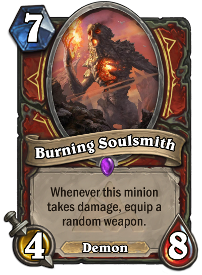
I came... roughly 40th, this week? A few places from the bottom of the barrel. As you can see, this card wasn't particularly polarising - it was a fairly uniform 'meh'.
Looking through the data, I can see where a lot of the flaws are in my design:
- Compared to other Warrior submissions, my submission lacks a real reason to be a Demon, outside of how I chose to flavour it. The effect itself doesn't feel particularly demonic - CovenantKevlar's entry, for example, utilised the 'Pay Health instead of Mana' mechanic, which makes far more sense. They even chose a similar name as I did.
- I erred in not looking through the submissions before submitting my own - far better Warrior cards (in my eyes) had already been submitted. My entry didn't stand out as a unique idea.
- My idea wasn't exciting. Sure, getting a random weapon can be cool, but continually replacing that weapon with other ones every time this gets damaged? That's annoying, not fun, and that's reflected in the fairly uniform voting it received. Hardly anyone really liked the design, which tells me that the concept itself needed improving, rather than a mere balancing or wording issue.
As you can see, the Transparency Report can be your best friend in finding out how to improve your card creation skills - generally, at least. It's still difficult to know exactly where a design went wrong, but you can interpret and adjust and see what the outcome of the next competition is each time.
Hopefully the next time I submit I can get a little higher, knowing my mistakes!
Shady Dealings
We're driving a hard bargain in this week's WCDC - a lot of upside on these minions, but a fair bit of downside too. Check it out by clicking the banner below!



Leave a Comment