Hello and welcome back to In The Frame! The format for all card art enthusiasts!
Last time, we talked about how MTG creates its card art, and learned about how publishers, like Wizards of the Coast, work together with artists to produce these phenomenal pieces for their games. But, of course, the big companies are not the only ones who are being creative! In every card game community, you have a lot of people who talk about their favourite artists, make their own custom cards, and, of course, create Fan Art! And today, we'll be taking a look at one of those fantastic pieces!
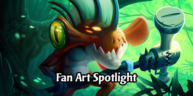
The art we're going to show you is by Guillaume Beauchêne, a french Concept Artist and Freelance Artist at Ubisoft. He created a couple of Hearthstone inspired Artworks, one of them being his Hammerloc, a unique spin of a Murloc.
Together, we'll be going through the various steps of creation for this card, and try to explain what's been done. If you're ready, let's get started!
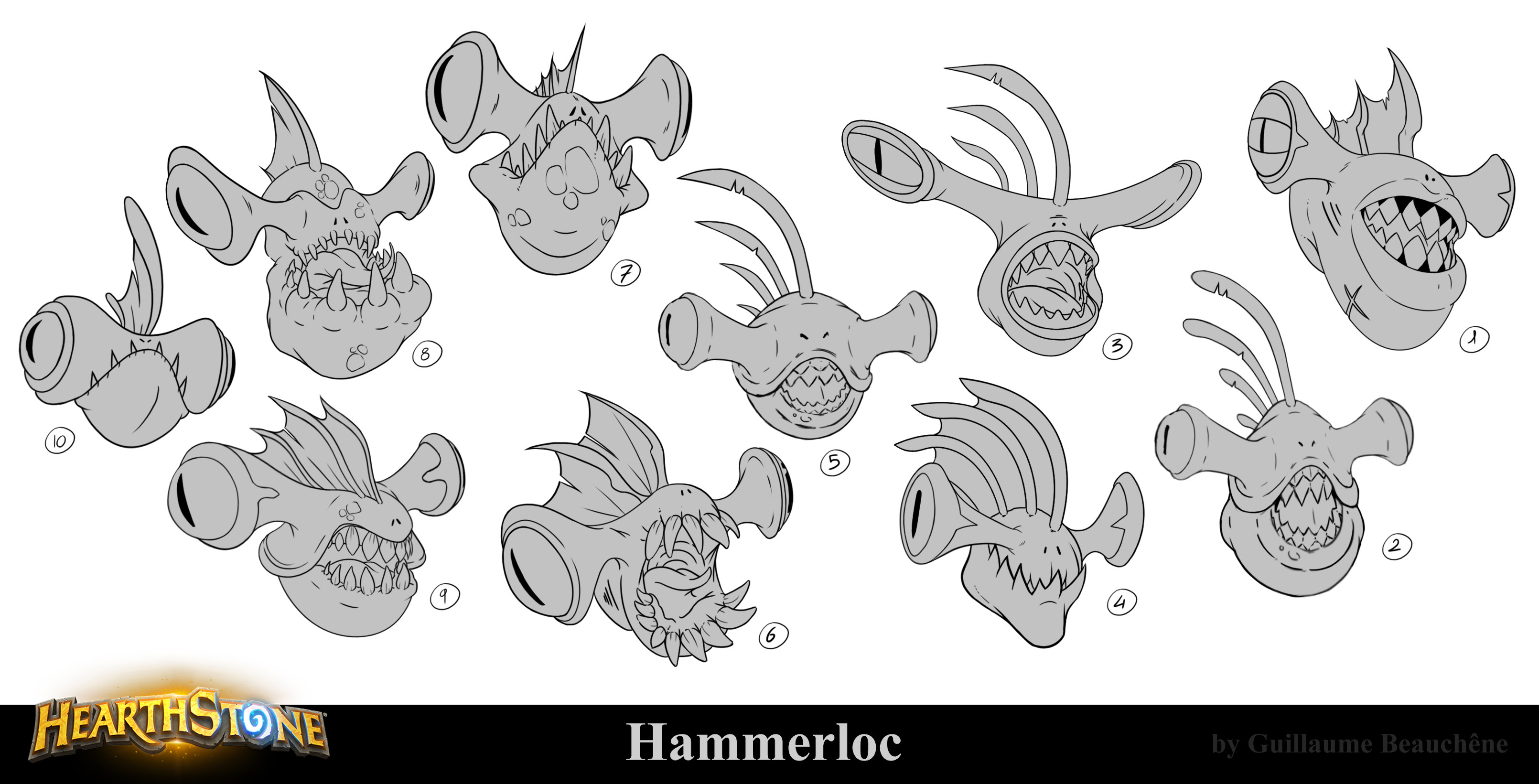
First off, Guillaume starts with a variety of different looking Head Shots.
In this step, you can see how he experiments with the features of the head, such as the fin or teeth, to find out what kind of a character he wants. Should it be one that's gnarly looking and battle-scared? Should it be alien and wild? Or, maybe something cuter?
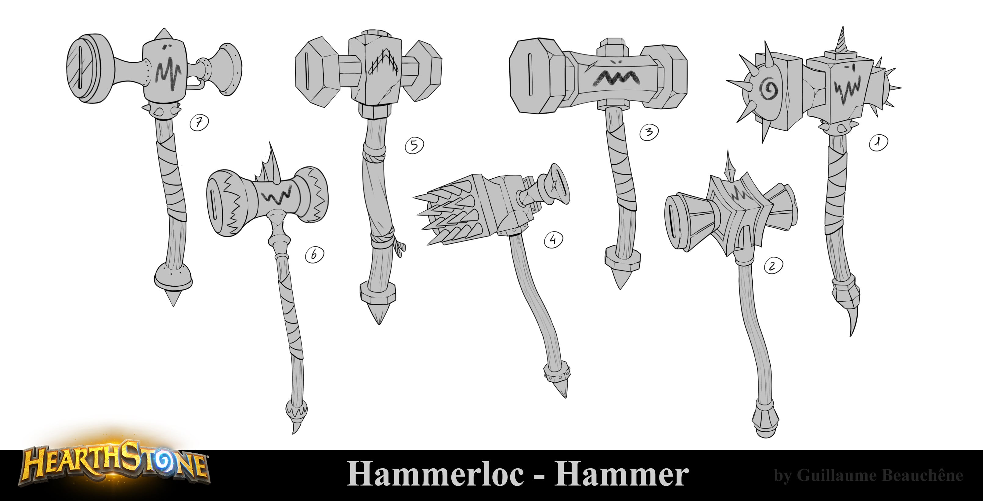
Next, Guillaume comes up with a wide array of hammer designs.
You can really imagine what kind of characters would use those weapons! By giving each of them certain characteristics, and pairing them up with the already created heads, he can figure out way easier what design works best going forward.
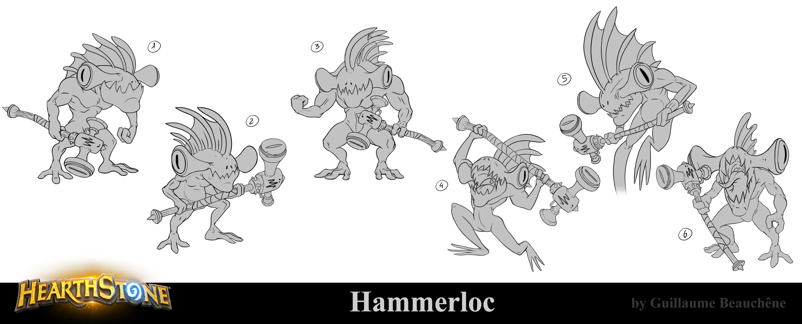
After he picked his favourites, Guillaume then proceeds to figure out how the rest of his character might look like.
His first idea was to give his little buddy some muscle, so he can properly swing that hammer! But that apparently wasn't good enough, since Guillaume decided to go for a smaller body. I assume he did so to make the head appear bigger and therefore have more focus on that.
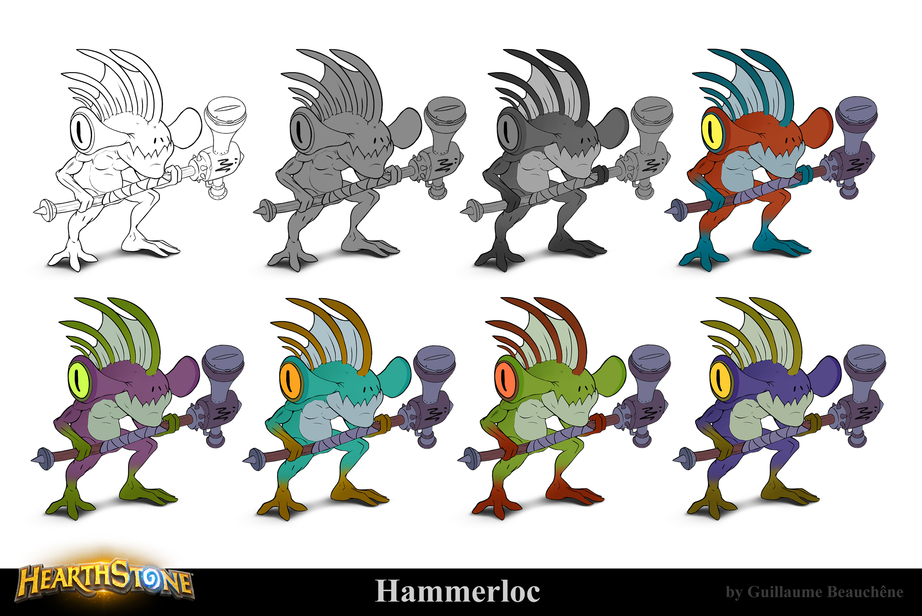
Let's give our little friend some color!
First, Guillaume uses grayscaling to figure out the intensity, then he experiments with different color schemes.
I wonder if they're inspired by World of Warcraft's other Murloc races?
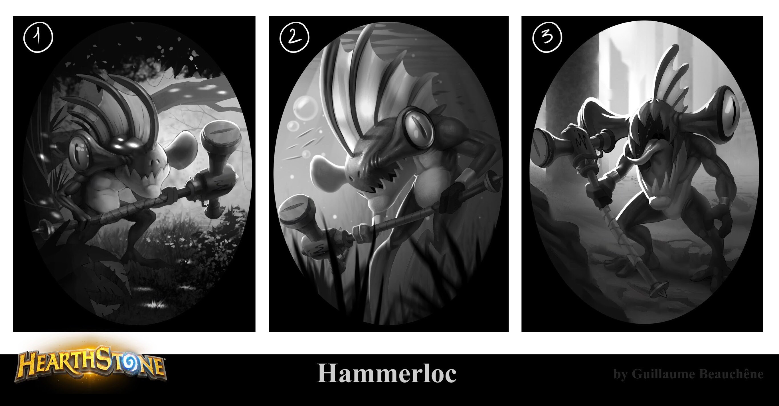
Now that we are finally done with the character design, it's time to put him into the frame.
We see how the artist tries out different scenarios for his character, so he can find the best possible one to show off its unique design.
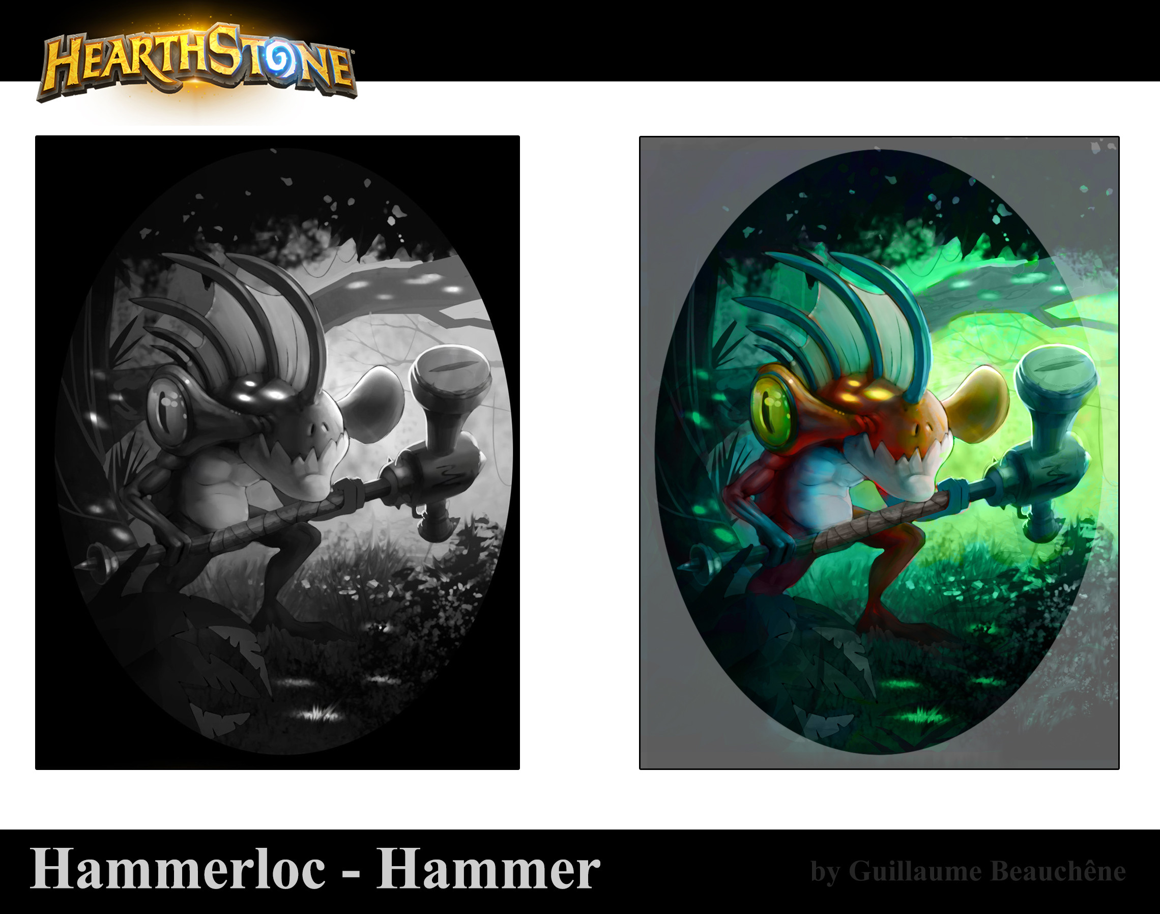
The last thing to do is to add some color.
Guillaume decides to place this little guy in a little peaceful forest, maybe nearby a pond.
The orange scales of the Murloc contrast quite nicely with the vibrant green of the surrounding area, making him stand out.
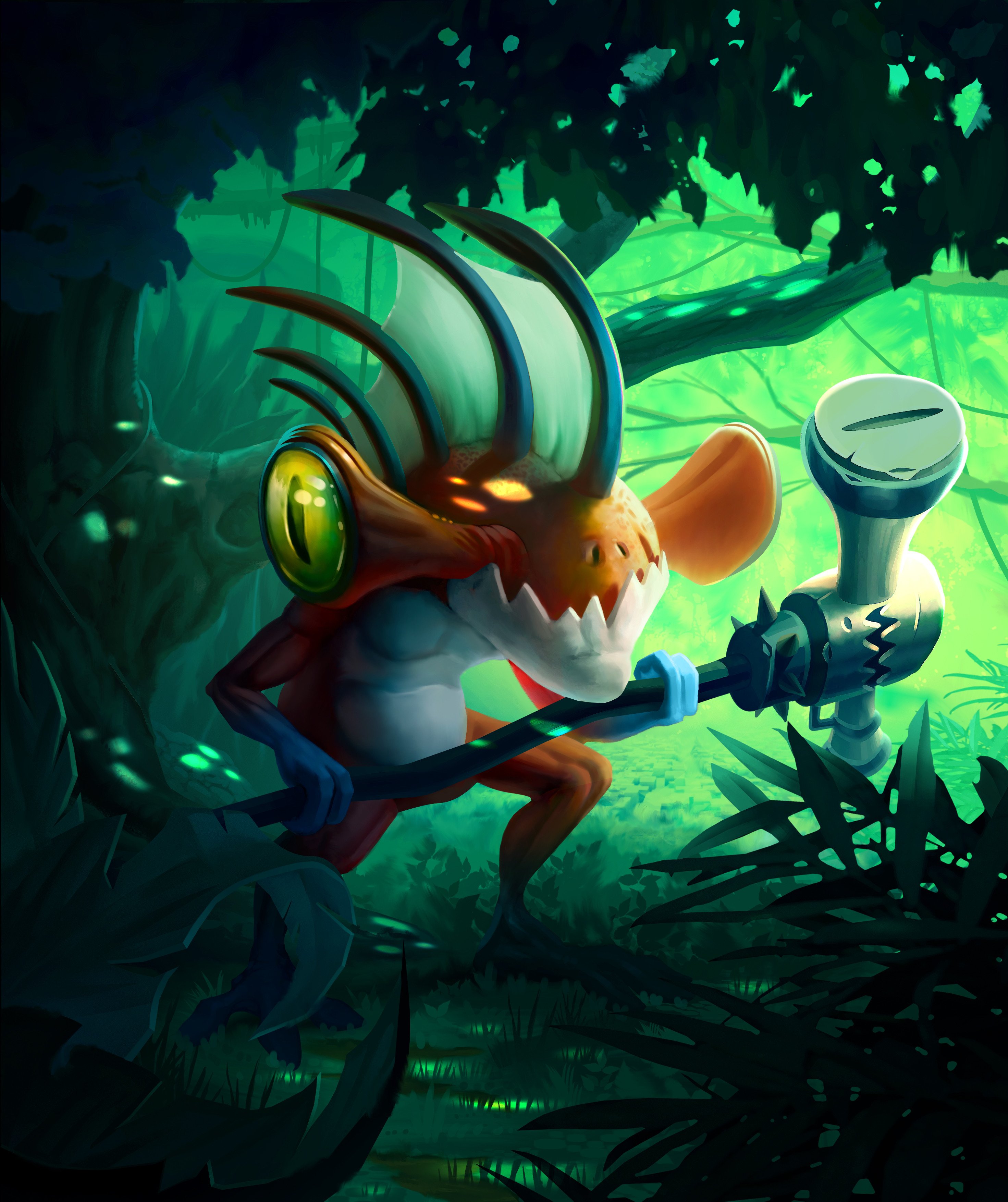
...TA-DAA!
The final artwork in all it's glory.
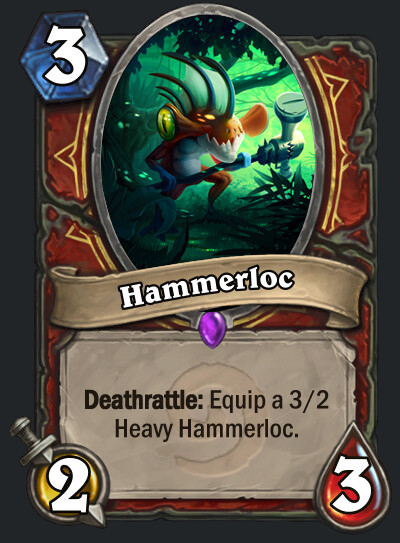
He's just standing there...
MENACINGLY.
If you like Guillaumes' art, go check out his Artstation or his Instagram!
And that's it for the first Fan Art Spotlight here on In The Frame! I hope you enjoyed what you saw!
I always love to see these full breakdowns of artwork. They give you so much insight into the thought process of the artist. You get to see what their initial idea is, how they approach it, and how this idea eventually takes form in the end. And if you're lucky, you might even learn something from that!
What did you think about the art? Do you like it, or is there something you'd like to change? Tell us in the comments below!
Also, if you like to see more fan art, check out our interview with the winner of Hearthstone's 2020 Art Challenge!
![Hearthstone 2026 Class Set 1 Card Reveals - Day 4 [Finished?]](https://youre.outof.games/media/v2/uploads/bb/58/bb58f8ce8ac44fd68f118ffe2f417874/hearthstone-2026-class-sets-1-day-4.webp)
![Hearthstone 2026 Class Set 1 Card Reveals - Day 3 [Finished]](https://youre.outof.games/media/v2/uploads/64/47/64473d09907d4743a55a788e6e09c866/hearthstone-2026-class-sets-1-day-3.webp)



Leave a Comment