In this issue of Fan Creation Tutorials, we're back with HearthCards. Last time, we covered all you need to know to start making cards, although I'd be lying if I said there wasn’t more worth learning about, so here we go!
Importing
In our last Tutorial, we briefly talked about the "import" button, but didn't go into much detail.

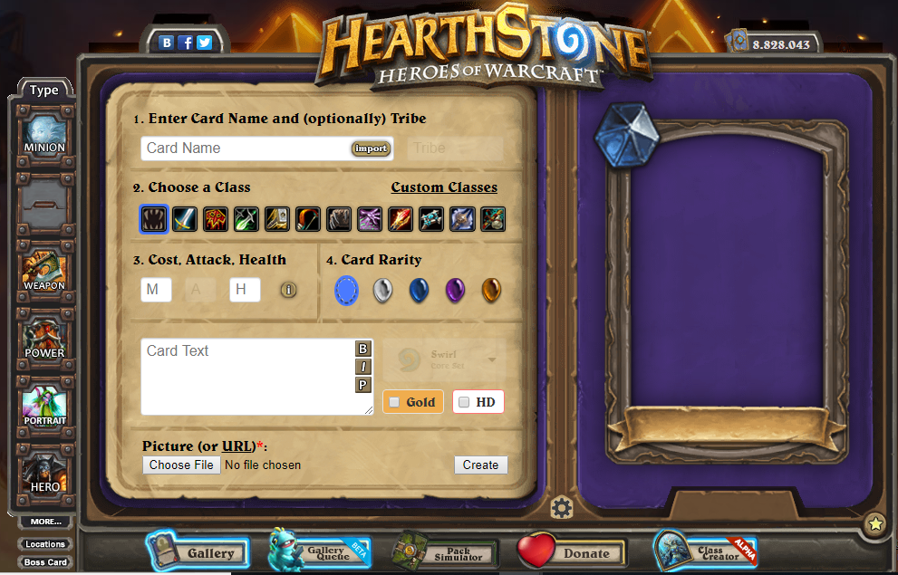
The "import" button allows you to import real Hearthstone cards onto your canvas, which is a useful tool for making fan-made changes to existing cards. Simply click on the button, and the following screen shows up.
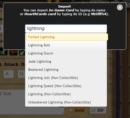
Write a name of a card you're looking for - or part of its name - and select it from the list. If you choose a minion from Goblins vs Gnomes set or an earlier one, it will also play its entrance soundbite. Although not practical for searching, each card also has an ID number that can be anywhere between 1 and 5 digits. For example, 7 is Garrosh Hellscream, 2261 is Nefarian, 47348 is Night Prowler, etc.
One can, however, do the same thing with cards created via HearthCards. All cards in the HearthCards gallery have their own ID string, an 8 character long permutation of letters and numbers. This string is actually a default name of the created card which you can see in its URL or when you save the picture into your computer.
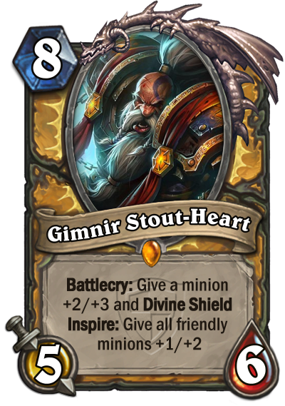
Importing one such string will load up a card from the HearthCards database into the editor. For example, code '9b5fff54' will load up Gimnir Stout-Heart, a card that HearthCards uses as an example of how the Health-Cost icon works.
To find the ID string of a card, go to the gallery, right-click on a card image and select "Open Image in New Tab", and the ID string will be in the URL.
Tchotchkes and Trinkets
While the above card is still fresh in our minds, let’s look at the "MORE..." section. Clicking this button under the card types menu will bring up the following screen.
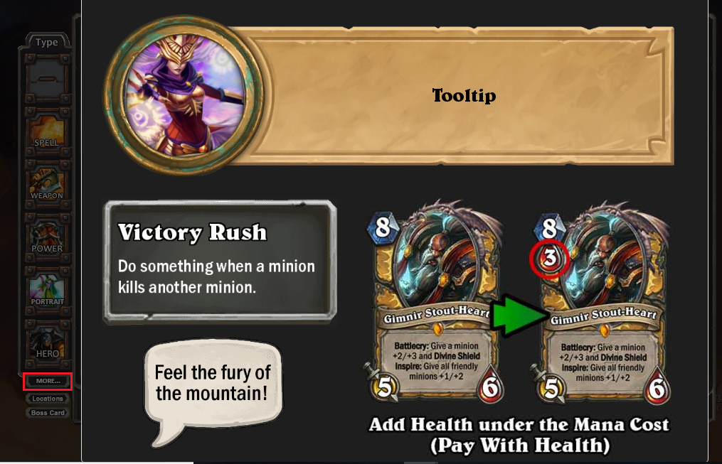
From here, you can create custom text found in PVE-content, keyword tooltips, emotes, and Health-Cost icons (similar to how [Hearthstone Card (Cho’gall) Not Found] and Bloodbloom work, although the way they are presented here is unseen in the game).
Adventure Tooltip Generator
First feature is so called "Adventure Tooltip Generator".
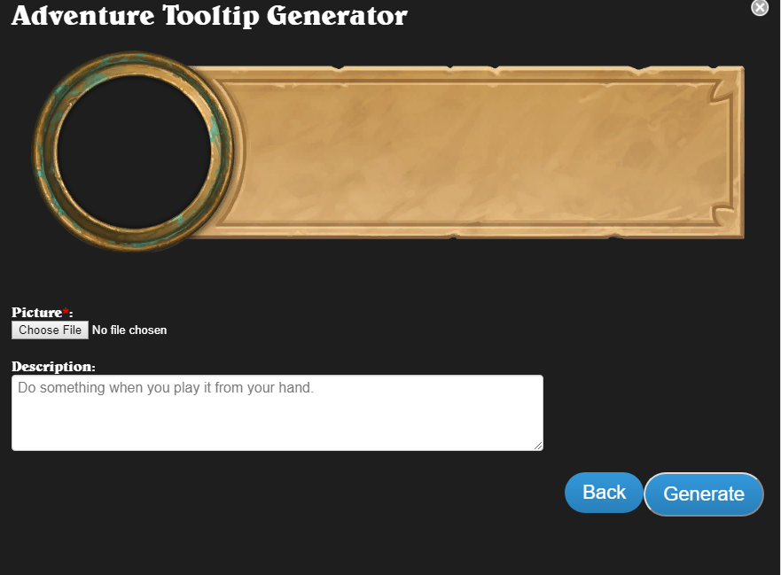
With this tool you can create "text bubbles" found in single player adventures. It works largely the same way as making cards, so this should be no problem. Unlike cards though, you cannot use image URLs as the artwork. Only pictures from your computer. It also has a textbox to fill in, which, like cards, does not display automatically. It only displays after it’s generated.
Once you select an artwork from your computer, a slider will appear under the image. Changing the art's perspective works the same way as it does on cards. Move the slider to zoom in and out and click-drag the picture to move it around.
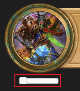
Once you’re satisfied with the result, click on "Generate".
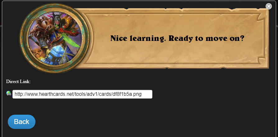
You can copy the URL or right-click on the created image and save it into your computer. Or simply click on the "Back" buton if you want to make something else instead without saving the current image. Note that if you try to generate an adventure tooltip with no artwork, it will glitch out.
Keyword Tooltip Generator
Now on to the "Tooltip Generator" for keywords.
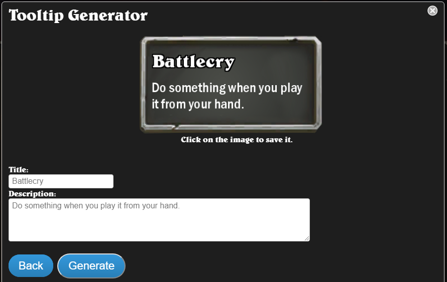
You know how, if you hover over a card with a keyword, it will bring up the little textbox that tells you what the keyword means? You can create this for your own custom keywords. It works the same way as the Adventure Tooltip Generator, although there's no artwork needed.
Once you type out what you want, click on "Generate" to display the result.
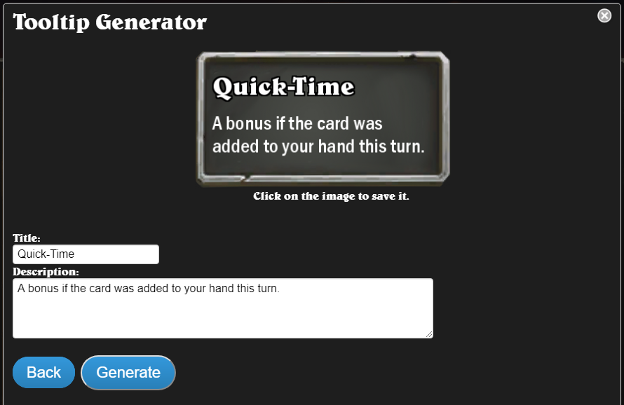
Unlike the Adventure Tooltip Generator, it will not bring you to a new screen. Instead, it just applies the text to the canvas at the top as if it would to a card. Although the interface will tell you to "Click on the image to save it", it’s better to right-click on the image and save it into your computer.
Emotes Generator
The Emotes Generator allows you to make your own custom emotes for your custom Heroes or PvE encounters.
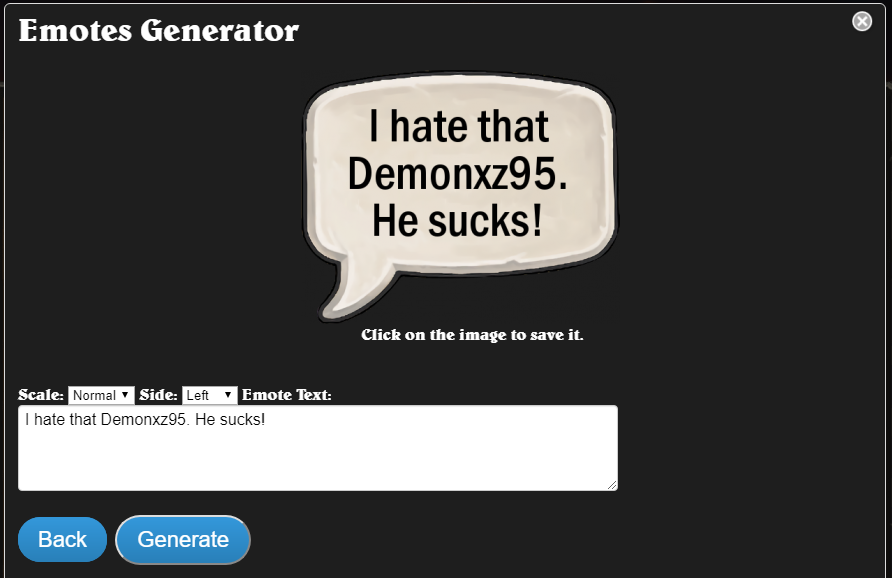
You can scale the emotes in four sizes. Tiny, Small, Normal, or Large. But this option is largely meaningless, since most text editors on popular websites let you change dimensions of a picture you want to input in your post anyways. You can also change which direction the speech bubble points to (left or right), although most existing emotes in the game point to the left.
Click on "Generate" to apply it to your canvas. As for saving, I recommend the same approach as for Tooltip Generator. Right-click on the image and save it into your computer.
Health Under Mana Cost
The final feature in the "MORE..." section is being able to add Health Cost under the Mana Cost.
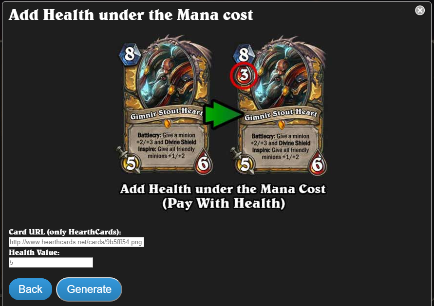
It will require an URL of an existing HearthCards card, meaning you will need to make the card first the regular way, then copy the URL here. Then, the only thing left to do is choose a Health Cost, type it into the appropriate field and click on "Generate".
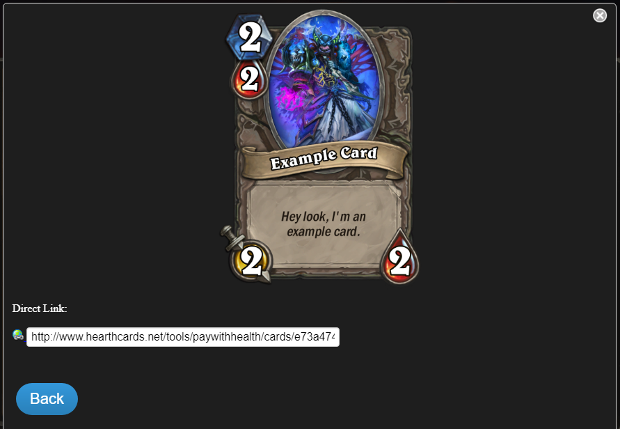
And there you go. You will be given a new URL, which will be for the picture of your card with added Health Cost. Although you should still save the card into your computer just to be safe.
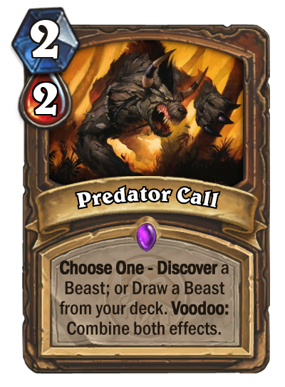
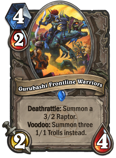
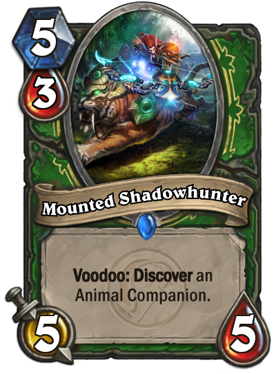
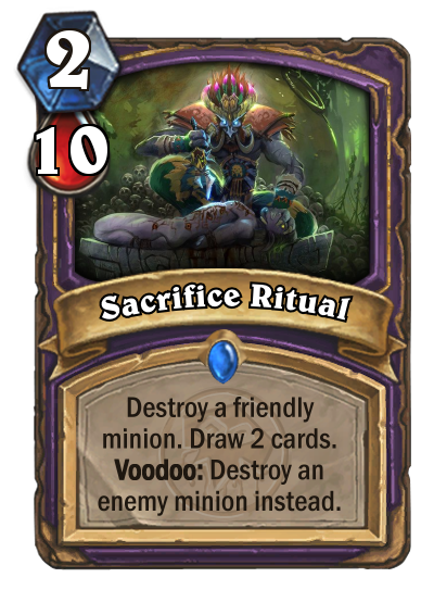
If you’re familiar with RazorOfArtorias's custom expansion, Servitors of the Loa, you might remember that this tool was used as an essential part of his Voodoo mechanic, where you could choose to pay Health to gain the Voodoo bonuses.
Locations
Below the "MORE…" button on the bottom-left, you can find a feature that lets you create "Locations" cards.
Clicking on the "Locations" button will bring up a canvas with a very obscure card style, not seen anywhere in the game. Perhaps its inclusion was because "Field" spells as a concept were so popular?
The "Location" cards are very unconventional in design, as the artwork covers nearly the entire card, and they do not contain a textbox. Instead, the text written on the card appears over the artwork. The text will not bold keywords, and will appear as white text with a black outline.
Examples of Location cards from the HearthCards gallery:
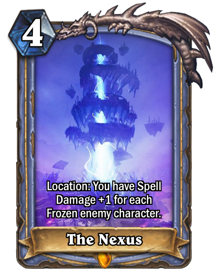
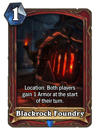
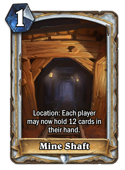
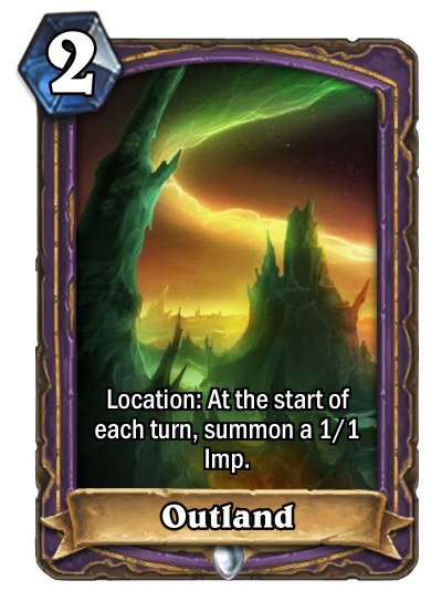
Despite appearing as such, the word "Location" is not a requirement for any of the Location cards. You can assign a Mana Cost and/or Health Cost to this type of card. If you leave both fields empty, card will be created without the Mana Crystal symbol in the top-left corner.
Location cards are useful for making additional card types (akin to the Hero cards introduced in Knights of the Frozen Throne), or for making concept art. Note that art may not fit as well as usual because of the larger artwork space that needs to be filled out. All custom class options except for Scales and Weaver support Location cards.
Boss Card
Last card type you can make with HearthCards is technically not a card per se, but a preview of a PvE boss encounter you will be facing next (in Dungeon Run, Dalaran Heist etc.) .
Clicking on "Boss Card" will bring up the following screen.
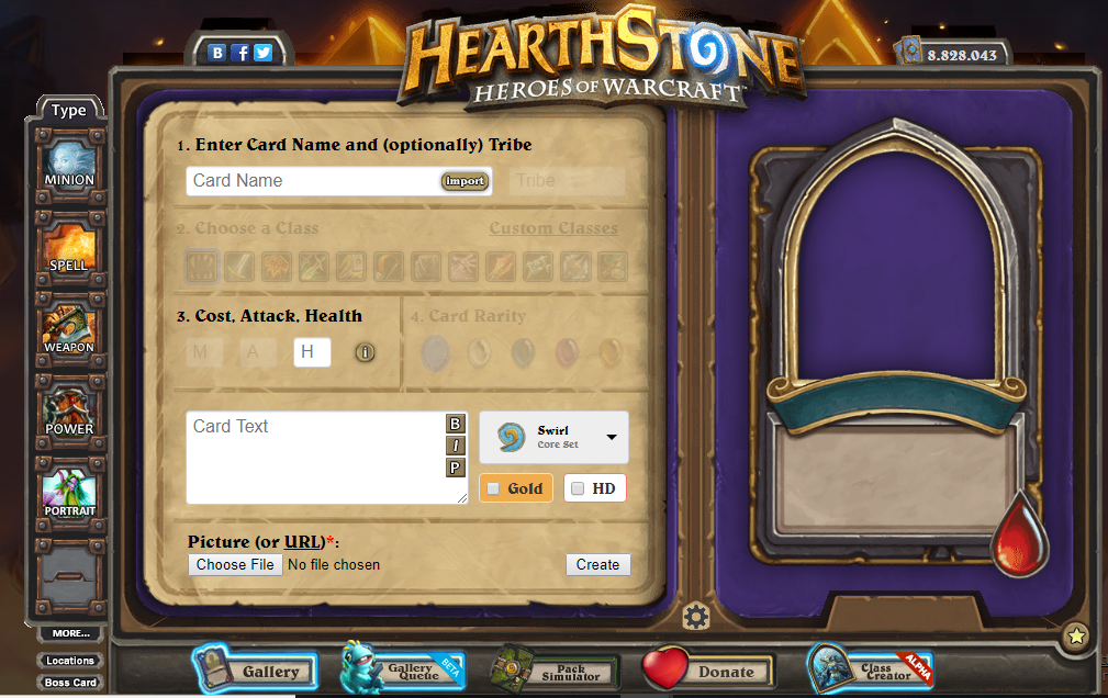
Although the rarity gems are grayed out, they are actually still selectable and will appear on the published card, but this is effectively meaningless since Hero cards exist.
This tool is useful for making custom PvE encounters.
Balance Helper
The Balance Helper is another tool that we talked about last time. Let's dig a little deeper.
To access the Balance Helper, click the "i" button.

A spreadsheet with Hearthstone cards will open up.
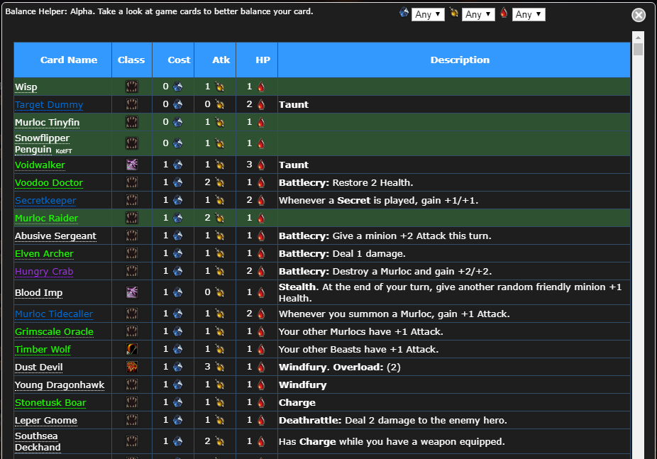
This is a list of every collectible minion in the game, from Basic set up until Rise of Shadows (at the time of writing). It displays the name, class, Cost, Attack, Health, and textbox of each minion (if a minion has no textbox, its row will simply appears highlighted in green). This is intended to help you balance your minion by comparing it to other minions in the game. Although, it has no use for balancing other types of cards, it may prove useful if you’re having trouble balancing a minion.
Gang Emblems
Are you interested in signing up your card to a gang? Be my guest! If you choose Mean Streets of Gadgetzan as the card's watermark, it will bring up the following screen.
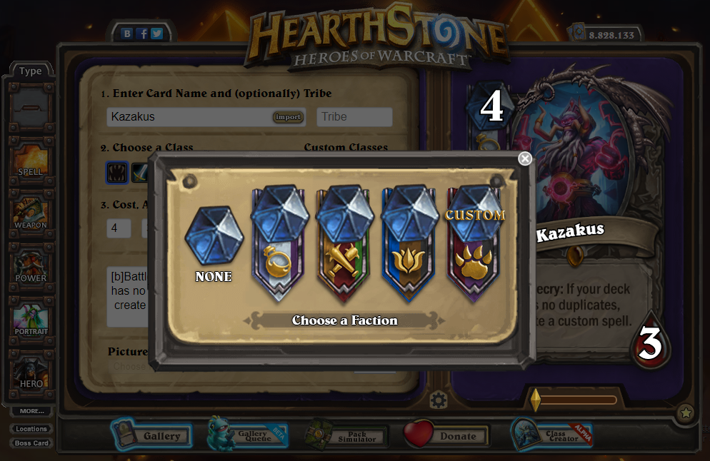
Here, you can choose either to have no gang, The Kabal, Grimy Goons, or Jade Lotus. However, the most interesting option is "CUSTOM".
Selectin the "CUSTOM" option will bring up the following menu.
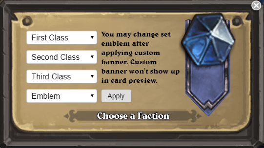
This is where you can design your own gang emblem. The three class options will change the color of a section of the banner depending on which class (First, Second, or Third) is associated with it. For example, picking Warrior as the first class will change the left-most section of the banner to the Warrior red color. In addition to the 9 base classes, and the two extra classes (Death Knight and Monk) provided, colors for Demon Hunters, Archmage, Swarmlord, and Lich exist. You can even have one class occupy more than one spot … if you wanted to do that for some reason.
Additionally, there are 30 custom emblems to choose from, as well as an option to simply have no emblem at all. You cannot pick the emblems used for The Kabal, Grimy Goons, or Jade Lotus. The emblem will not show up while you’re creating the card (instead showing up as "CUSTOM BANNER"), but will properly display once the card is published.
Important note! Once the emblem is applied, the card’s watermark can be changed, and the emblem will still be there!
Backgrounds
Next to the "Gold" button, that lets you make the card golden, there is a "HD" button which allows you to add additional flair to your card via different background settings.
![]()
Clicking on the HD button will prompt the following screen.
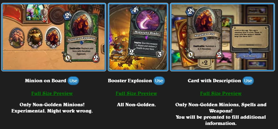
These are but few of the available background options
Each background has a "Full Size Preview" button, which will show you how the chosen background template looks in fullscreen. When you’ve decided on a background you want, click on the “Use” button. When you select and confirm a background, the HD button will have a checkmark to signify that the card has a background.
The background won’t display during the card creation, nor once you publish the card. You have to copy your card's URL and paste it in your browser, only then will you be able to display the card with your selected background.
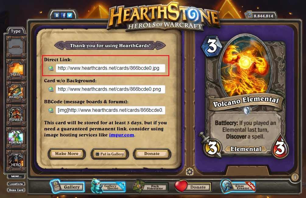
The background option "Card with Description" will also prompt you to add flavor text and an artist's name to your card. Note that some card types may not be applicable with certain backgrounds (for example, only minions can be used with "Minion on Board" background), and these cards also cannot be made golden.
At the bottom of the backgrounds menu, you will also see additional bonus options such as "Meme a Minion", "Meme a Minion/Spell", and "test". Whilst the other options are intended for better showcase of your card, these 3 options can be used in a more jokey context.
Additional Fine Tuning
Clicking on the "cog" button (circled in red) will open up a special menu.
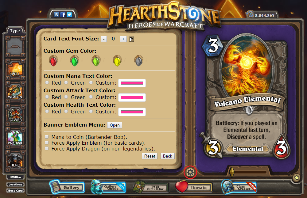
In this menu you can change the size of the card's text. If you find yourself with an orphan in your textbox, or it otherwise could simply look better, lowering the font size can make it fit in less lines and clean the textbox up. Real Hearthstone cards use this as well. A few examples of real Hearthstone cards with smaller than normal text include Deathstalker Rexxar and Splintergraft. A typical rule of thumb is that if you need to go lower than -5, your text needs to be changed altogether. Click on the "P" button to display the changes.
One weird quality about card text sizes: typing enough text into a card will lower the size automatically, but it will still show up as 0 in this menu. In this instance, changing the 0 to a -1 will have no effect, but eventually you will reach a point where it will begin to appear smaller. If you decrease the font size, then increase it past its previous size, it will still appear as its previous size.
You can also choose a custom rarity gem (Red, Green, Lime Green, Yellow, or Gray).
To showcase stats or cost change by enchantments on your card, you can also choose a dfferent color of the Attack, Health or Mana Cost symbol. Hearthstone typically uses the red or green colors to indicate negative or positive changes. You can however select a custom color, by clicking the (by default) pink square and bringing up a color palette.
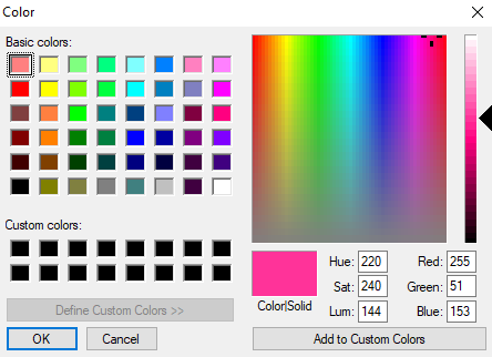
Here, you can change the color of the selected symbol (Attack, Health, or Mana Cost). Don't forget to then select the "Custom" option to apply your chosen color to the respective symbol. If you want to change all three, you will have to change each individually.
The Banner Emblem Menu section will let you choose a banner for your card or create a custom one. This is the same menu that appears after selecting the Mean Streets of Gadgetzan watermark.
From here, you can also force apply the watermark to Basic cards, and the silver dragon element to non-Legendary cards, as we discussed last time.
Last thing you can do here is to change the Mana Cost into a Coin Cost for purposes of making custom cards used in Bartender Bob encounters, such as seen in Dalaran Heist adventure. Note that during Bartender Bob encounters, you only have 2 coins, and all cards cost either 0 or 1, although there’s nothing stopping you from making one with a different cost.
Hidden Goodies
It seems like we covered almost all that HearthCards has to offer ... or did we? There are still few secrets i have yet to show you! Hidden class borders and watermarks.
Typing {{CLASS=custom1}}, {{CLASS=custom4}}, {{CLASS=custom5}}, or {{CLASS=custom6}} into your card’s textbox will change your card border to one of these 4 styles, which are never made accessible through regular means. You might recognize the border of {{CLASS=custom1}} as the border used for CheeseEtc's Chef class.
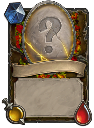
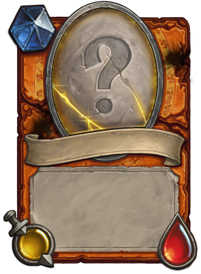
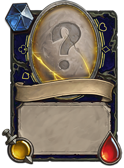
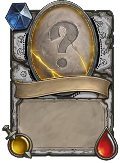
The others are Firelord by Logovaz, Gambler by Tox, and what appears to be a similar-themed border by Otovent.
Although these are interesting border designs, none of them support the use of Hero cards, Location cards, or Dormant cards.
This same can be done with custom watermarks. Here is a list of 17 custom watermarks that you can apply to your cards. Type {{EMBLEM=customX}} into your card’s textbox where X is the number used in the watermark’s code. To see the watermark’s code, click on one of the cards.
At this point, you have learned everything HearthCards has to offer. At least in terms of making cards.
Thanks for reading. Have you ever used some of the special features we talked about to spice up your card?

Leave a Comment