You ever play a game whose inventory made you say you yourself "Why am I being forced to interact with this?" I'm sure everyone has. In part one and part two of our talk, we discussed list-based and grid-based inventories, respectively. What these two still had in common was that they were still quite functional. In this last part of our discussion, let's have some fun and go over a few inventories that will make you question the nature of your reality. That's perhaps an overstatement, but at least you might get a chuckle out of them. We'll then bring it all together and hope future inventories learn from past inventories' mistakes.
The following inventories we'll poke fun at aren't of any particular 'type' as outlined in the categorization we previously did. Regardless, we've put our little classification in the spoiler box below if you want to still give it a read:
What informs the final design of an inventory system - that is, what players get their hands on - is the nature of the game it is a part in. There's a tight relationship between inventory and items, loot, mechanics such as power, and just itemization in general. Let's see some examples:
- An inventory may be seemingly infinite (such as Skyrim) or finite based on the available items in the game (such as Hearthstone's collections).
- An inventory's size may be constrained by other factors instead, such as weight (Skyrim), premium subscription (Elder Scrolls Online), bag size (World of Warcraft) or upgrades (Deus Ex: Human Revolution).
- An inventory system could be divided up into several sub-inventories (Hearthstone's several collections, Skyrim's tabs that sort by item type) or it could be a free-for-all (World of Warcraft's bags, save the recently-added Reagent Bag, can fit any item in the game in whatever order you wish).
- Speaking of order, inventories could be ordered by the game (Hearthstone cards ordered by Mana cost, Skyrim's sub-inventories alphabetically), or allow the player to order items (World of Warcraft).
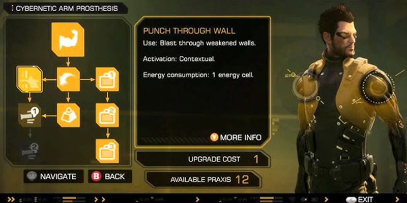
Deus Ex: Human Revolution's augmentation tree allows you to upgrade your inventory size three times.
At a base level, each inventory can allow or restrict player freedom depending on the context. There's nothing inherently wrong with the inventories I exemplified above, and certainly players' taste is varied enough for each iteration to have its fans. But what about informational distinctions?
- Inventories can be list-based, like in A Dark Room, or Skyrim (with a visual preview on the right, including stats, only when the item is selected).
- Inventories can be icon-based, like World of Warcraft, with a tooltip showing the item's stats only when the item is hovered over.
Additionally, we've also seen plenty examples of inventory layouts:
- The list, where reading item names is the main task players have while interacting with the inventory (Skyrim).
- The image list, where both the item's form as well as its stats are visible from the get-go (Hearthstone).
- The "visual horizontal list" (bear with me, I'm naming these on the fly!), used in games with small inventories, where all items are displayed, usually along with a keybind (Unreal Tournament).
- The grid, where seeing icons are what is used to inform the player of the nature of the item (World of Warcraft, DOTA).
- The, uhm, "Tetris grid", where each item takes up a specific amount of space and organizing your inventory is a mini-game (Diablo 2, Path of Exile, Deus Ex: Human Revolution).
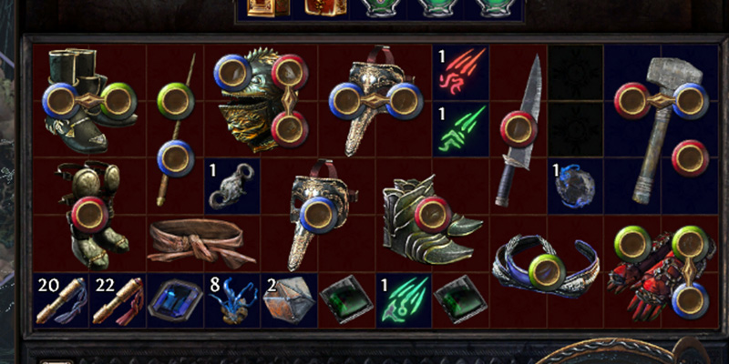
Path of Exile's inventory is uniquely vintage, but its wonkiness adds another layer of depth to loot management.
Lastly, player interaction:
- An inventory can be immutable when the player has no say in the ordering of items (Skyrim, Hearthstone, Unreal Tournament, A Dark Room, Elder Scrolls Online).
- An inventory can be mutable when the player can order items at will (World of Warcraft, DOTA, Diablo 2, Path of Exile, Deus Ex: Human Revolution).
This is to say, there's an overwhelming amount of ways to design an inventory system, and equal ways to make it great, or not so great. The examples I've listed above merely scratch the surface of a deep, dark chasm of inventory types. Talking about all kinds of inventories would be a novel-sized book, but let's discuss some of the pros and cons of the most popular inventory implementations.
The Wheel Out of Time

We've all come across the 'wheel' - a type of inventory that allows you to quickly swap between items such as weapons or consumables. It's basically a staple of console gaming, where you've got the right buttons to properly interact with it. It sometimes even shows up in PC games, so what makes its appearance in Clive Barker's Undying special?
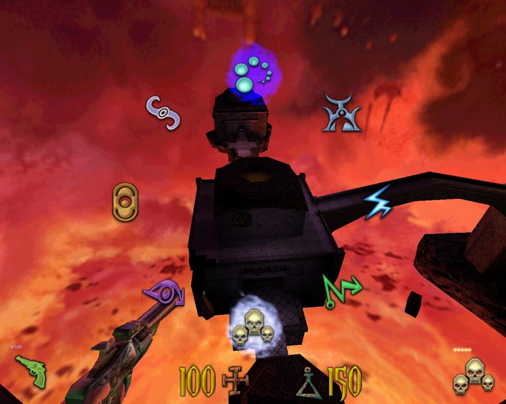
Spells and weapons in Cliver Barker's Undying are equipped from inside a wheel inventory.
Well, Clive Barker's Undying only released on PC and macOS. There were plans for console ports of the game, but they were cancelled due to low sales. You see this sort of inventory make its way into PC games all the time, since it's easier to design just one inventory for all platforms, and PC players can take the hit. What you don't see is the wheel being there without the justification that it's the same on console.
Let me tell you, I've played this game several times. You can sort of hotkey a couple weapons and spells to make things easier, but I still have trouble hitting the right spell or weapon every now and then. It's just not made for mouse, yo.
To be fair, however, Undying's inventory as a whole is not too bad. The non-weapon, non-spell inventory (that holds health kits, bullets, quest items etc.) is a small list on the left-hand side of the screen that you can scroll through with the up and down keys. Reaching the end just starts the list from the top, and with the relatively low number of items in the game, it works. Bonus points: Neither the list or the wheel inventories pause the game when you're interacting with them.
Mass Effect (Xbox 360)

Swerving in the opposite direction for a moment, consider the general pain of having to navigate UIs on consoles without a mouse. Then consider having to do that in a game whose menu makes children cry. That's Mass Effect for you.
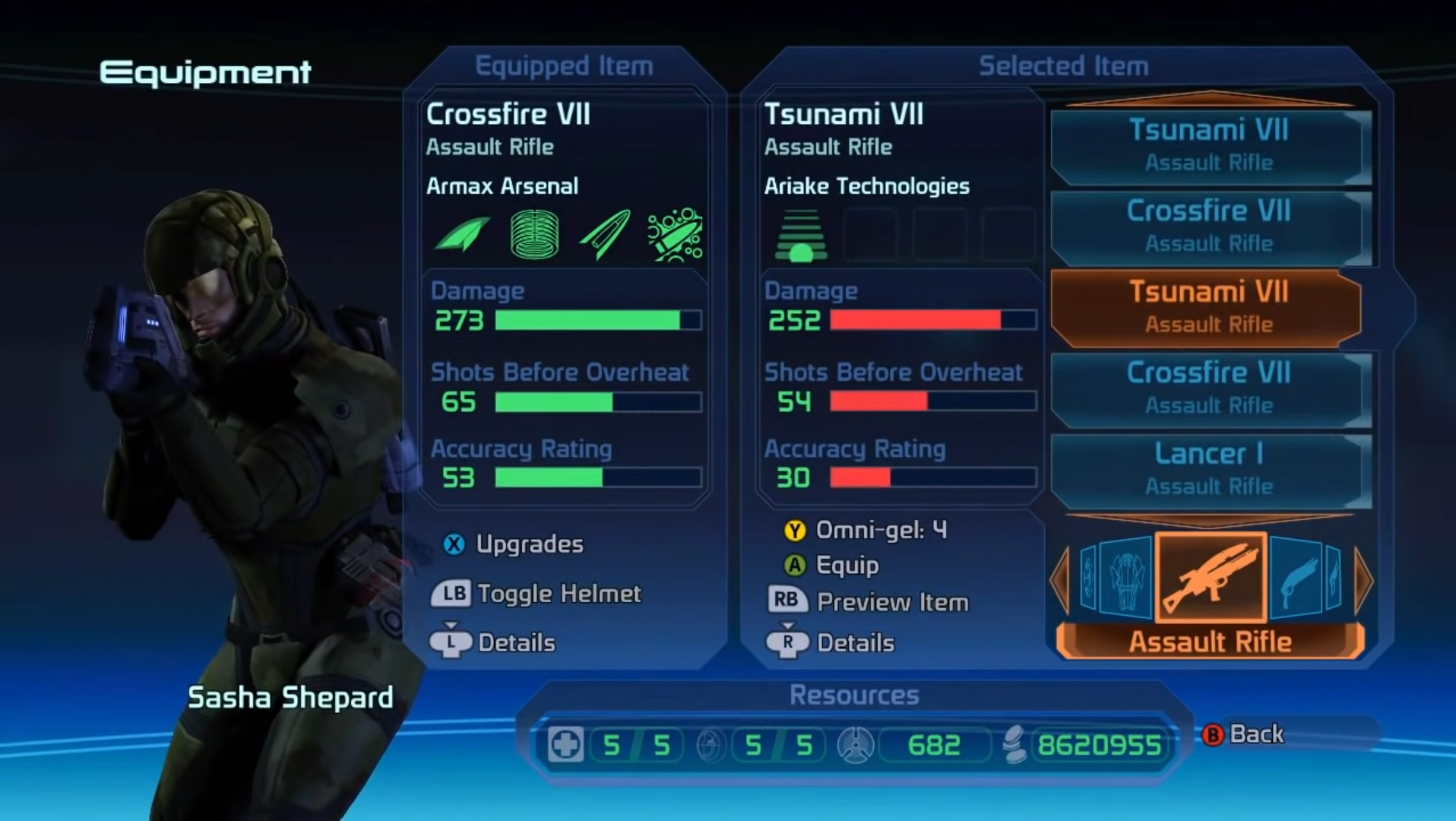
Let's just unpack that image for a moment:
- There's a whole lotta' buttons lying around. Alright.
- There's a 'horizontal wheel' at the bottom right that lets you switch between item types.
- There's a list right above the wheel that scrolls between several different variants of the same item.
- Not pictured, but the inventory tutorial is a massive text dump right before you're hit with this glorified excel sheet of an inventory.
But wait, there's more:
- You can't change the order of items.
- Items don't stack, so you need to sell everything one by one.
- Worse, you pick up items automatically (and the inventory is limited), meaning you're forced to free up inventory space, one item at a time.
- When deleting or turning stuff into omni-gel, the item list snaps back to the top.
If you ever want to know what purgatory feels like, play Mass Effect 1!
Dead Island

There's few inventories out there so frustrating it makes players ask themselves whether they should bother to continue playing. Dead Island suffers from this. Initially you might take a look at it and say "right, it's a list inventory that's not too great but I'm sure, aside from being slightly disorganized, I'll be fine". Wrong! This game's also got a notorious weapon wheel, but let's focus on the list inventory, which you can see below.
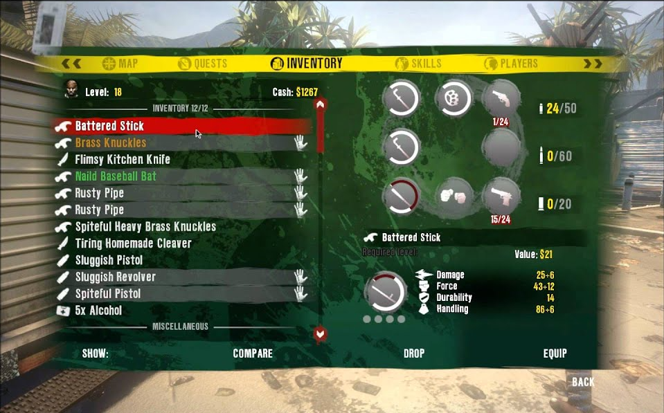
Right, aside from a bunch of other bugs, we've got a few problems here:
- Stacking is messed up. Sometimes, your health kits will stack properly (up to 10), sometimes they won't! Up to anyone's guess why that happens!
- To remove some mystery, if your inventory if full, and you have four health kits, you can't pick up a fifth unless you drop something first.
- This means, the way the inventory was designed is that when you pick up an item, stackable or not, it first gets added to the inventory, taking up a slot, and then is merged into the stack.
- The inventory system is, of course, designed for consoles, so you don't get to use the full power of your keyboard on PC.
What's more, we're dealing with a list inventory. You can carry quite a bit of items in this game. Aside from their two categories (Inventory, which contains equippaable stuff and Miscellaneous), there's no other sorting options. Things can become a mess, and what's worse, there's all sorts of weird interactions with picking up weapons and them automatically replacing weapons you equipped in your slots, making you go back to the inventory to set things straight.
Inventory Design Redux
We've looked at inventories as a whole: lists, grids, mutable, immutable and we even poked a bit of fun at bad PC implementations of console-first inventories. Even so, we're still scratching the surface of inventory design. We could do a whole dissertation talking about inventories in old games, compared to inventories now (and seeing how far we've come), but honestly it'd be like punching down on a 1920s car because it doesn't have a USB slot, or parking assist.
I think we can draw the following conclusions from our journey:
- No inventory design is perfect - at least not yet.
- Many inventories suffer from being designed for a different platform, rather than being universally bad.
- Even if an inventory is generally bad, it can still be valid for a different game.
- As much as we don't like certain inventory systems, I'm pretty sure developers like designing them even less.
With how many issues we've come across in the inventories we discussed in this series, we should still be grateful that most inventories are functional and generally fit well with the game they're a part of. Sure, Skyrim and its huge lists might work better with a grid inventory divided into tabs, but it's still good enough that it hasn't made players quit the game. Despite its issues, it's actually versatile enough that it was ported to like nine other platforms (if you count Alexa). From a business perspective, Skyrim's inventory is great.
If you had to ask me which of these inventories we discussed I find the best in general, I'd probably pick Minecraft. The fact that you can infinitely expand your storage and label it as you please is far too rare in gaming. Give us more power over organizing our mounds of loot!
Thank you for coming on this journey. Whether or not you agree with any of the points made in this series, I hope you at least found the general horror of inventory design interesting and entertaining. If you could change any game's inventory, in any way, how would you do it? Let us know in the comments below.
Previous Entries:
Comments
It always bothered me how the selection wheel worked in undying and I recently made it more mouse friendly. I would love your thoughts on this update.
That... actually looks great! As long as the 'Enter' key functionality, to use items remains working, it looks like a net positive improvement over's the game's extremely clunky wheels.
Yep, all original functionality is there.
Sounds wonderful - I'm still quite a way away from yet another playthrough, but I think I'll give your mod a spin next time!