Hello and welcome back to In The Frame! The format for all card art enthusiasts!
In today's article, we're gonna go back to Magic: The Gathering, and delve deeper into the topic of art direction. We already know that the Developers over at WotC commission artwork for MTG from many individual artists all over the world. Over the course of almost 3 decades, hundreds upon hundreds of creative heads have already contributed to the game and its world(s). Every single one of them brought something special to Magic, whether it be through their own interpretations, unique ideas, or, of course, their styles.
But, if everyone brings something different, why does Magic artwork still look like Magic?
Throughout its history, MTG has gone through many changes and reinterpretations of its gameplay and therefore also its artwork. Combine that with the fact that artists love to add their own spin onto things, and you get the difficult task of a Developer to keep the game consistent with its core design AND create new and fantastic art.
So, how do the Devs make sure that artists know how to depict new characters, races, tribes or even worlds? How do they make sure that the cards of a set really feel like they not only belong together but also to the entirety of Magic?
Well, the answer is: through Style Guides! These are probably the most important visual tools that Devs can give to artists when it comes to creating a unified vision of the game. Most people have probably never heard about these guides, so let us all together take a couple of minutes to find out what a Style Guide exactly is, what it contains, and how it influences the creativity of artists.
Let's get started!
What Is a Style Guide?
A Style Guide is a document, usually digital, that contains details about the story, concept art, and info about the brand. It is created by Magic's Research & Design Team (or R&D Team) and sent out to the writers, developers, card designers, all of the artists, and the Magic Brand Team.
How Is It Created?
What comes first is the setting. The members of the R&D Team get together and decide where the set should take place. Should it be in a world full of giant monsters? Should it be in a city-world controlled by guilds? Or maybe something with Norse mythology?
Next on the list are the details of the setting. By figuring out where and when the set takes place, and how that correlates with Magic's already existing lore, the story gets roughly developed. Through that, the team eventually finds out what races, characters and places could play a bigger role in this scenario. All this info is then processed by an Art Director, and given out to a team of Concept Artists.
Those Concept Artists, usually 3-6 people, then start to, well, draw concepts. For about 3 weeks, they work together with the Creative Team, whose task it is to decide what pieces will be used for further development. After that's done, the artists then proceed to fully flesh out their designs.
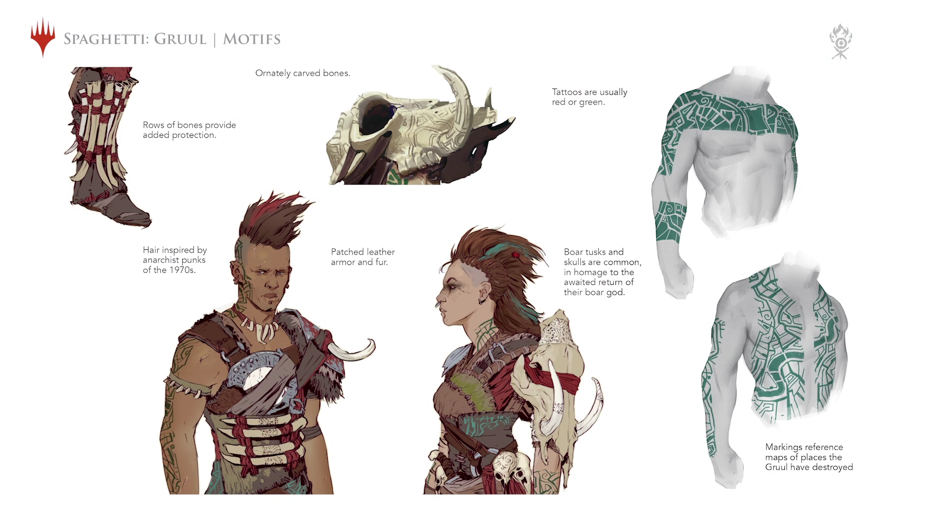
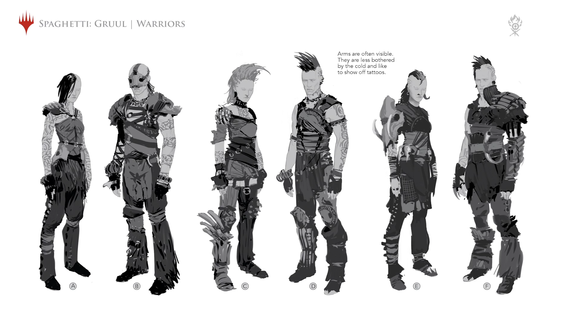
Here's an example of what one of these concepts could look like.
These are for the Gruul Clans in "Guilds of Ravnica".
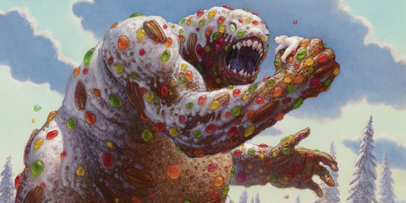
I prefer them with bolognese sauce.
What's In It?
A guide always starts with general and important information about the things that are constant to the game. That's necessary, in case new artists, that have no experience with MTG, joined the team.
Here's a little glimpse at said info and for more complete details, you should check out this blog from Matt Cavotta.
Magic's Attitude
- Magic is a spellcasting battle of wits between so-called Planeswalkers, which are powerful, magic-wielding beings.
- Every illustration should work in that context. They should be active, bad-ass, cool, etc.
- The target audience is Boys 14 and up.
Purpose Of Illustrations
- Set and create the world; Make the game visually interesting.
- Keep the game fresh.
- Represent what the card does and help the player to recognize it.
Lands
- Lands are Mana resources, from which Planeswalkers draw their energy.
- They play a key role in creating the mood and feel for the game since they are the cards the players will see the most.
- The artwork *generally* shows landscapes, and never buildings, creatures or characters.
Creatures
- Creatures are summoned by the players.
- Use the Style Guide as the foundation for your interpretation of the creature; Stay close to the base design for iconic characters.
- If your card depicts a group, try to make one of the members the focal point.
Instants, Sorceries, Enchantments
- These represent the spells you can cast.
- The action of the spell should be the focal point.
- Art descriptions for these cards are usually stricter than the ones for creatures since they tend to represent important concepts.
Artifacts, Artifact Creatures
- Artifacts are objects or creatures created by magic.
- Since they don't belong to any of the colors, try to make them look neutral.
- Don't make them look like they are high-tech or Sci-Fi.
... And of course much more.
New Set, New Rules
After the most important information about Magic has been laid out to new artists, the guide begins to introduce the teams to the setting of the next expansion.
It starts out with the general information about the underlying themes and ideas of that set. Within the first couple of pages, the guide describes the new landscapes, their people, important hierarchies, key characters, and so on. Concepts and beliefs are explained, races and tribes are added, and new worlds are being discovered.
One such description could look like this:
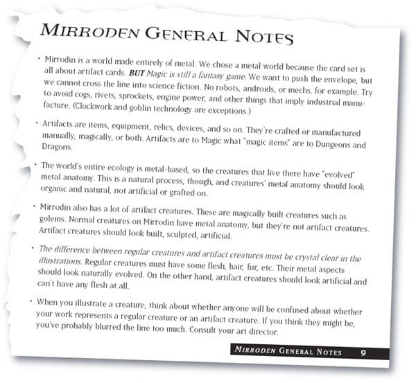
A page from the "Mirroden" Style Guide.
It's these thorough descriptions, provided by the guides, that let the artists reach such a high level of focus and cohesion. Through this unity, artists can explore specific aspects of designs, without taking away design space for future ideas.
Let's take a look at how the guides can influence the appearance of one of MTG's races.
Beneath this, you'll see 3 pictures that show Leonin. But, although they all belong to the same race of cat-humanoids, they all possess different features due to different Style Guides, and thus have uniquely distinct character designs.
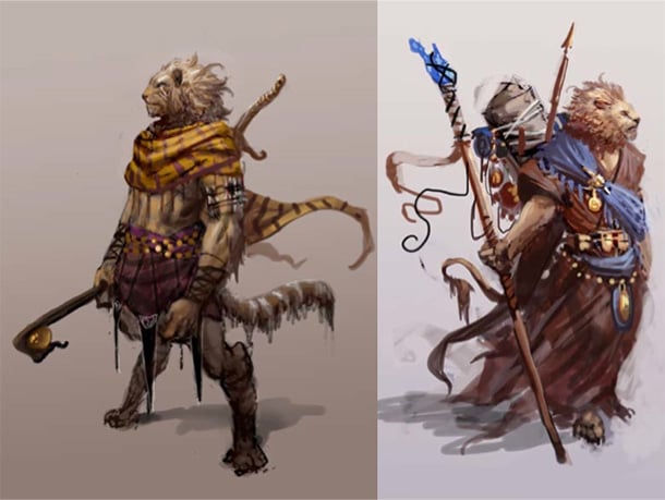
Leonin of Theros.
The life as an outcast people in this greek-mythology-themed world gave them a somewhat nomadic look.
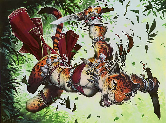
Leonin of Naya.
This tropical setting gave artists a great opportunity to depict a more exotic and wild variation.
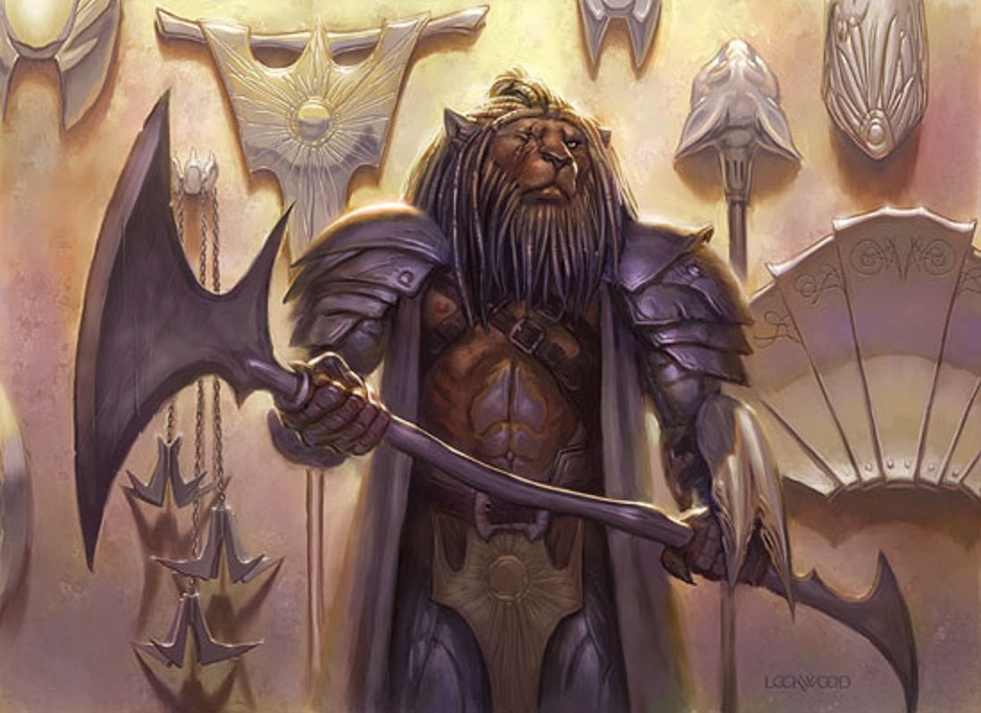 Leonin of Mirrodin.
Like all life forms on this Plane, a part of their biology consists of Metal.
As you can see, these Style Guides play a huge role in Magic's cohesive art experience!
They make sure that all the different teams can pull on the same string, and so coordinate their efforts to deliver a clear, unified vision of the game. It should also be noted how vital this unity is to Magic's health. In the early days, MTG didn't have any Guides, which led to some really jarring differences from card to card. But, since there was no competition back then, no one would've batted an eye about the art on some cardboard. Thankfully though, the Devs over at WotC realized how instrumental this unity to Magic's success truly is, and thus not only ensures its longevity but also sets a high standard for today's card games!
Thanks for reading!
It was really interesting to go through some of MTG's early designs and see how much it differs from the ones of today. I especially liked to look through the vast amounts of concept art that exist out there.
Would you like to hear more about Magic's Art Development? Or is there some concept art that you would like to see on here? Tell us in the comments!


Leave a Comment