A new patch is coming to Legends of Runeterra this week that updates all the card frames to provide more clarity to region icons. We've also got a fresh lab rotation, expedition changes, a new small visual effect on Primastic Cards when drawn & played, and more. Read on for all the details in the patch notes.
Quote From Riot Card Layout Update
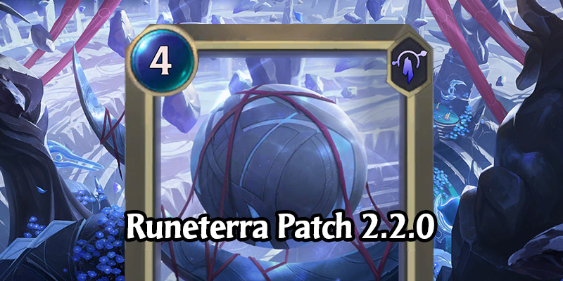
Patch 2.2.0 introduces a brand new look for cards! As we’ve added more (and more complex) cards to the game, we’ve seen text overlapping with Region icons in some languages. This update gives text a little more room to breathe and makes the Region more distinguishable across the board.
Champion
Spell
Landmark
New Lab: Heimer’s Madness
Patch 2.2.0 brings a new rotation to Multilab:
- Lab of Legends
- United Front
- Heimer’s Madness (New in 2.2.0!)
After some brutal battles in Lab of Legends, Heimerdinger seems to have gone mad with his newest experiment - Heimer’s Madness!
This new 1v1 PvP Lab starts out pretty tame, but can quickly get out of hand. Here’s a crash course on how to manage your madness:
- Each player starts with 4 max Mana, and a small premade deck with a few random Champions, Spells, and Followers.
- At Round Start, instead of gaining an additional max Mana, the cost of all cards in each player’s hand and deck is reduced by 1, down to a minimum of 1.
- Each Round, the attacking player receives a spell that lets them choose a card to add to their hand, with 2 additional copies added to their deck.
Create low-cost Followers and Spells to overwhelm your opponent, or choose high-cost cards and try to control the match long enough to discount them for some insane combos!
Expeditions
We’re sticking with minor tweaks again this time around, starting with some light buffs to Afterlife and Moonlit Heist by removing some of their more inconsistent cards. Shroom and Boom is receiving some new aggressive options and losing Insightful Investigator. Finally, Augmented Assault is gaining the Investigator as well as a few more 2-cost commons to fuel it.
- Reduced the Luminous Dusk offering bonus to half of what it was previously, meaning it will now show up twice as often as normal. This will be completely removed with the following patch.
Afterlife
- Removed: Pesky Specter, Ravenous Butcher
Augmented Assault
- Added: Clump of Whumps, Insightful Investigator, Trifarian Hopeful
Moonlit Heist
- Added: Zap Sprayfin
- Removed: Double Up, Shakedown
Shroom and Boom
- Added: Poro Cannon, Zaunite Urchin
- Removed: Insightful Investigator
Miscellaneous
- Prismatic Cards have a new minor visual effect when viewed in the Collection, and when being drawn or played.
- In the Collection, cosmetic items that were available as part of a limited-time event are now labeled "Legacy." A new "Show Available" filter will hide Legacy items.
- The Tournaments Tab has been updated for the upcoming Seasonal Tournament; round timings will be more clearly displayed during the Open Rounds and Playoffs.
- On mobile, the in-game language can now be changed from the Settings menu.
Bugfixes
- Fixed an issue that would sometimes disable PC hotkeys.
- Fixed an issue where Oracle's Eye would sometimes be disabled.
- Fixed an issue with An Acquired Taste occasionally causing units without to appear as if they had Spellshield without actually having one.
- Fixed several audio and card text issues for Aphelios.
- Fixed an issue where Diana’s Nightfall visual effect wouldn’t play properly.
- Fixed several inconsistencies in Tutorials and Challenges.
- Updated several cards' text as part of ongoing work to improve text consistency.
- Fixed a crash related to Get Excited.







Leave a Comment