Scholomance Academy is now out and we're having a lot of fun playing with the new cards and seeing what decks come out of it. With that said, it's time to return to a tradition that I do for every new expansion, and that is the Concept Art Spotlight for the set. Many of the cards that we will recognize had their artwork evolve and change in very interesting ways over time until eventually reaching the finished product.
Every image in this article is courtesy of ArtStation, and links to every artist's ArtStation page is provided. With that said, let's get started.
Transfer Student by Ivan Fomin
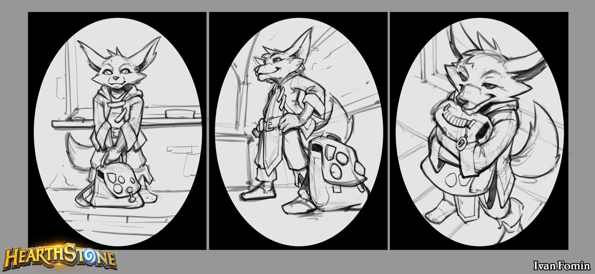
The first card we got to play with before the set launched, and it's the first piece of concept art posted for the set. Ivan Fomin went through a few iterations of concept art for Transfer Student before settling on the first one.
Rattlegore by Ivan Fomin
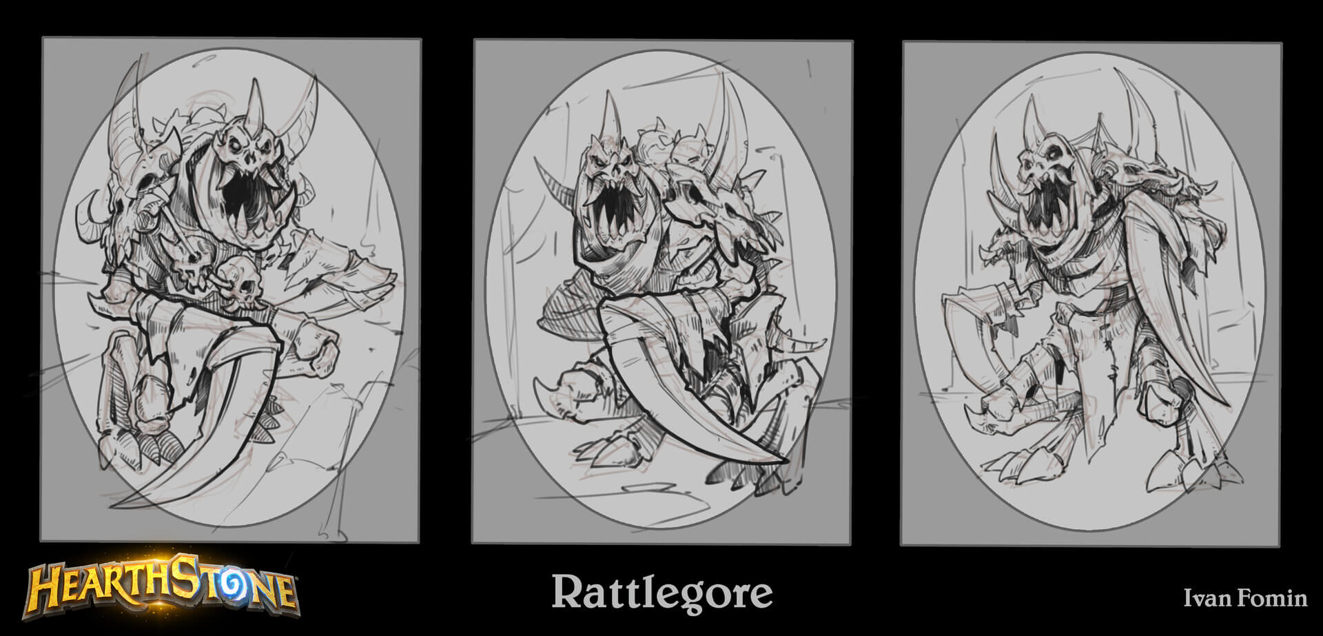
Rattlegore similarly had some different poses for the card frame. 9/9 for the final art though.
Frazzled Freshman by Ivan Fomin
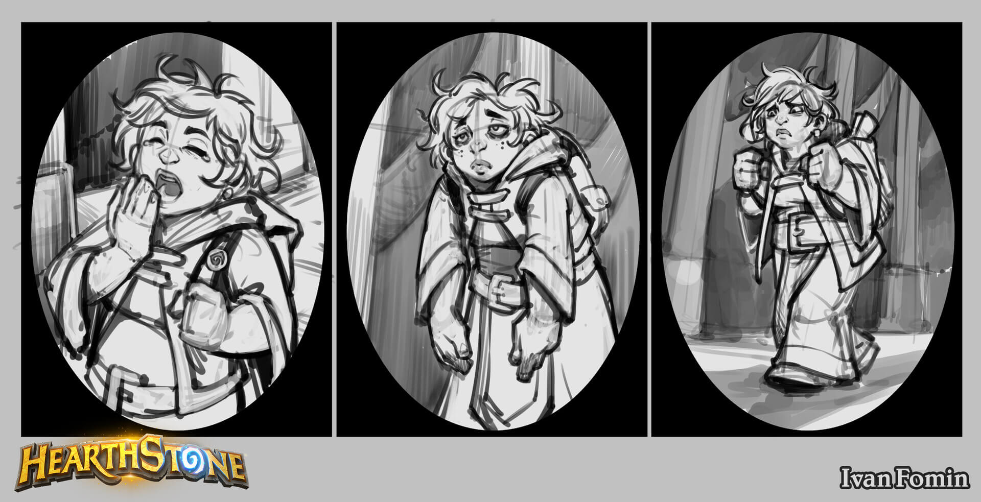
Frazzled Freshman had a very different mood in its concept stages, at first she was tired, and then she seemed to be afraid at one point.
Spirit of Vengeance by Dmitry Bolotov

Dmitry Bolotov had worked on the artwork for Spirit of Vengeance, the token from Cycle of Hatred. It seems that the spirit was originally much more "shade-like" (as seen on cards like Ancient Shade or Shifting Shade) before shifting to the hooded design with a concealed face.
Adorable Infestation by Ivan Fomin
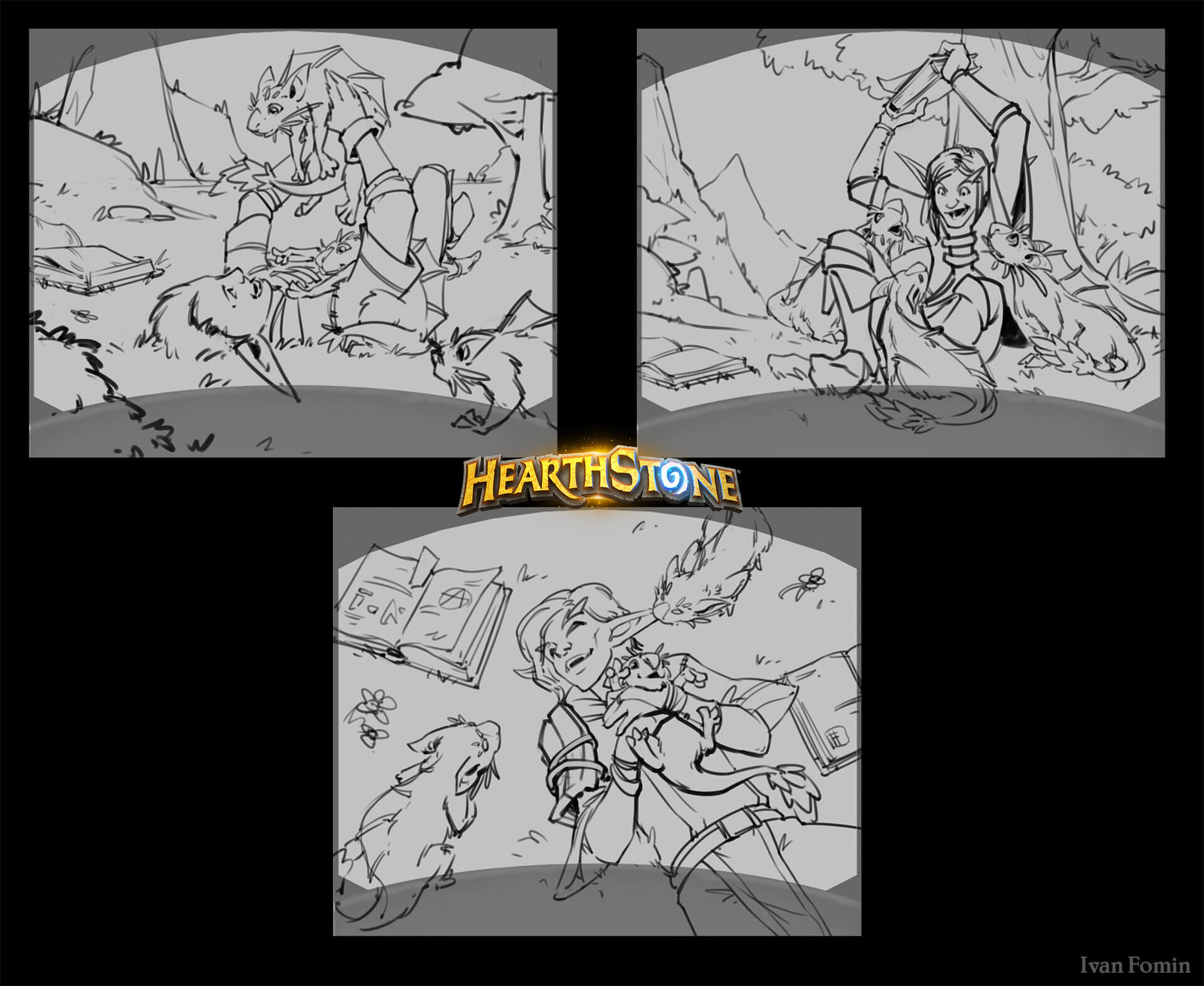
Ivan provided these different designs for Adorable Infestation, which houses the cutest card of the set, the Marsuul Cub token.
Devout Pupil by Mike Mishkin
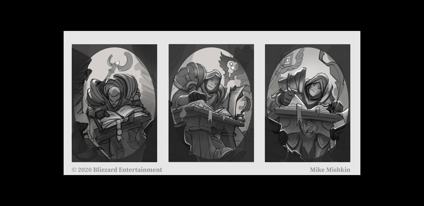
Arguably seen as one of the more exciting dual-class cards to come from the set is Devout Pupil, and we have Mike Mishkin to think for the artwork. Interestingly, the student's staff in each piece seems to be different for each iteration, and none of these three staffs were used in the final artwork.
Voracious Reader by Ivan Fomin
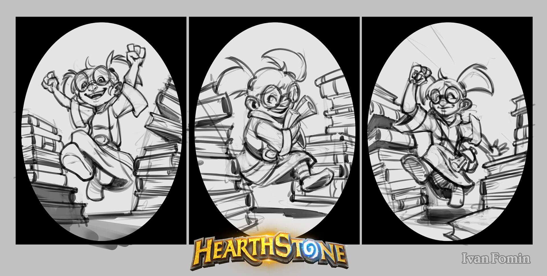
Ivan's next concept art in this article belongs to Voracious Reader, whom I thought would be eating the books judging by the name, but I guess not (and that was your bad joke of the article).
Blood Herald by Ivan Fomin
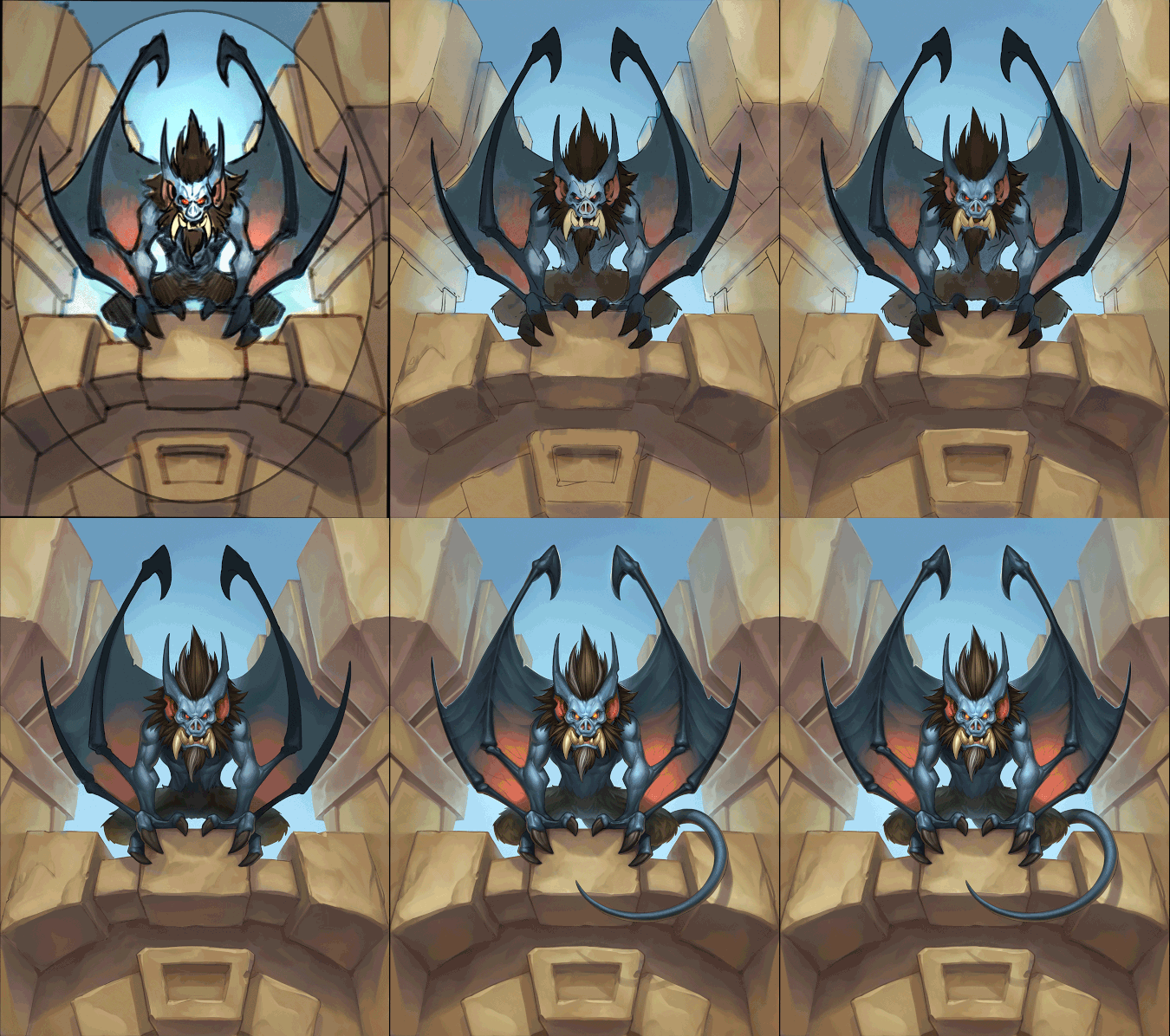
An art process gif detailing how the art used for Blood Herald came to be.
Power Word: Feast by Ivan Fomin
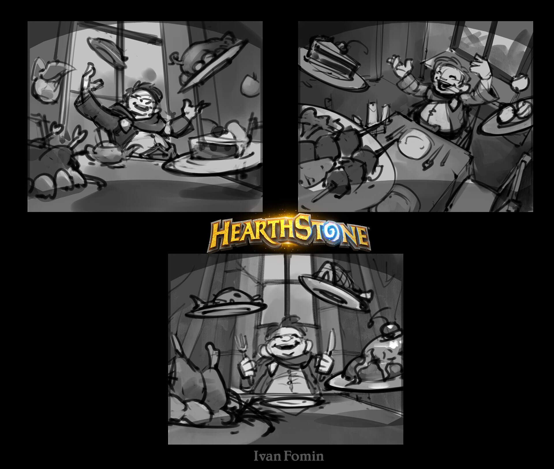
I had no idea that feasting would be a Priest theme now (I guess they rhyme), but here's the concept art for Power Word: Feast, provided by Ivan Fomin.
Teacher's Pet by Ivan Fomin
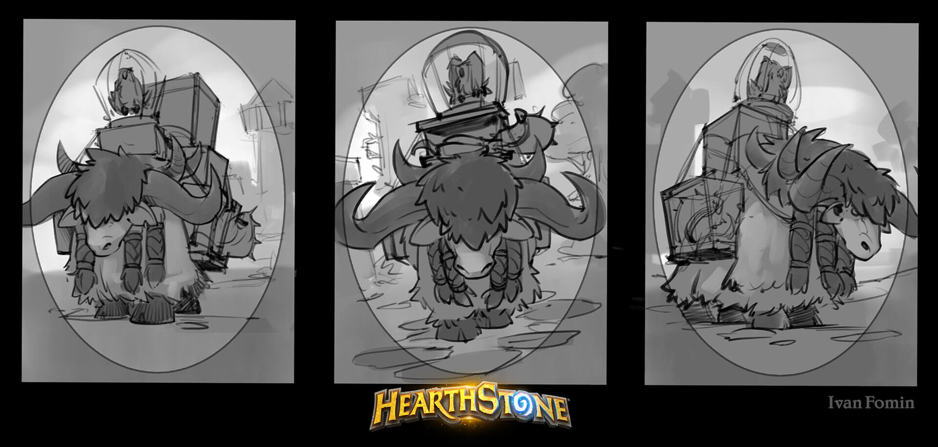
Watch Teacher's Pet as it moves (or maybe it's the camera that's moving) from looking one direction to the other. a 10/10 pun though.
Vulpera Toxinblade by Ivan Fomin
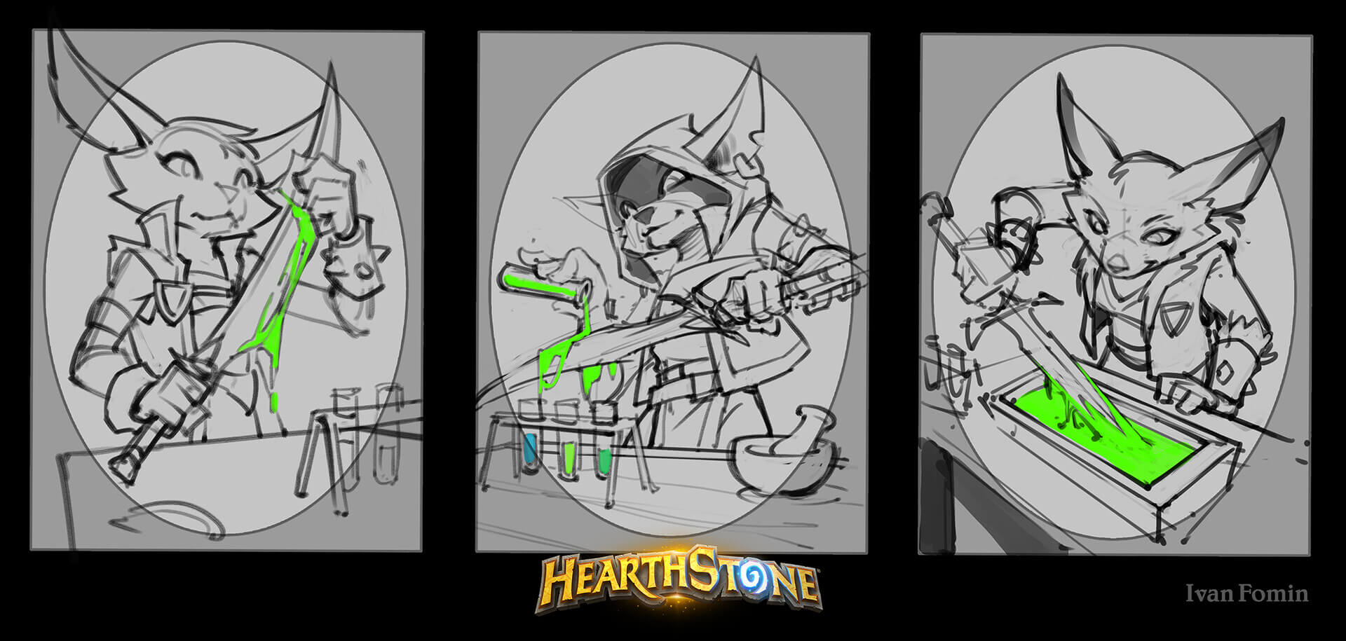
Concept art for Vulpera Toxinblade by Ivan Fomin, of which the Vulpera appeared to have several ideas on how to apply the poison. It seems that the most practical one is the one that was used for the final artwork.
High Abbess Alura by Mike Mishkin
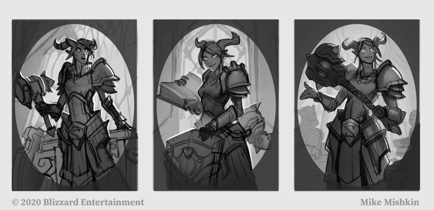
Concept art for one the dual-class Legendaries, High Abbess Alura. She appeared to have had glasses at one point, and this appears in the reveal video for her. They, however, are not present on the final artwork.
Keymaster Alabaster by Rafael Zanchetin
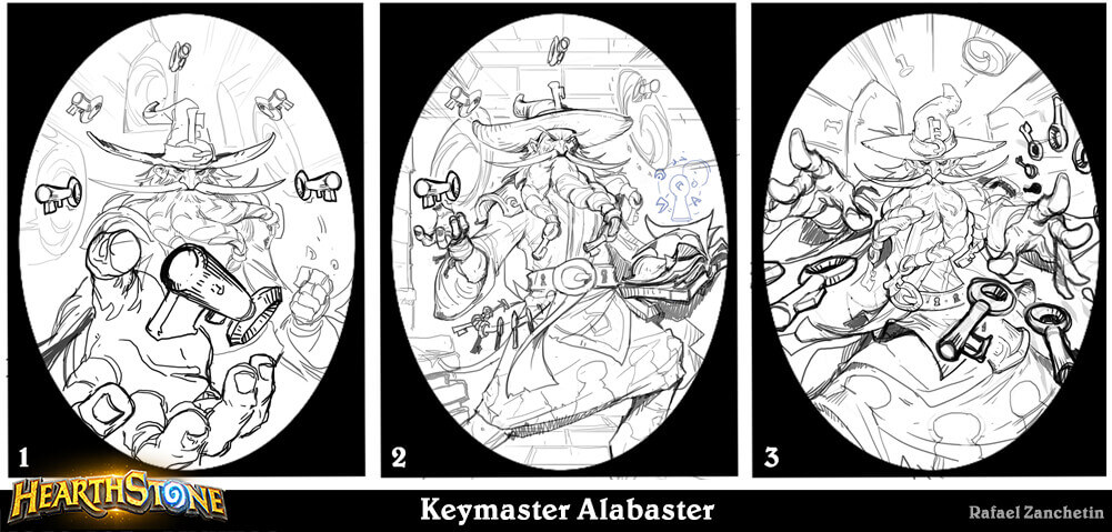
Nice rhyming name by Rafael Zanchetin on some nice concept art for Keymaster Alabaster. Perhaps he could tell you the key to becoming a great artist and unlock your potential.
Instructor Fireheart by Rafael Zanchetin
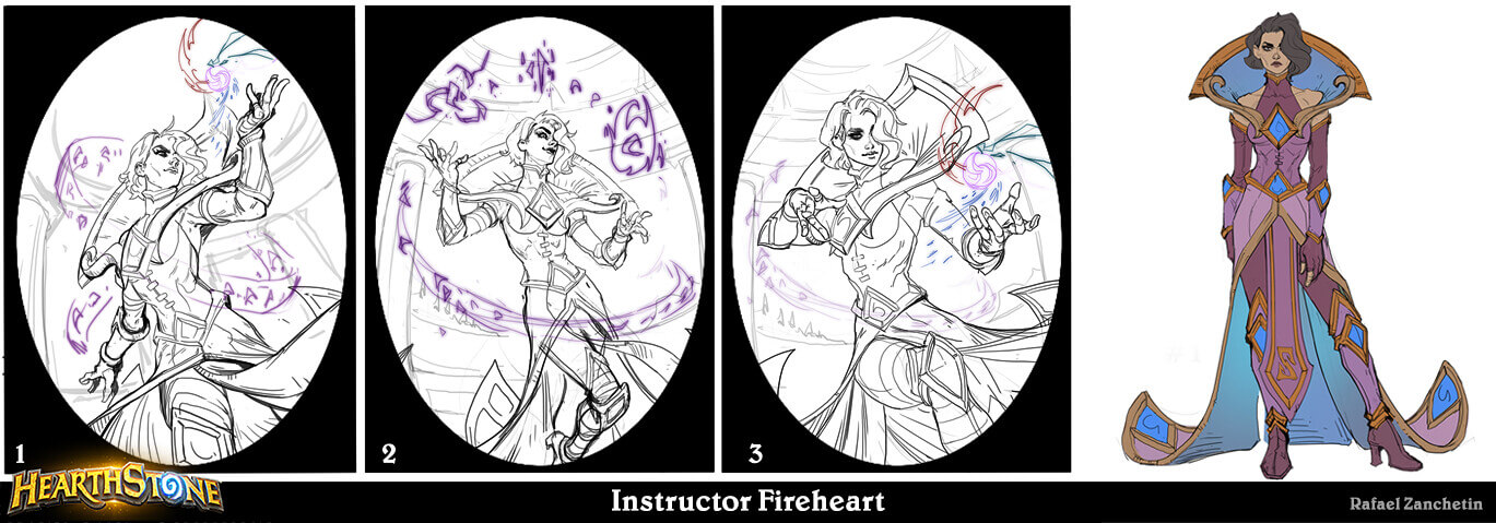
Rafael also made this concept art for Instructor Fireheart, who happens to be a re-imagining of Chillheart before she has cold-hearted.
Sorcerous Substitute by Gagaya
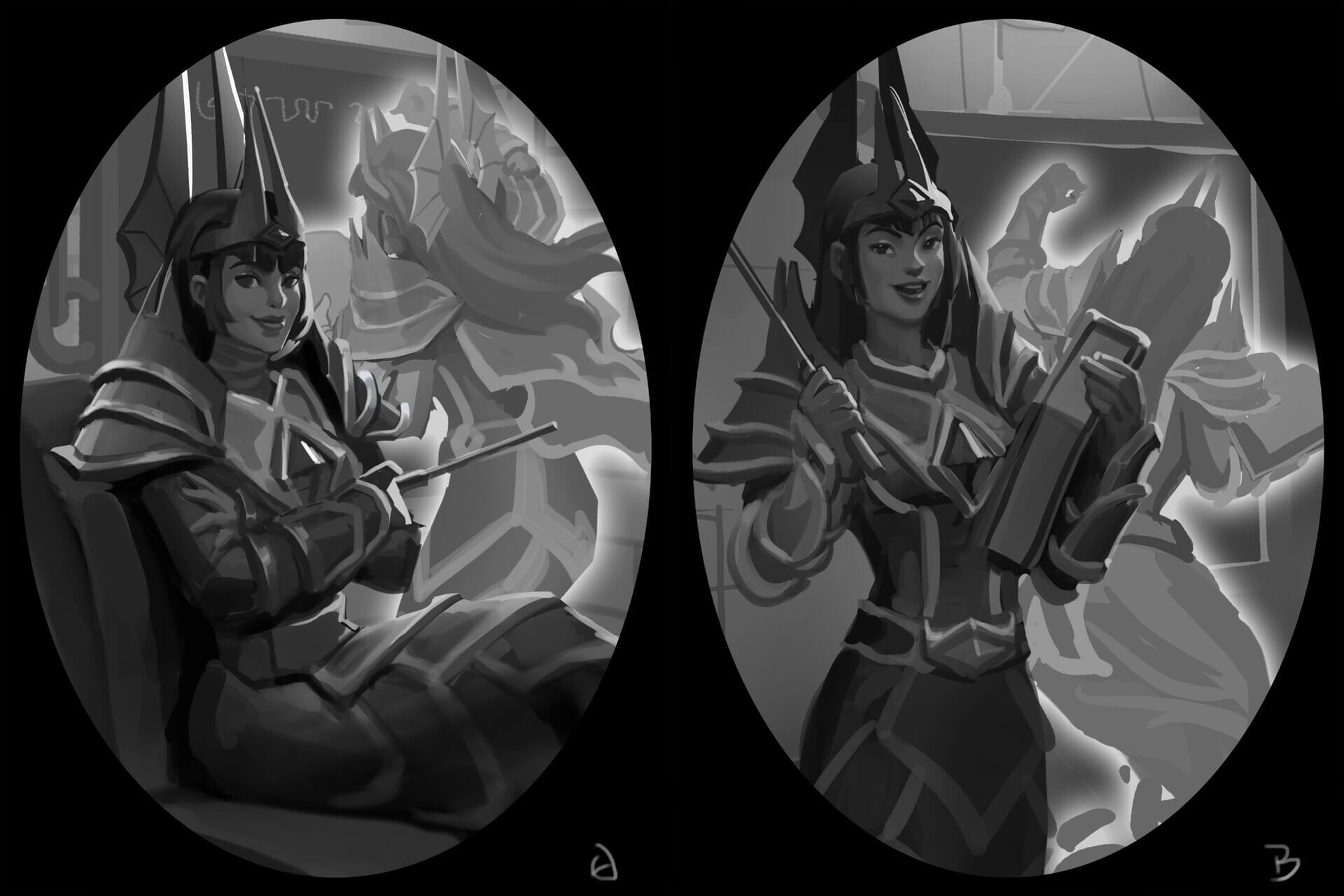
Two early designs of Sorcerous Substitute by a 2D artist who goes by the name of Gagaya.
Mozaki, Master Duelist by Jim Nelson
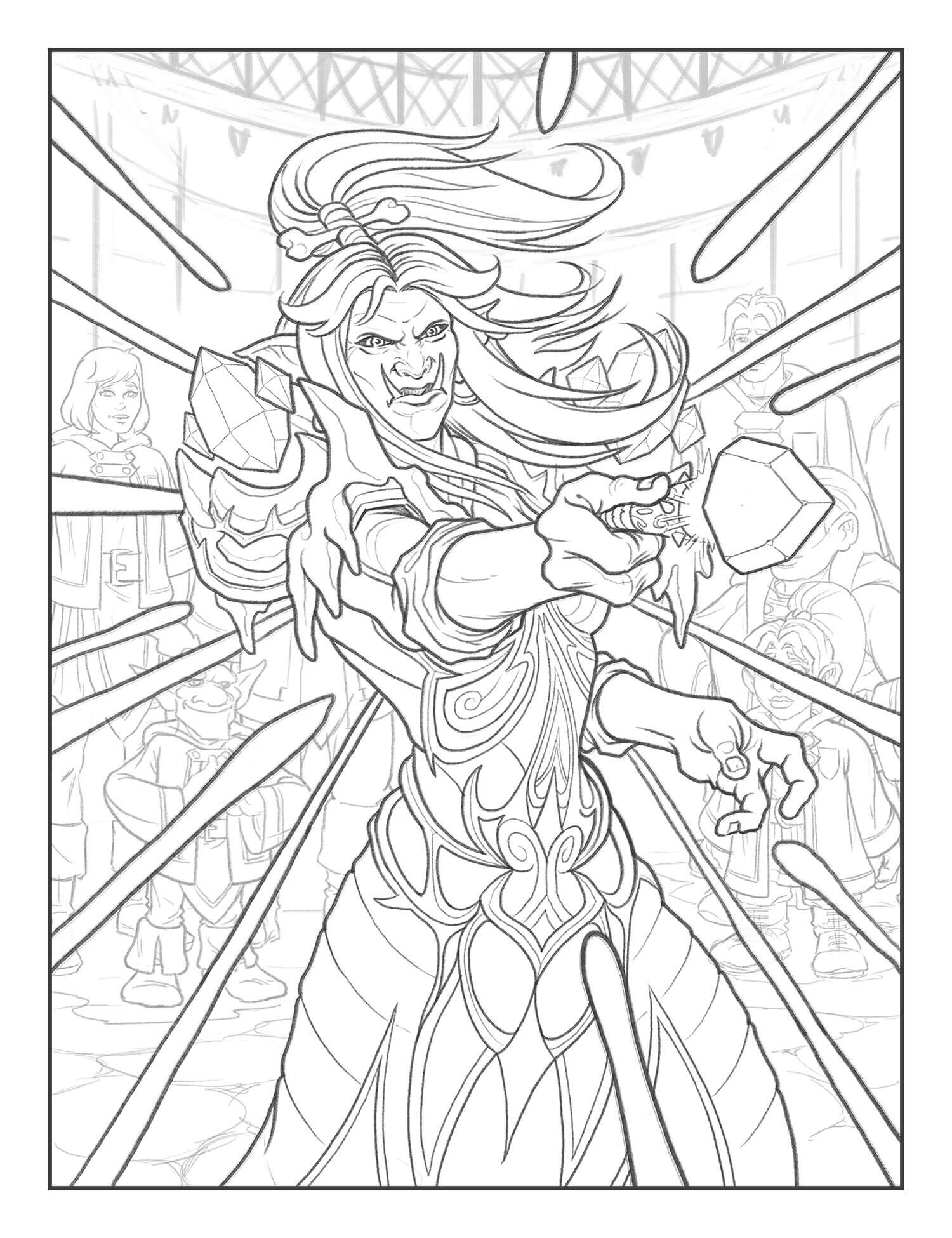
Jim Nelson provided this preliminary sketch of Mozaki, Master Duelist. Notably, the background architecture is different compared to the finished art, and the people standing behind Mozaki are much easier to see.
Wandmaker by Jim Nelson
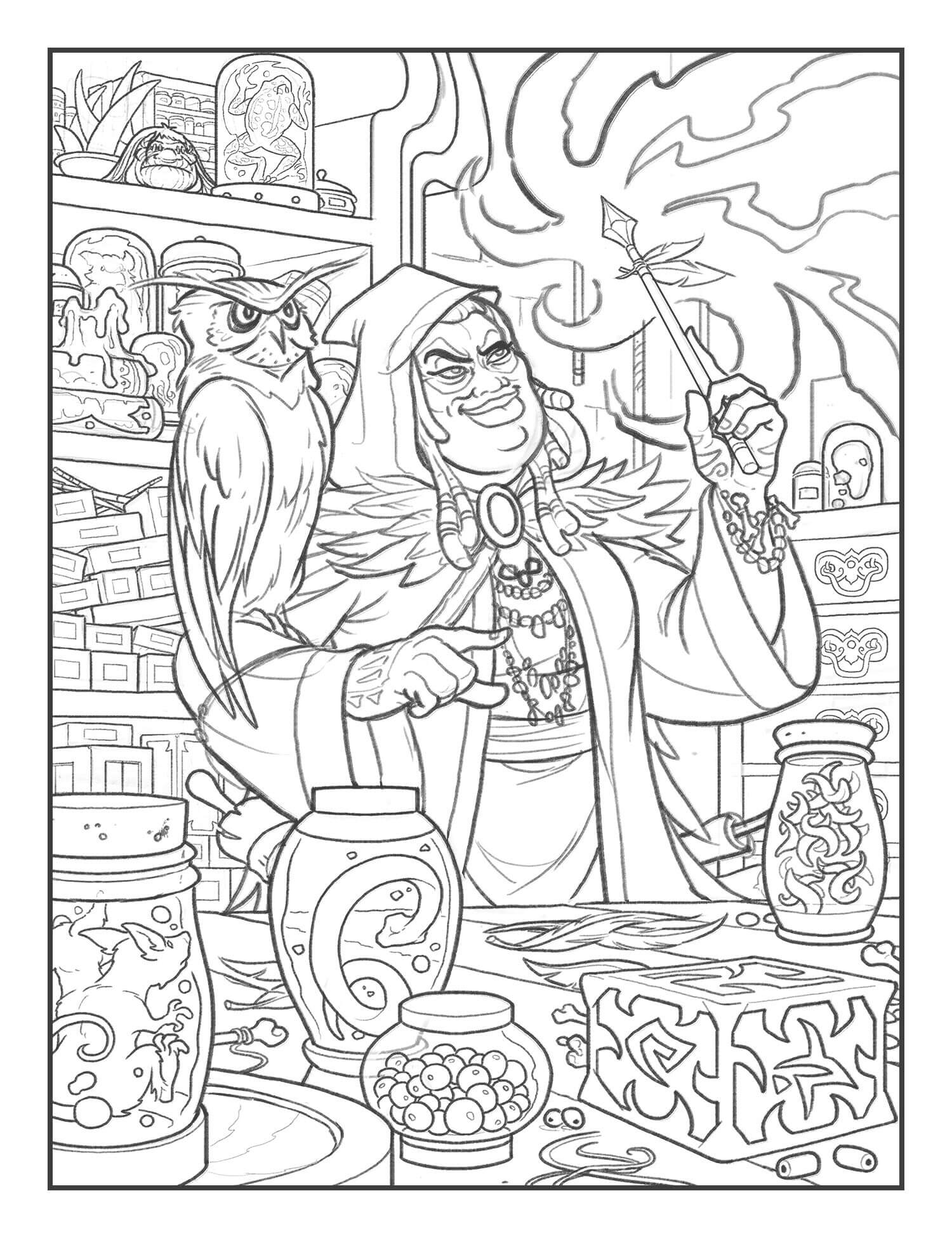
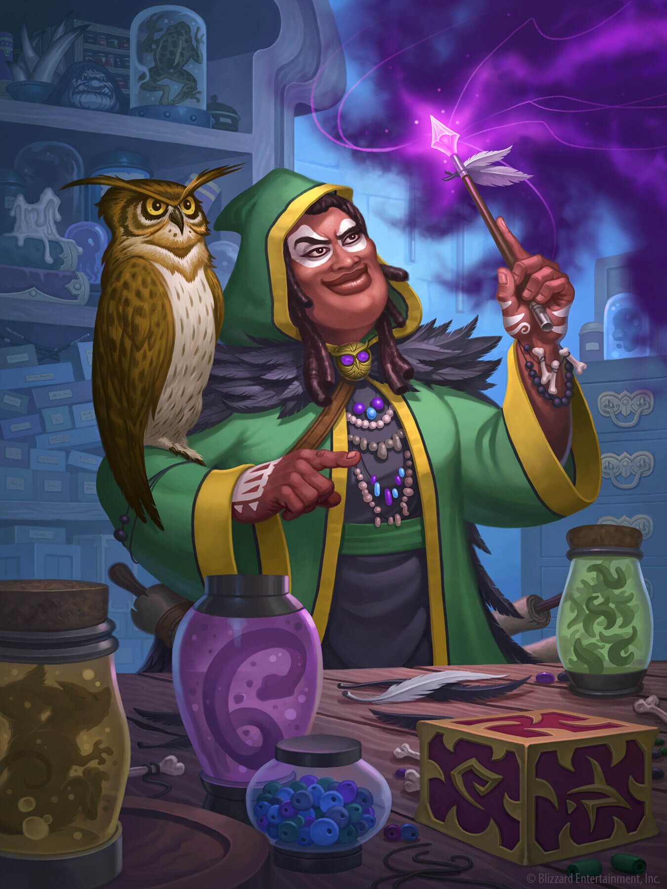
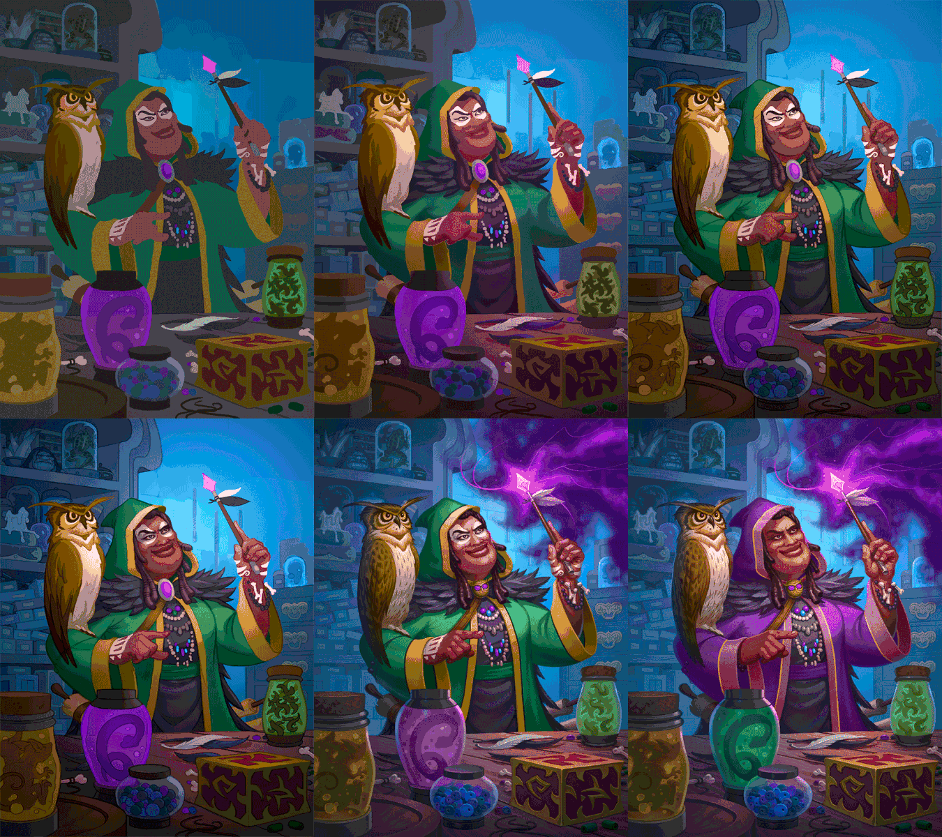
Wandmaker had a very interesting development cycle. Notably, the magician in the artwork originally had white paint over her eyes which was removed from the final artwork, as well as a green cloak instead of her purple one used in the final artwork. The snake in the jar was originally purple before being changed to green in the final artwork.
Shield of Honor by Jim Nelson
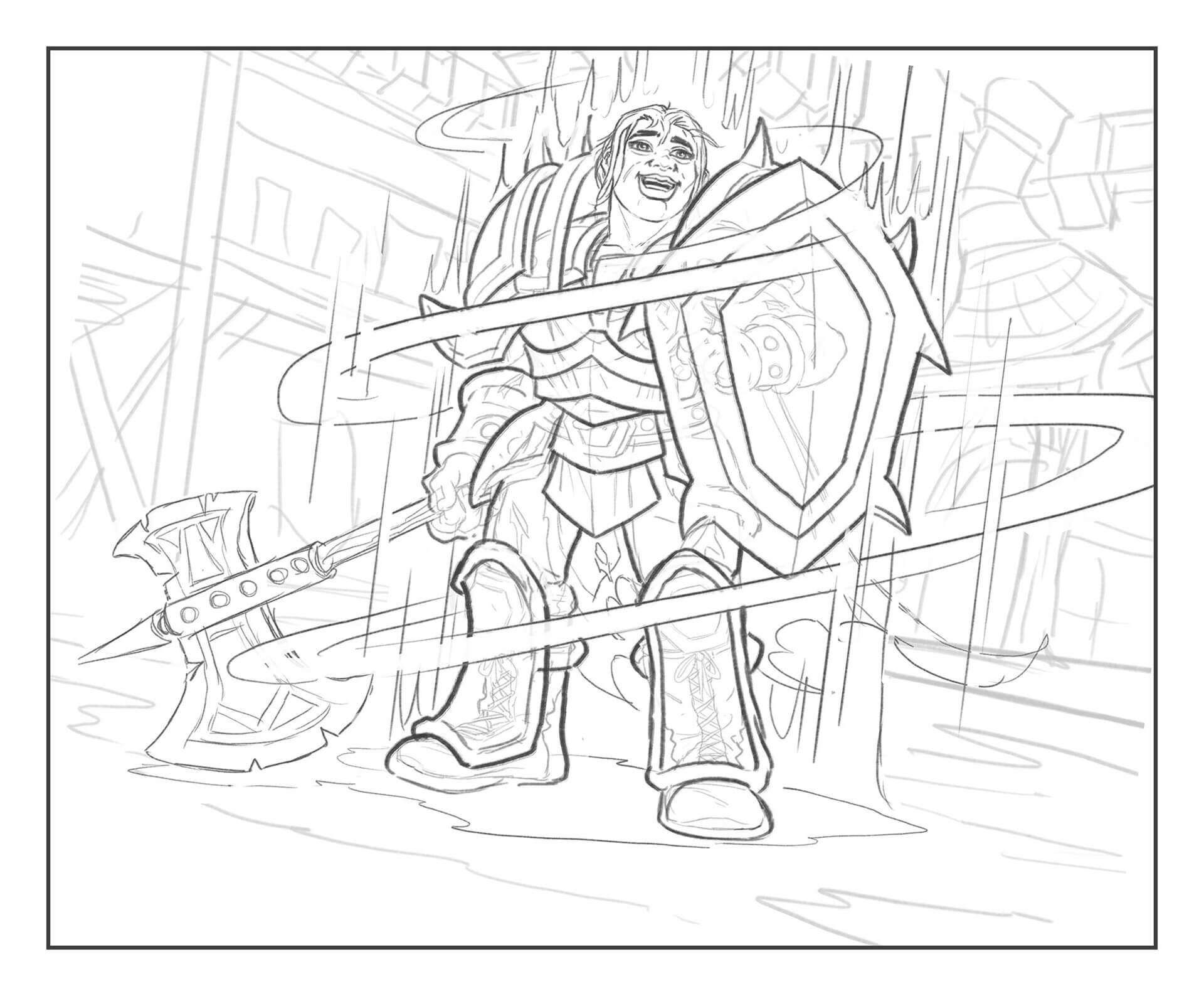
A preliminary sketch of one of the Warrior/Paladin dual-class cards, Shield of Honor, using a different frame size than a lot of Jim Nelson's other cards.
Soulfed Felhound by Mike Mishkin
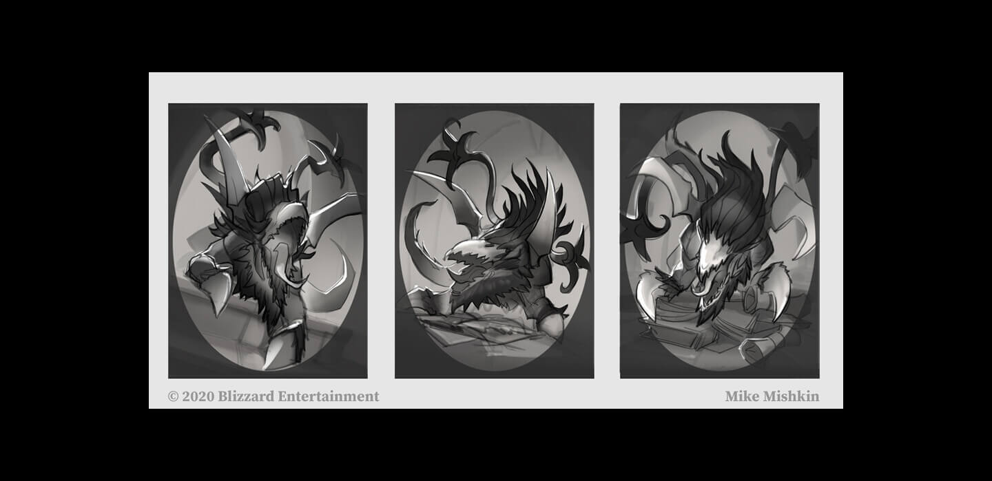
Mike provided concept art for Soulfed Felhound, the token created by Fel Guardians.
What happened to the hounds when they tripped on a rock? They... fel.
Animated Broomstick and Fishy Flyer by Jim Nelson
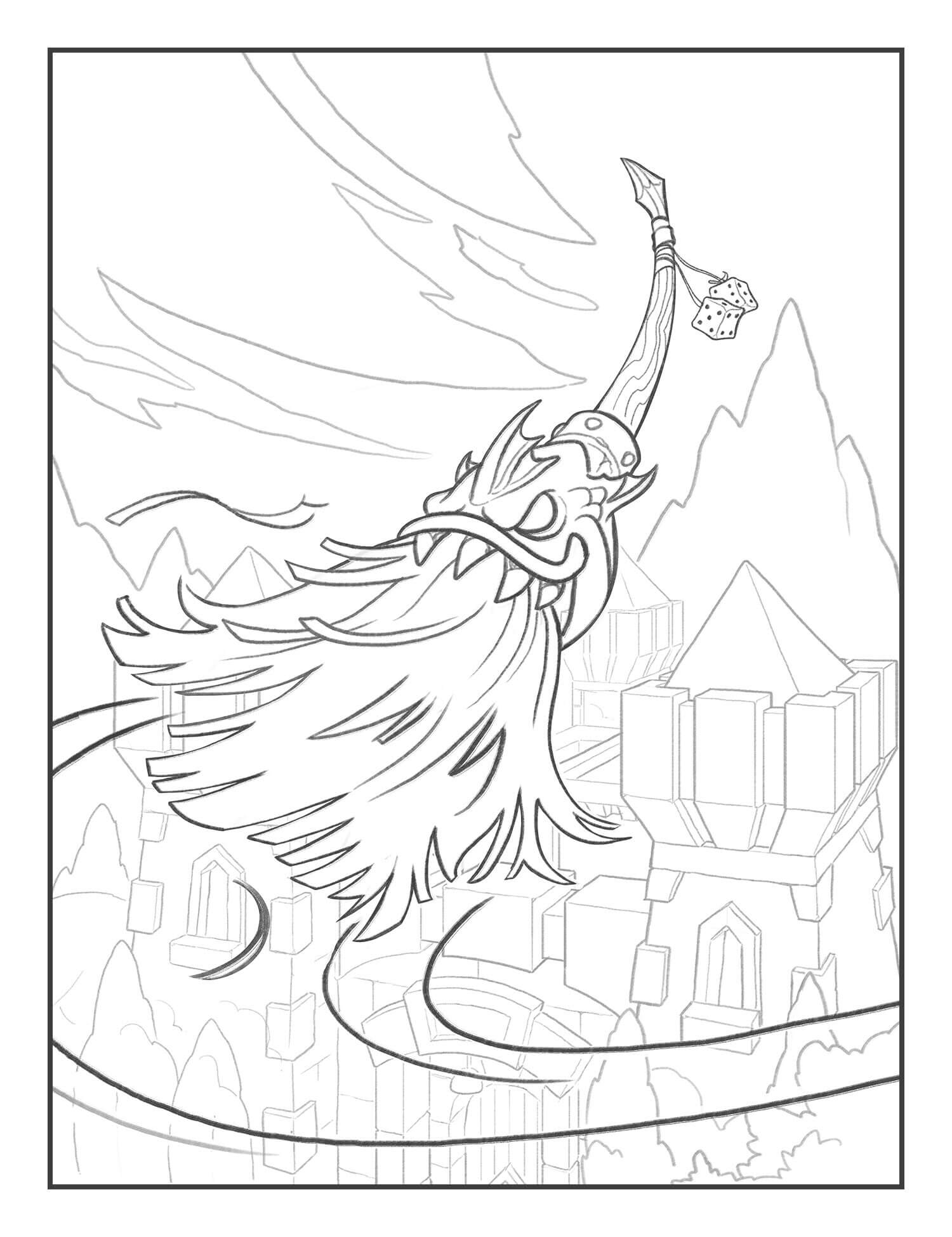
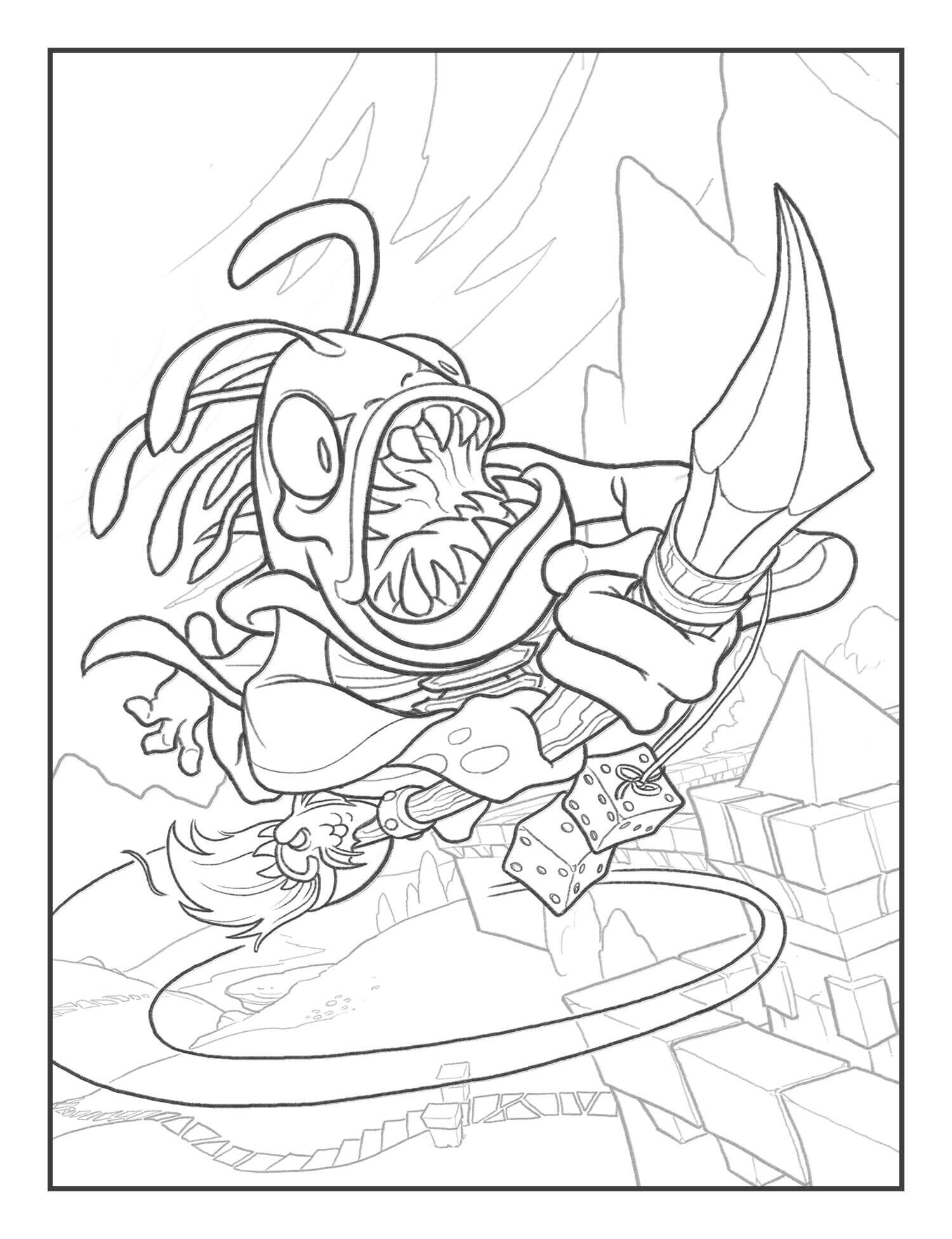
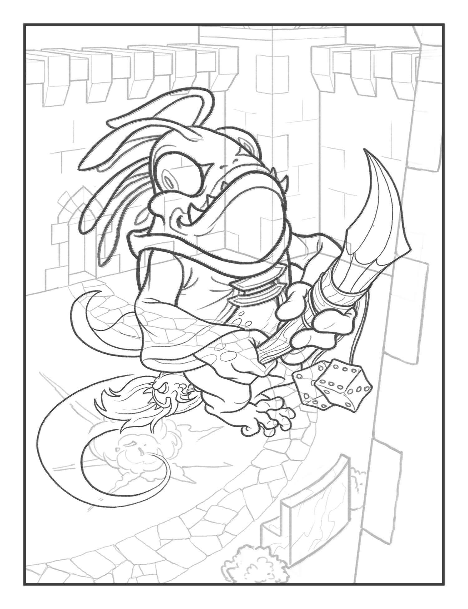
Here's a set of 3 artworks that are connected together, featuring Animated Broomstick and Fishy Flyer. One may notice the Fishy Flyer is riding the broomstick in his(?) artwork. Even in death, he continues to ride on.
Survival of the Fittest by Patrik Björkström
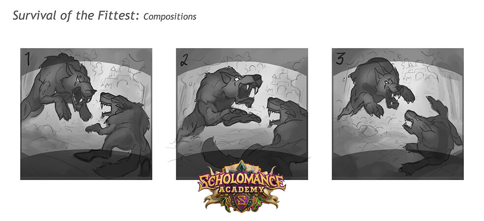
Quickly became a meta-defining card is Survival of the Fittest, with Patrik Björkström providing the composition sketches for the card.
Divine Rager by Patrik Björkström
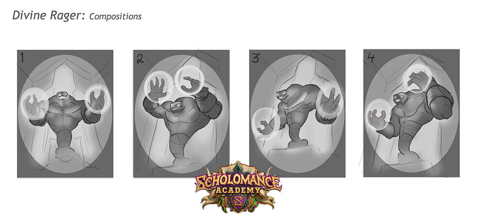
Patrik also provided the concept art for what is undoubtedly the best card in the entire set, Divine Rager, which originally seemed to have had a more Voidwalker-like design.





Leave a Comment