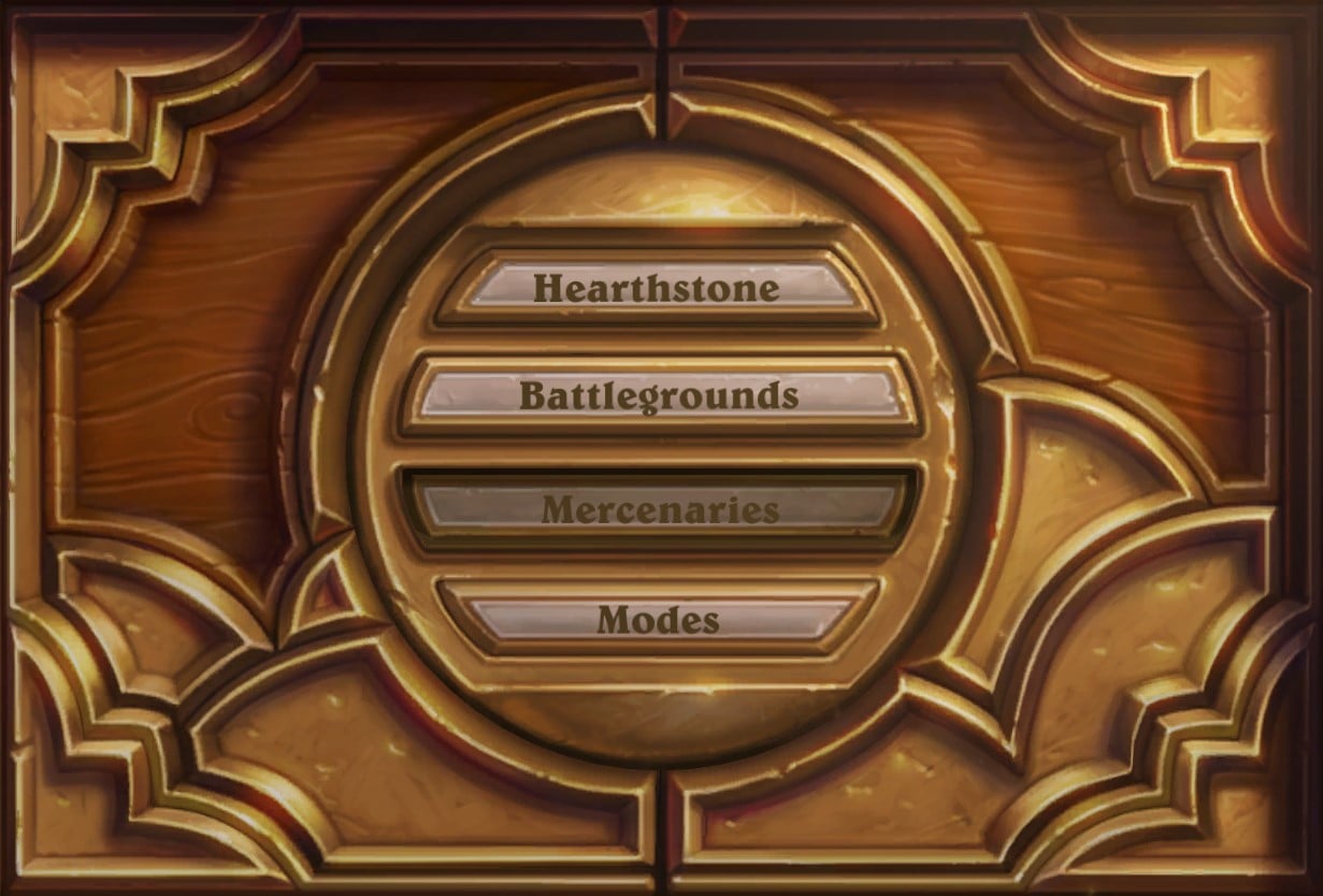
We're seeing the platform of Hearthstone evolve with a major, yet minor, update to the main game menu in today's patch.

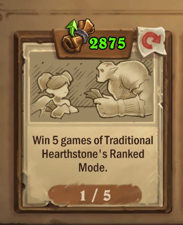
The first major change is to the Play button which is now simply "Hearthstone". We know Blizzard looks at the entire game as a platform to enjoy different modes so splitting out constructed play into Hearthstone is in line with these goals. It better communicates to players if you want to play the core of the game, that's where you want to be. This change is communicated elsewhere in the game with references to Play Mode in quests changing to "Traditional Hearthstone".

Battlegrounds overtakes the Adventures menu which has been relegated to the Modes button at the bottom. This is little surprise since Battlegrounds is a huge mode with enough active players that Hearthstone's Game Director, Ben Lee, said if the game were on Steam as a standalone, it would fit into the top 3! The move into the main menu makes the game easier to access for players that only play that.
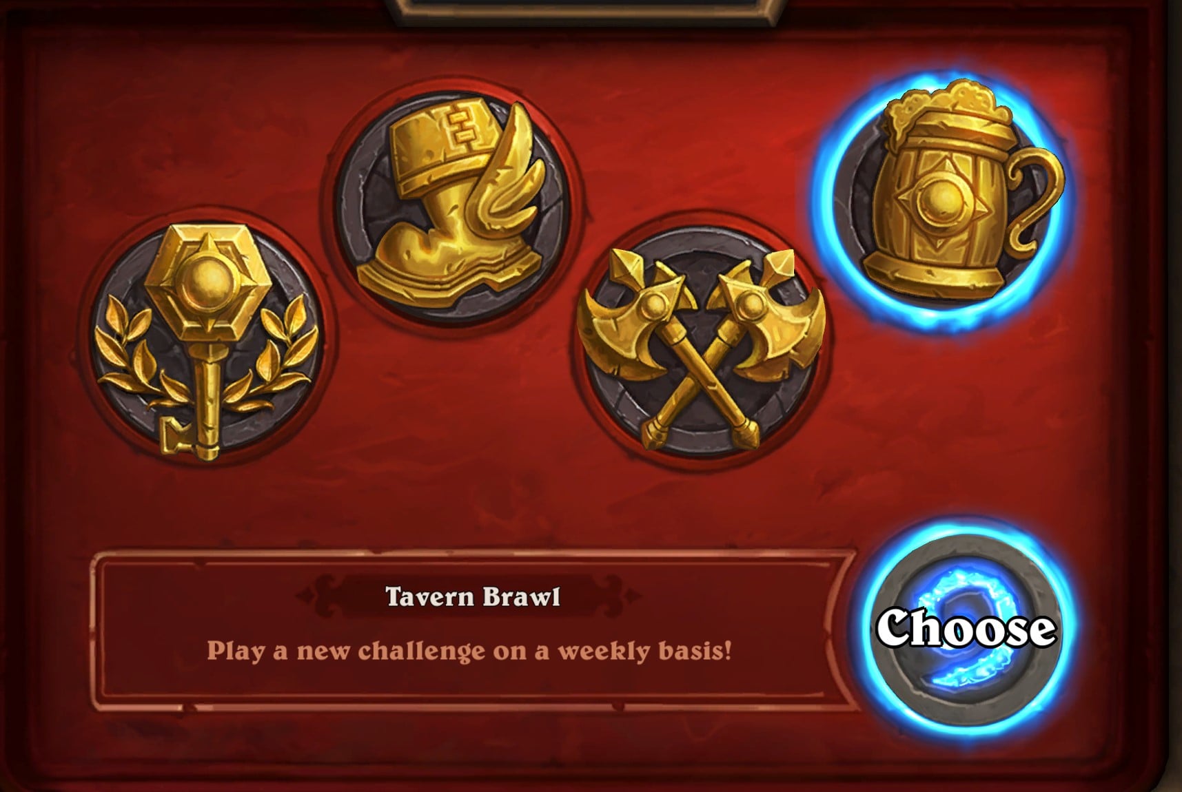
Finally, we have Mercenaries taking over the Tavern Brawl slot. With the huge new mode coming on October 12, it makes sense to put it front and center, especially with it being another completely different game inside of the platform. It also makes sense with Tavern Brawl clearly being a project put on the back burner as the team worked on Mercenaries and honestly, we don't really expect much new out of the mode. Tavern Brawl was an amazing addition to Hearthstone but it has been outclassed in many ways since then - and there's nothing wrong with that!
So, you'll now find the Modes menu filled with the following options:
- Arena
- Solo Adventures
- Duels
- Tavern Brawl


![Echoes of the Infinite Card Reveals - Day 3 [Finished]](https://youre.outof.games/media/uploads/c3/c3/c3c3fff6-52bb-460a-80dc-b7674cb9c3d2/echoes-of-the-infinite-day-3.webp)
![Echoes of the Infinite Card Reveals - Day 2 [Finished]](https://youre.outof.games/media/uploads/e8/9b/e89bc64b-975f-43b9-a6da-2f424f94833d/echoes-of-the-infinite-day-2.webp)
![Echoes of the Infinite Card Reveals - Day 1 [Finished]](https://youre.outof.games/media/uploads/e6/71/e6714b1b-3226-4b84-9914-a2fd7d424247/eoti-day-1-reveals.webp)
Comments
Today in reddit:
Play hearthstone to play hearthstone
Enough with the piggybacking. Just create their own servers and interface blizz. I haven't touched battlegrounds in a while now and having to stare at that game icon everyday wont make me want to click it.
‘Hearthstone’ option on top looks dreadful.. ugh
holy crap, you can actually play the hearthstone mode in hearthstone
wowzers
They had a whole imaginary table of space to use - why not use it? Put an dagger beside the book and have players unwrap something on the hilt to start Mercenaries. Crack open a compass to start Adventures. Click on an event flyer to open Battlegrounds.
Anyway, my point is that Hearthstone is a game about whimsy. In terms of graphic design, it says a lot with little words. This overhaul, though, displays of that magic. It feels like they did the bare minimum. This is the face of your game - why'd you settle for the lowest common denominator?
I appreciate the whimsy of Hearthstone, but merciful heavens, don't make me guess which icon does what. (The Google apps on my phone are a good example here, or take a look at the icons in the achievement pages of the HS journal.)
Words! Clear, obvious, meaningful words!
That is a good point, actually. We've all faced the inexplicable challenge of figuring out new water fixture controls in hotels or friends' houses - does it bend out? up? down? do I push it in? which way is hot? It's amazing that something so simple can be made so complicated without words.
The same is true for the internet - as I learned while teaching my parents how to navigate the web, what constitutes a link or button - 'something you can click on' - is really inconsistent. Blue text? an image? underlined text? specific symbols? outlined buttons?
All that said, I think they could implement something more interesting and still give it text and a uniform button UI. Hopefully Flux is right, re: this being a stopgap before a bigger release.
I don't think this is the major overhaul that has been hinted at in previous Q&As. If this is, that is a huge let down. This seems like the smartest thing to do though to push these two modes hard since they will be the main face of the game outside of constructed play.
There is also mobile considerations to make when they are overhauling stuff, so take into into account for why they can't just add tons of buttons everywhere.
Ah, I hadn't thought that this might not be the major overhaul they've teased. In that case, it makes some sense to have a stopgap measure in the meantime. I hope that you're right! I would, honestly, be surprised if this was their main effort.
When Hearthstone gets sideline inside its own game
They should just make new games at this point rather than tying everything to the clunky and limited HS UI. Mercenaries should be standalone.
Clunky and limiting as the Hearthstone UI is, building a new game from scratch would be more expensive in terms of time and money, and a lot riskier from every angle. Remember how long Mercs has already been delayed? Add a couple more years onto that for a standalone version.
It makes so much sense to keep it all inside of Hearthstone, much like Teamfight Tactics inside of League of Legends.
At the core, Battlegrounds and Mercenaries are still card games and they share quite a bit with their parent mode. Having them standalone would be a huge mistake because it creates more effort to switch between them which could harm player retention. If I just got done a bunch of constructed and I thought "ah maybe I'll go play a BG quick" but that would require more than a button, I might not do it and just log for the night.
However, with that said, I am concerned about Hearthstone on mobile. Having a new, asset-heavy mode is adding to the install and download size. I know its not something that would be easily accomplished, but having the ability to opt-out of content for Mercenaries, being prompted to download it upon first entering the mode, seems like not a horrible idea. They could even ask when you first launch the game.
Teamfight tactics is standalone on mobile tho
Not much choice there since League of Legends itself isn't on mobile (Wild Rift is an entirely different game, easier mechanics, separate from League). I think TFT would take a small hit to players if it was in its own client, though it would certainly get League players to stop crying about it "causing performance problems" for the main game (yeah, better get rid of URF too then /s).
There's just so much value baked into using your main game as the launcher for sister games. If it wasn't for Out of Cards, and if Hearthstone had a Battlegrounds-only client, I can assure you I wouldn't bother going for even the monthly card backs. But, since its there and the client is open, its a great reminder!
I think this is a good opportunity to highlight a quote from Ben Lee during a Blizzconline Interview "Hearthstone has become a platform for card games"
We've been pushing that quite a bit with the AMAs because Dean loves to mention it too!
Kind of awkward to have Heathstone and gamemodes that are also Hearthstone but different.
Feels like the Menu design is just outdated at this point and needs a general overhaul. Only so much you can do with 4 buttons
"Ah, welcome to Hearthstone! Would you like to play Hearthstone, or other Hearthstone?"
Why can't they just rework the whole main menu instead of having menus inside menues? A tad annoying, and shouldn't be that hard.
The box is a big part of Hearthstone's identity. Many promotional images feature it, so any menu overhaul will have to feature the box doing what it does (opening, closing, making noises, glowing, etc.) which would require a complete redesign. So yes, it would be very hard.
Edit: Since I didn't mention it, redesigning the UI here would be more than adding or dragging these buttons. A complete "mechanical change" would be required, and only the devs know if that is possible at this point. Besides, this layout was not made with more game modes in design, so no matter what it will be super clunky.