Guess who hasn't decided what they're going to be talking about this week? It's me. I'm suddenly infinitely more impressed with people who manage to maintain weekly columns for broad topics. Time to start writing and see where it takes me.
I can at least tell you that we've got some spelling in mind this week, I guess? Ooh, I just had an idea!
Exchanging X-Change
Of course, we must first congratulate this week's WCDC winner, Wailor, who won with their Financial Advisor!
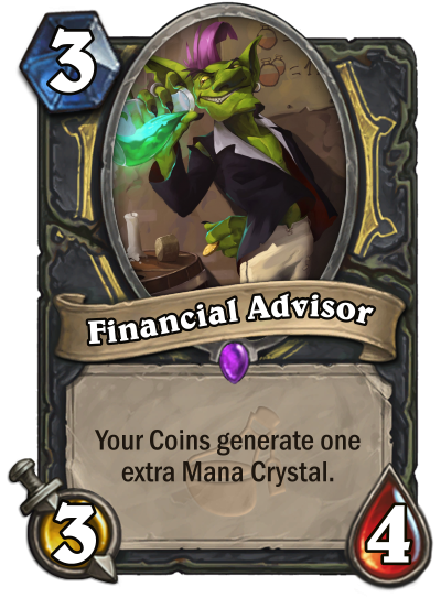
We look forward to their ideas for next week!
Flavour of the Weak
Today, inspired by my glib 'spelling' comment at the beginning of the article, I'll be talking about some of the many intricacies and idiocies of Hearthstone card text. There are a lot of things that can trip up a prospective fan card creator, so I'm going to do my best to give you some tips on how to improve your creations.
First things first...
Keep It Simple, Stupid
The tried and tested KISS method holds more true in Hearthstone than it does in many other games. Hearthstone, above all else, is a fantastically accessible game; if your card design isn't coming across to people easily, or requires paragraphs of explanation, then you're probably trying too hard.
One of the most common ways this comes across is the unofficial 'four line rule'. If your card needs more than four lines of card text, it's too complicated. Now, there are ways around this - things like Discover or Adapt keyword fairly wordy mechanics into a manageable chunk of information, and the reason they do so effectively is because while those mechanics would be a pain to write out, at their core they're very simple to understand and play with.
Another way Hearthstone follows through on this ideology - perhaps a little too zealously - is by just... not explaining what cards do sometimes.
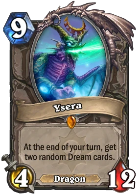
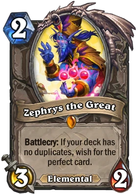
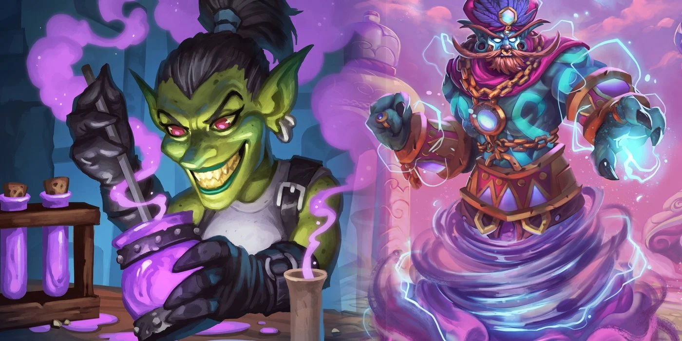
What is a Dream Card? Play Ysera and find out! What does it mean to wish for the perfect card? Honestly, good luck pinning down more than half the rules wrapped up in this one, Zephrys seems to do whatever he wants sometimes.
I think this tendency to oversimplify is both Hearthstone's greatest asset and its greatest weakness. You can draw people in far easier when you have these interesting mysteries and mysterious interactions, but equally you can push people away by confusing and obfuscating them into having no idea what some of their cards do.
Howdy, Y'all!
Something I constantly have to remind myself when designing cards is that Hearthstone is an American game, and if I want to design something authentic looking then some things will just have to be misspelt. I can talk all day about the flavour of a card that I love; I can tell you what Magic colour I most identify with; I can complain about how much armour-gaining cards Druid has. All of these things and more will be what I discuss, but when it comes time to pin them onto a card, you can bet that that Armor spell will have fantastic flavor and the art will match Warrior's color-scheme perfectly.
Or at least, I should do that. I'm entirely confident that I don't do so consistently, except in the case of Armor, given how ubiquitous a mechanic it is.
We're actually quite lucky in Hearthstone that things like this don't affect the game too much. We aren't an RPG where putting on your pants first or second would matter; there's no real-world flavour to mess up on by suggesting I was so blootered I malkied someone; I'd be impressed if someone managed to come up with a situation whereby I'd have to know the difference between coccyxes and coccyges.
Still, it's always worth keeping in mind. A 'real' card will be as American as apple pie.
Cards Are Your Friends...
Sometimes, the answer to your struggle will be evident on the cards themselves.
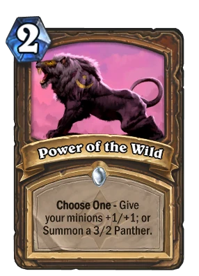
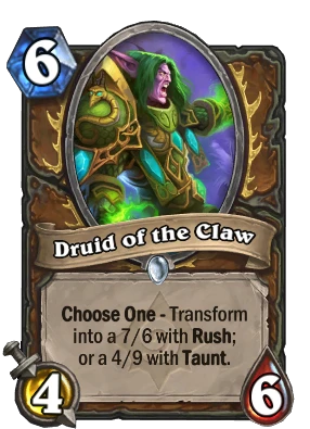
Choose One cards, for example, are something that I see people trip up on formatting time and time again, but there's plenty of existing examples for you to cross-reference with.
Study up on them, because even if only subconsciously people can pick up on the tiniest discrepancies in wording or grammar and that can sour them on an otherwise appealing card design.
I see a similar thing happen with the watermark designers choose to give a card; often a seemingly insignificant part of the card to some, to me it tells a story about the design. It informs me of where this card would slot into Hearthstone in terms of flavour, power level and mechanical history. A Witchwood card needn't just be spooky - perhaps this card is important as it pushes an archetype from that expansion or time period. Similarly, giving a card an ill-fitting watermark can make a design seem poorly thought-out. Why does this Classic card have the Reborn mechanic? Why are Elemental synergies appearing in Blackrock Mountain?
...Except When They Aren't
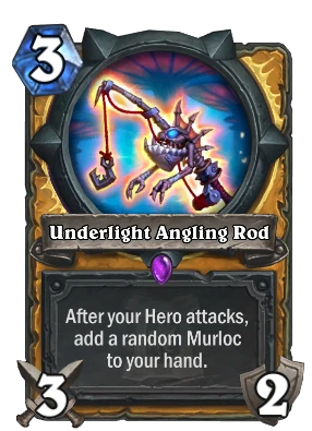
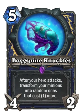
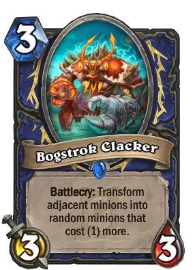
Of course, you shouldn't read the existing cards as gospel. Rather infamously, these three cards from the same expansion have blatant inconsistencies between them; two of them were even revealed back-to-back!
Should it be 'Hero' or 'hero'? What about 'random ones' vs 'random minions'? Inconsistencies like these are so common in Hearthstone that it's a meme at this point; if an expansion went by without some sort of weird wording I'd honestly be shocked.
It actually somewhat annoys me that it gets brushed off so easily by people, because it's one of my pet peeves and is frankly a bit unprofessional. For a game as large as Hearthstone is, there should be standardised wording for cards, and at the very least someone should make an editing pass on everything to bring them in line with each other before pushing it live.
Anyway, just take the existing cards with a grain of salt, and always make sure you check multiple variations of the same effect if they exist, just in case.
What's Your Damage?
Keeping in theme, the WCDC this week is all about spelling. We only really care about spelling one word though - click the banner below to find out more!



Leave a Comment