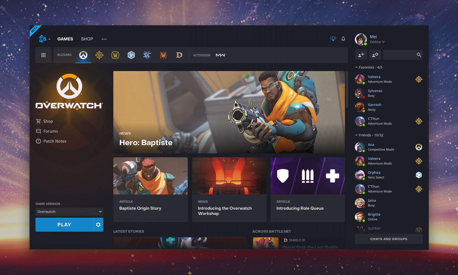
Blizzard has rolled out an update to the Battle.net App Beta which overhauls the interface and brings more features to the client.
- Hide Games - Don't play certain games? You can now hide them! Bye Activision!
- More News - You can see more articles within the view for each of the games.
- Docked Friendslist - Your friends are always accessible on the right side of the client.
- The friendslist also updates based on your selected game to show friends playing that game first.
Follow the instructions below to update your Battle.net app to experience the new client. It has been a great experience so far!
Quote From Blizzard We’ve been hard at work on new features for the Battle.net Desktop App, and we wanted to show you a preview of what we’re developing. Starting today, anyone who’s opted in to test Battle.net updates can try out our beta.
Though we’re improving the look and feel of Battle.net, we also want to keep this preview familiar and easy to use. Here’s what to expect.
The most obvious difference between the beta and its full-release sibling is a refreshed user interface. We’ve heard many of you loud and clear: You want more control over your game navigation, and you’d like your friends and chats to be easily accessible. You’ll also notice that we’ve updated the stories view for each game, so you can see more recent updates and highlights. To see all the updates in the Battle.net beta, check out our patch notes.
If you didn’t sign up to test new versions of Battle.net, but you want to, log into the Battle.net Desktop App, head to the “Beta” menu in "Settings", and opt in to try future patches before they’re officially released.
We’ll continue making the Battle.net App more user-friendly, more informative, and more customizable. We want it to help you connect with your friends and play games quickly and easily.
If you have any thoughts about what would make the app a better experience for you, please use the app forums to send us your feedback.
We’ll see you in-game!


![All The Great Dark Beyond Card Reveals for October 12 - Day 2 [Finished]](dark-beyond-reveals-day-2-thumb.webp)
Comments
Works like charm under Wine in Linux, unlike previous version!
At first I had trouble finding the close 'cross' and minimize button, the app was full screen for me. Turned out I use 1920x1080 res combined with 125% size for fonts and apps (because it's a laptop). When I set the app to high DPI modus, it was fixed.
Tried it, love it, keep 'em coming Blizz.
I've gotta say that I quite like this new design. Thumbs up to you for this one, Blizzard.
FINALLLYYYYYYYYYYYYY !! I dont want to offend anyone buyt how f*cking hard it is to allow us hide games, literally waiting years for small sh*t it makes using app so much more enjoyable and just better, i study programming and i know is't not a lot of work so CONGRATULATIONS BLIZZARD thank you. Btw if you think im mad im not, i want to help you understand how they skip small things that should be in app or any game from the beggining, like in Overwatch we could't see our teammates ult % for about 1,5 year and its really easy to do it, almost as easy as changing dmg on some hero you literally just change numbers, here you have to write small portion of code that is taking literally 1 information and displays it so thank you for that too
can this new battle.net app change the save folder of HS screens ? can it stop the auto-play of videos/streams ?
I only play HS. All I use the app for is to launch HS.
It is surprisingly unintuitive where this option is. There are a lot of menus and dropdowns to click around on.
The only thing I ever change, when clicking the launch/play button, is the region dropdown. They've put that 3 clicks away.
So, yes, it looks prettier, but for my particular use case, it is a step back.
Still, it is beta, so things can change :)
Not sure if Im misreading something but if you just want HS at the top menu bar - you can right click and "Remove from Favorites" and get rid of all icons except HS. If that's not enough, you can just click the pixelly box on the top left and check/uncheck the stars so that HS is the only one that is starred. Is this not intuitive still?
Regarding the region thing, yes, they did make it an extra click for you to change regions. Send feedback so they know something has gotten worse. This is a beta. Give them the feedback they want.
I was actually referring to the top left-most Battle.net options dropdown. Don't think I've ever clicked there before. There are several other profile and account menu items lurking about. It probably makes a lot more sense to people that play other games and do other things with it on a daily basis. Anyway, I found it.
I did leave feedback - I like to assume that's what they're after in a beta :)
looks kinda nice
A new B.net UI : what year is this?! ^^
How the hell the favorite friends of Mei are Sylvanas, Valeera, Garrosh and C'thun?! lol
btw its a nice looking ui
C'Thun is actually a pretty nice guy, once you look pass the creepy stare & slimy tentacles
I think that Sylvanas is "busy" in the screenshot because she has no time for games :)
Only some of them are dead so its okay :D
How do you opt in?
Reading is hard ..! ^^
Is reading harder than being a dink or presenting a helpful response? Who knows?
Love it!
Also that Bye activision! Made my day