Welcome, welcome, to the greatest Fan Creations article series by a turtle on the internet! It says something about me that I contemplated checking to see that there weren't any others; I'm not sure what it says, but I imagine it's something positive and healthy.
Conversation this week will be about looking to the past, and how it can inform the future.
Queen of the Crop
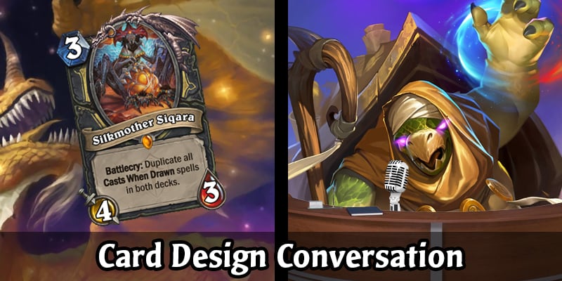
Firstly, congratulations are in order for DestroyerR, whose Silkmother Siqara won this week's WCDC!
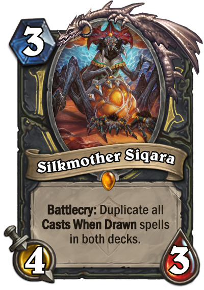
We look forward to seeing what they come up with for next week's theme!
Background Check
Well, we've certainly had a lot of these WCDCs now! I don't know that it's been mentioned anywhere before now, but each Season for the WCDC will be 20 competitions, so we're over halfway through. There's been a lot of fantastic entries - along with a few hiccups, here and there - and overall I'd say it's been fantastic to get back to this.
I wanted to take this time to look back at some of my own entries, and look for the design lessons I learned from them.
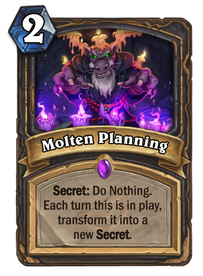
Molten Planning // 1.10 - Top Secret
This was one of my favourite cards I've ever designed, because of the inherent limitations of the design. Something that people often overlook when design a custom card is the Watermark; the emblem behind the card text which denotes which expansion the card is from. One of my biggest pet peeves when looking at a custom card is seeing a Watermark which doesn't make sense. Perhaps they've thrown Inspire into jungles of Un'goro, or Discover has shown up in the halls of Naxxramas; these things weaken a design for me, because it makes it seem like the creator didn't care enough to notice the mistake.
This was most prevalent in our tenth competition, Top Secret, where we received many Rogue Secrets in expansions for which they didn't make sense. Any Rogue Secret that didn't have an Ashes of Outland or Kobolds and Catacombs Watermark received extra scrutiny from me, as I wanted it to make sense as a standalone Secret. There were a few that did this well, though I believe they both actually were in either AoO or KnC anyway.
My own Secret took on this task, appearing in Rise of Shadows where Rogue Secrets would have just left Standard. I enjoyed the task of coming up with a design where it didn't matter that your opponent would know what Secret you'd played. While the card is gimmicky and weird, the challenge of creating it makes me like it more than most other cards I've created.
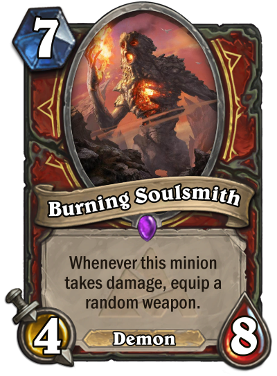
Burning Soulsmith // 1.07 - Demonic Obsession
Ah, Burning Soulsmith. I talked about this card a little in the Conversation following its competition, where I used it as an example of how to analyse where you went wrong in a design using our Transparency Report.
What I didn't say at the time - because I was being all serious and professional and helpful and other boring things - was that the design just plain sucks. From the flavour to the mechanics, everything about the card falls apart at the slightest prodding.
What is this Demon that appears in Blackrock Mountain? Why, in fact, is this card a Demon instead of an Elemental? The art I chose worked for the setting, but the way I forced that art to try and fit the prompt that week is a big fat failure, trying to trick the viewer into liking it as a Blackrock Elemental while simultaneously disguising it as a Demon.
Mechanically the card is arguably even more of a mess. You can tell I was pushed for time and just wanted to throw something in as an entry. What do Warriors do that could be vaguely Demonic? Damage triggers! That's kind of like the sacrificial thing that Warlocks do. OK, now how do I make it more Warrior-y? Weapons, duh! Better make it cost a decent amount, that way I can give it a lot of health and get a lot of triggers from it. Then you look at the finished product and realise... OK, so if I trigger this myself, I might not even get a very good weapon, meaning the feeble statline doesn't make up for itself straight away. If you don't trigger it, you're only ever getting one weapon from it, because it doesn't matter how many times the opponent damages it to kill it - you can't swing with any of those weapons until your turn.
Lesson learned? Don't design a card just to have a card. If you're not feeling a prompt, it's OK to sit it out.
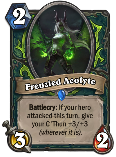
Frenzied Acolyte // 1.06 - Are You Prepared?
This was a fun card to create, but the reason I'm bringing it up here isn't because I learned anything fantastic from its design. No, the card I learned from this week was another finalist.
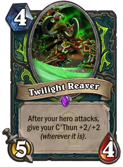
Twilight Reaver by linkblade91
This card also made the finals that week, and I gave it a higher score than my own card. The similarities are obvious; both cards are intended as C'Thun synergy for the imagined reality where Demon Hunter existed back in the days of Whispers of the Old Gods. The little things that set them apart are subtle, but in my mind that's what makes the difference.
Where my card gave +3/+3, link's gives +2/+2. This just feels more correct; of the existing C'Thun synergies, only Dark Arakkoa and Blade of C'Thun offer buffs larger than +2/+2, and both stand as extremely high-cost cards. My card gives a higher buff because it requires set-up, unlike the similarly costed Beckoner of Evil, but is that actually good? Or is it instead just an unsteady hand trying to prop up a shaking ladder of a design?
The other small difference is that link's effect is repeatable; not only can it synergise with one of Demon Hunter's weapons (the Warglaives of Azzinoth), but it also fits right in with several other repeatable effects from other classes, like Cult Sorcerer or Usher of Souls. My card simply goes off once, and doesn't even benefit that much from the additional +1/+1 - you still need another activator to reach the 10 Attack threshold.
The lesson here is that even the smallest things make a difference sometimes. I don't think there's anything particularly wrong with my own design; link's is just better.
Journey into the Unknown
Now, it wasn't just the fact that we're so far into the competition that got me thinking about my previous entries. No, the main reason was Shivershine's 'Into the Shadows' series!
One of our forum members and previous WCDC winner Shivershine has taken it upon themselves to go back to previous competitions and look through the entries which didn't make the finals for some of their favourites, and give a little review of them. I think it's a great way of seeing some of the cool ideas that didn't spark everyone's interest each week - and I'm not just saying that because they featured my own entry in the latest one!
You can find the first one, on our very first competition, here, and the second one, on our third competition, here. They begged off reviewing any of the treasures from the second competition for now, and honestly, I don't blame them - that was a really tricky prompt to try and design for.
I can't wait for more! It's always great to hear what others think of a design more in-depth than just the voting system, after all.
A Class Act
Now, it's time to get your pamphlets and scripted responses ready as we go out and try and recruit Legendary minions to a Class! Click the banner below to start your campaign.






Leave a Comment