I'm already loving the ideas you guys are coming up with for this week's theme (more on that at the end as usual) - I think flavour themes can be hit or miss for some people but we're really seeing cool designs from this one. Makes you wonder what makes a good flavour-based theme. How narrow does it need to be? How open?
This week we'll be looking at the trick question that design space can sometimes be.
Impressive Show
Firstly, congratulations to Sinth, whose Fiendish Imp took first place in the last card design competition!
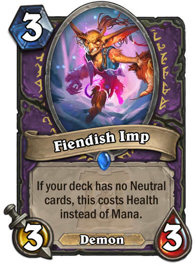
They'll be in charge of next week's theme - can't wait!
Spaced Out
I mentioned at the start of last week's Conversation that I had an idea for a topic I wanted to talk about, but I hadn't really had time to formulate my thoughts on it. If I'm being honest, I still haven't properly sorted out everything I was thinking about, but I find that I write best when I'm rambling anyway so I guess we're doing that.
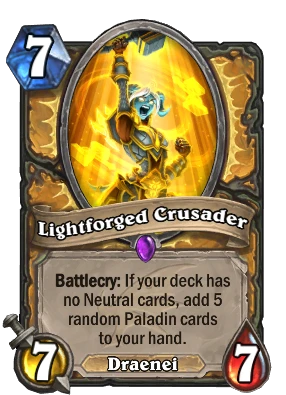
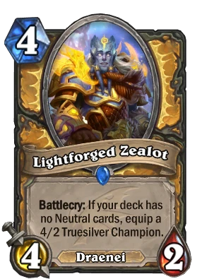
Last week's card design competition challenged you to create a card using the 'No Neutral' idea that Lightforged Crusader and Lightforged Zealot originated in the Descent of Dragons expansion. The catch was that you couldn't create a Paladin card; we know what Paladins can do with the effect, after all!
These cards are just pure class, mate.
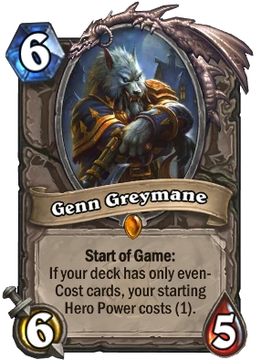
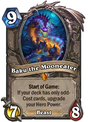
Here lies the pitfall, however, one which many designers run into from time to time and which is almost inherent to some WCDC themes. The trick of the trap is that it goes counter to a different trap that most designers learn early on to avoid; avoid cards which restrict design space. This occurs when you create something that is so powerful that other cards will forever need to be balanced around it - Genn Greymane and Baku the Mooneater were examples of this.
There's something odd about these, but I can't even put my finger on it.
So what's the opposite of designing something that restricts design space? Well, there's two variants on it in my mind - trying to design something within a restricted design space, and trying to design something in too open a design space.
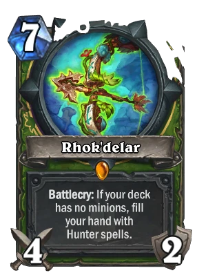
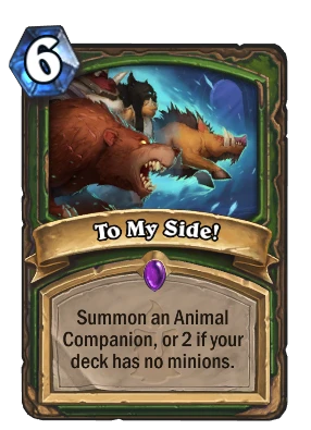
An example of the first would be to try and design a new Hunter card which cares about having no minions in your deck. This isn't necessarily an impossible task, but you are looking to design something within a far tighter design space than normal. You need to consider how this card interacts with the existing cards in that archetype, because they are likely to be inherently synergistic - not necessarily an issue, but something extra you'd need to come in mind. You also need to manage the expectations of a card like that; people already have an idea in their minds about what a card like that should do and how powerful it should be, so straying too far from that could result in an objectively well-designed card that is nevertheless poorly received.
Now, this is actually an issue inherent to card game design as a whole. The longer a card game goes on, the more likely you are to want to retread old ground. Hearthstone has already done this a few times - the dragon-in-hand cards, for example, or the singleton deck cards. The difference comes in how niche an idea something was originally, and how broad-ranging the effects of it are. It's just a matter of perception - designing a new Spell Hunter card will have people zeroed in on comparisons to Rhok'delar and To My Side! almost immediately, whereas a new dragon-in-hand card both has more cards to compare it to and easier talking points in terms of big hitters (big Dragons); Spell Hunter necessitates looking at all the spells available to Hunter, which is harder to wrap your head around than looking to the flashy Dragons you'll immediately think about including.
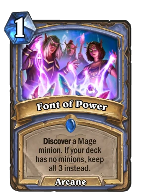
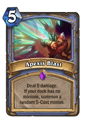
The new Mage spells are of course in a similar situation.
What about too open a design space? This is where last week's theme comes into play. Designing a single card around a theme - No Neutrals - which has never existed in a class before is an endeavour that is doomed to disaster. Where a Paladin card would be scrutinised and compared to the existing Lightforge cards and theorycrafted in existing decks, a Druid card (for example) has no point of reference. You have to take the entirety of the Druid identity, pick which parts you want to focus on and then funnel all your efforts into getting people to understand where the design is going.
In some cases that could sound simple. A No Neutral Druid might perhaps revolve around token or Treant generation, so perhaps the effect should be a buff to Treants or tokens in general. But Druids also have mana generation capabilities, so maybe it should ramp you in some fashion, or assist in drawing you cards. Dragon Druid, Treant Druid, Beast Druid, Taunt Druid, Token Druid, Mill Druid, Heal Druid, Quest Druid, Spell Druid, Jade Druid... so many options, and none of them obviously more right than any other.
You'd think that perhaps you could work backwards from the existing Paladin cards, but no - the only flavour they have is distinctly Paladin, of being so Pure that neutral cards are beneath them. The rewards are not particularly focused in any direction beyond a general idea of 'Paladin cards good'. The design space is so open and the flavour so non-applicable that it becomes a design for the sake of the design.
That's not to say that people didn't give the theme a right good go, of course. Fiendish Imp follows the general idea of the Lightforged cards, being a Warlock card with an appropriately Warlock effect as a reward. The flavour of it falls short - why does having no Neutral cards grant this boon? - but that was the trickiest part of the whole idea. It at least manages an appropriate Warlock flavour, if not the effect justification.
Anyway...
I did warn you this was going to be a bit of a ramble. I'm sure I've walked back on myself and confused the issue unnecessarily somehow, but the essence of what I'm saying is this - while a great idea for a WCDC the No Neutral theme is, when designing cards on your own time always make sure to consider the space you're designing in isn't a flavour or effect dead-end. I myself have fallen into the trap of loving an idea for a keyword, only to come up short when it comes time to actually design more than one or two cards with it.
It's not always about something not having enough design space either - sometimes too much design space leads to disjointed designs.
Food For Thought
A palate cleanser to finish us off! We're cooking up some great design ideas in this week's WCDC, so make sure to check it out by clicking the banner below.



Leave a Comment