As any Hearthstone resident knows, each class boasts unique card frames - or borders, if you will - with specific colorings and distinct patterns, which allows players to better tell them apart. However, something didn't play out quite as intended for Death Knight. As the people in the community spotted immediately during the new expansion announcement on November 1st, Death Knight's card borders appear to be just a recolored version of Warrior's. And there was a good reason for that. Or, let's just say, accidental.
A Case of Mistaken Identity
Looked at back to back, you can certainly notice the striking similarities between the two class frames:
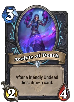
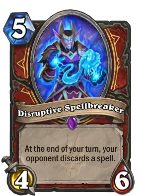
See for a comparison: different coloring obviously, but same markings around the art's oval.
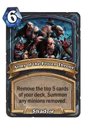
This definitely looked strange to us, especially because Demon Hunters did receive their own signature filigree and because Team 5 already came up with a Death Knight card frame back in Knights of the Frozen Throne for The Lich King's cards. Even though it may not look as distinct:
However, it appears that it was all but an intended result: Hearthstone Features Lead Chadd "Celestalon" Nervig - who as it turned out was also the the Initial Set Design Lead for March of the Lich King - confirmed on several occasions that Death Knight's card borders using the same style as Warrior's was just part of an oversight that Team 5 wasn't able to catch in time. Therefore, the newest class cards will go live with this card frame in the upcoming Patch 25.0, only for it to be changed into a brand new and exclusive form at a later date.
And this was pretty much noted as soon as the March of the Lich King expansion announcement became known to the world:
Quote From Celestalon @Celestalon great and exciting announcement today. Definitely a larger scale than I expected and I love everything, Except the DK minion frame. Is there a reason you're reusing Warrior's?
Ah hah, you're talking about the filigree! That was an oversight that we didn't catch until it was too late to fix for 25.0, but we plan to fix in a future patch. The frame itself is a completely different color scheme from Warrior, but that doesn't help if you're colorblind.
To be fair, the tweet you see above was published on November 1st, but with all the information shared on that one overwhelming day (we're still not sure whether we have caught everything there was), it is only natural for most players to have missed it - a brand new class, as well as a new bigger than usual expansion definitely took away all the focus back then!
Soon (TM)
For what it's worth, Celestalon has also reiterated his previous statement recently, confirming that the new Death Knight card borders will be introduced soon after March of the Lich King's launch - which is set to take place on December 6th.
Quote From Celestalon @Celestalon Is the Death Knight class gonna get their own card borders? It's a recolored Warrior.
Yes, soon after launch!
As you can see, no estimated time yet, but we think the best bet would be with the first post-patch balance changes, which are usually planned 2 weeks or so after an expansion goes live. Except this time it would have to be even sooner, due to the Hearthstone World Championship that's scheduled for December 16-18. Or, if we are dealing with the more familiar Blizzard's "soon (tm)", then perhaps something like early January 2023.
Now, as to how the new card frames/borders might look like exactly, that's anybody's guess! The odd requests for any sort of a preview have so far not been met with a clear response. Perhaps the nearest major patch - expected on Tuesday, November 29 - will have something to tease us with? However, don't blame us if that's just wishful thinking.
More on Death Knights
It's not far away now, so if you ever need more information on Hearthstone's newest class, there's been a lot of collected coverage by now:
- Death Knight Class: Deep Dive - The Rune System, Corpses Mechanic, Gameplay, Cards & Sets
- Death Knight Developer Insights: Part 1 & Part 2 - Themes, Lore, Goals, Behind the Scenes
- Death Knight Portraits, Legendary Hero Skin, and UI Sneak Peek
- Collected Death Knight Card Reveals





Leave a Comment