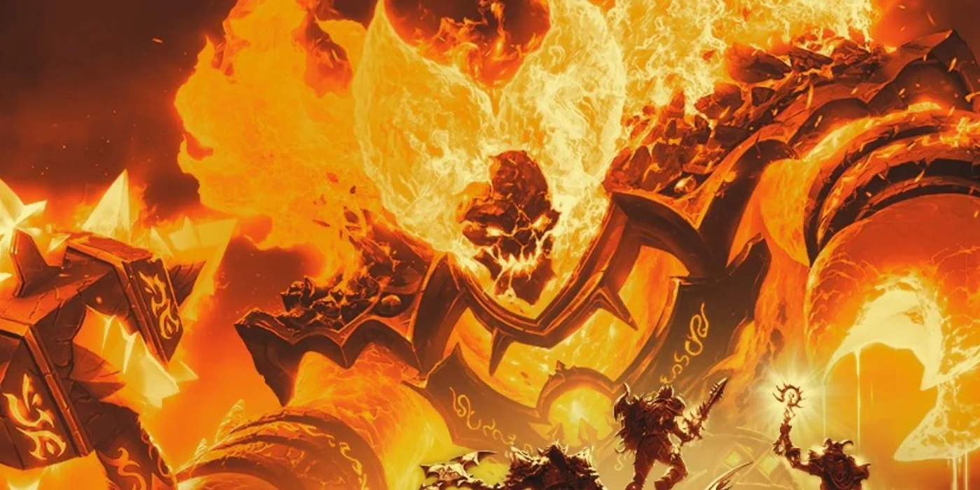
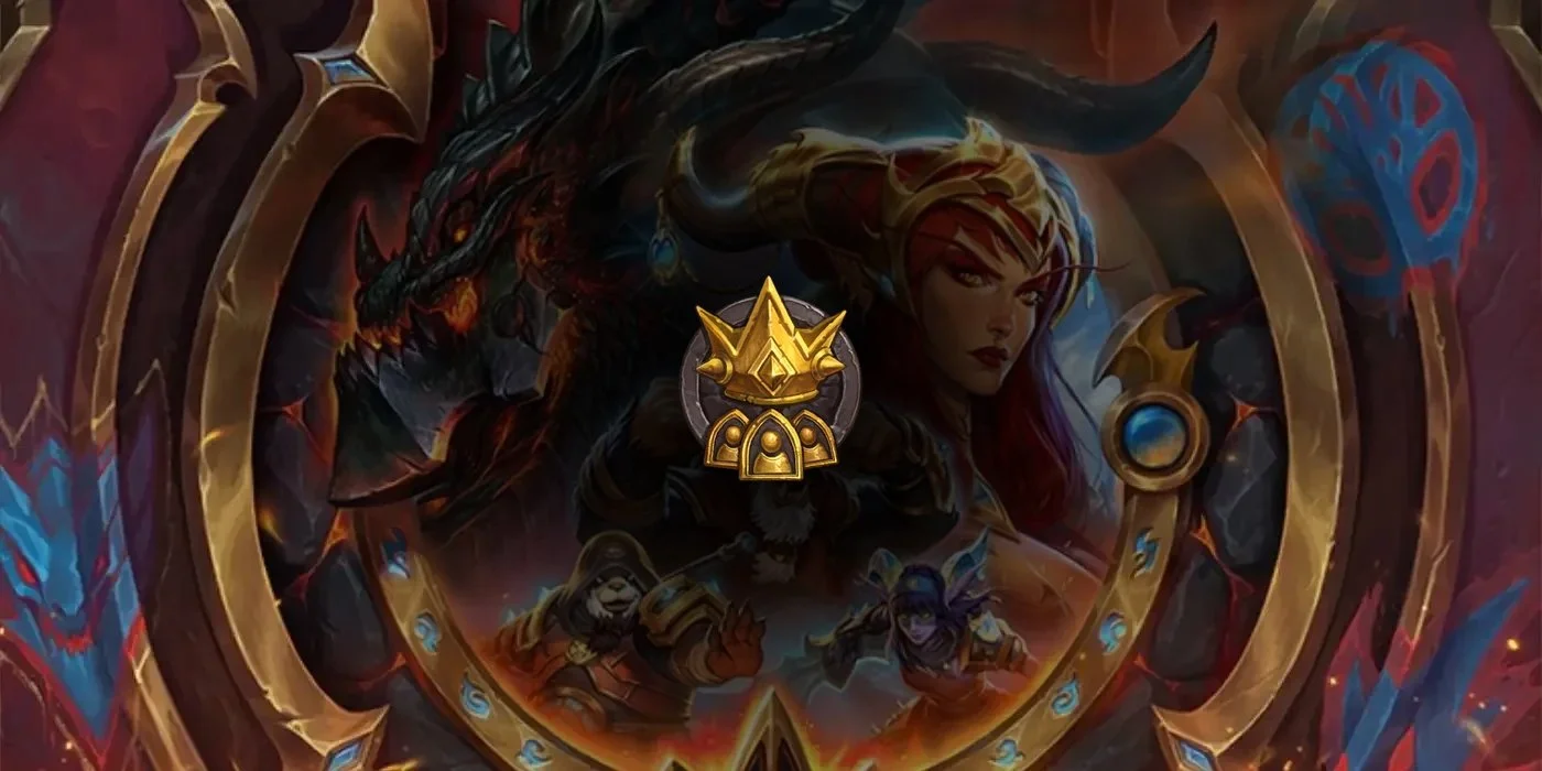
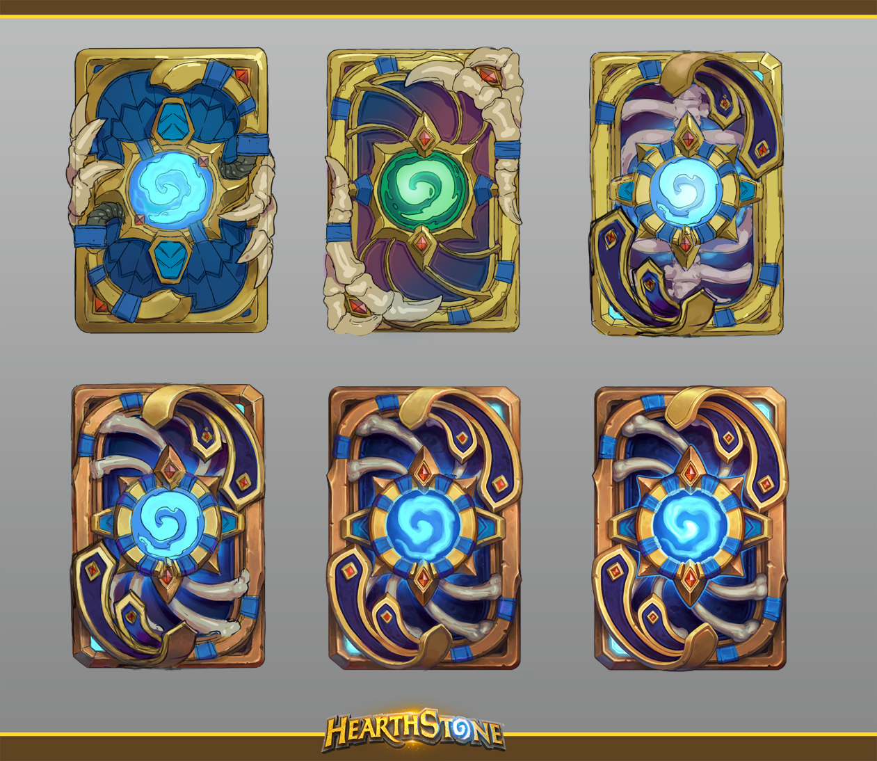
Blizzard Senior Artist, J. Axer, has shared some concept art of the Kel'Thuzad card back that comes with a pre-order of the upcoming Scholomance Academy expansion. But first, the finalized piece with animations!
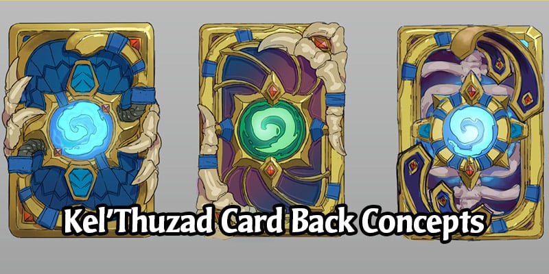
We can clearly see a few different concepts that were considered for the card back, along with some steps in achieving the finalized version we now get to love. What do you think of the other concepts?
Scholomance Gameboard
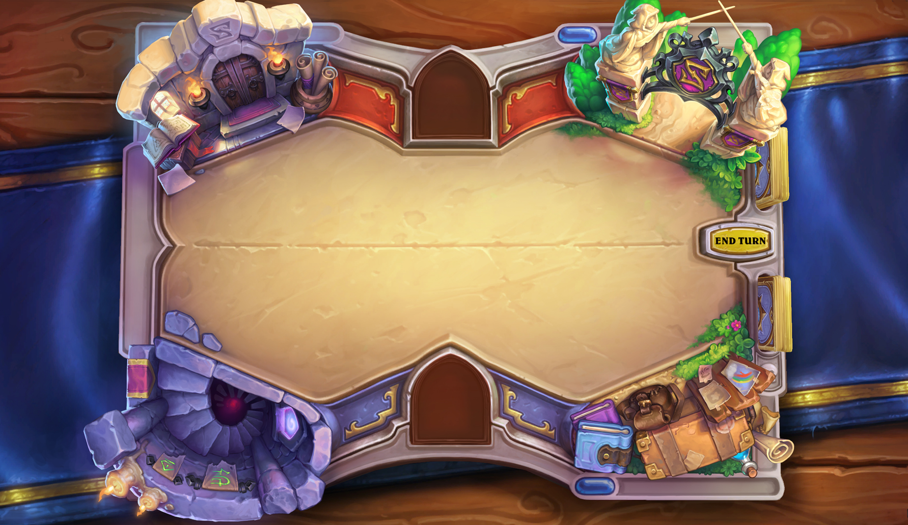
In addition to the pre-order card back, Jay was responsible for the Scholomance game board!
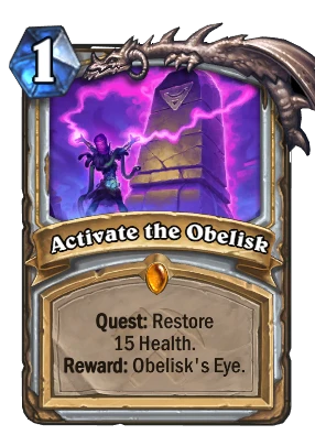
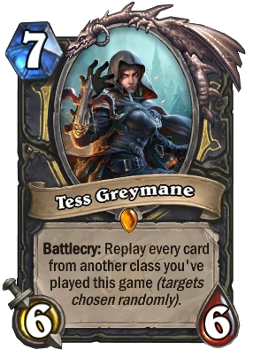
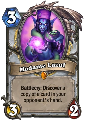
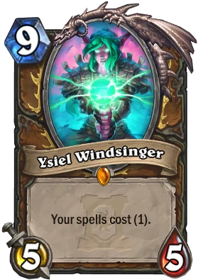
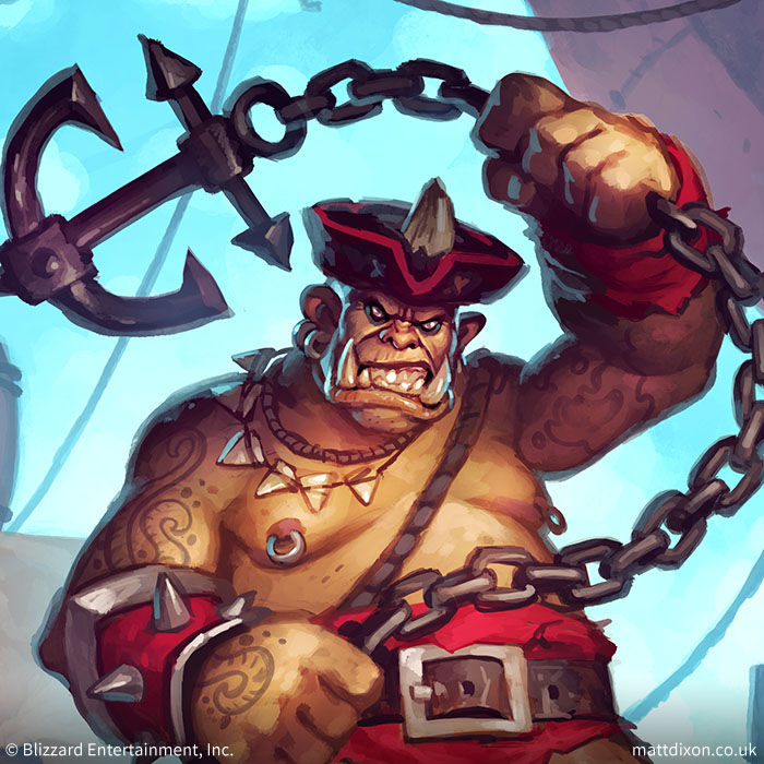
Hearthstone Card Art by J. Axer
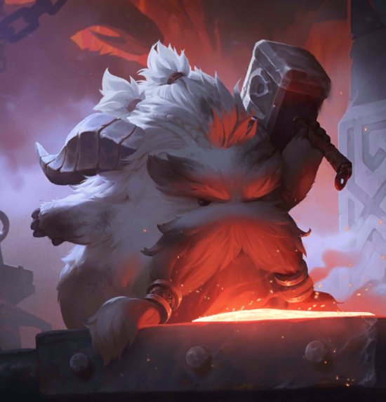
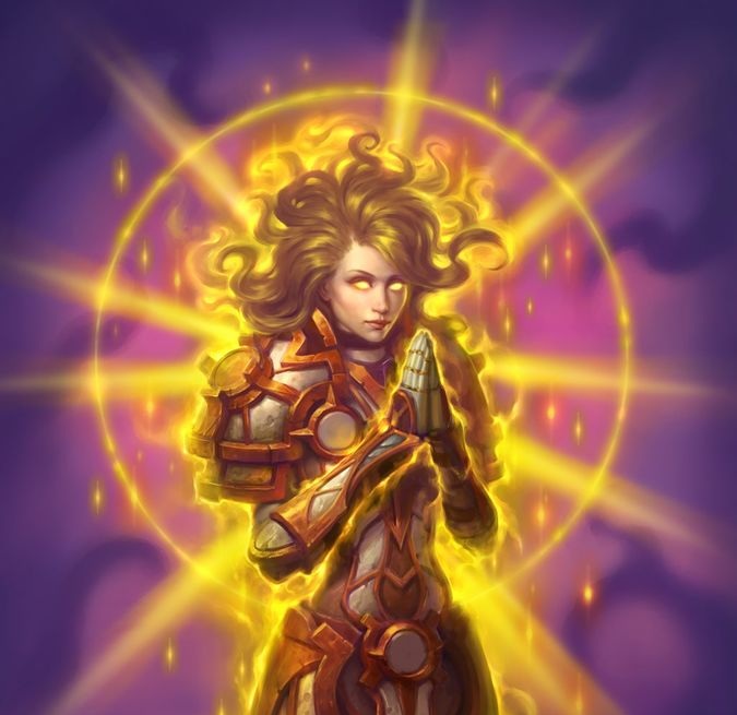
Here are some of the collectible cards that Jay has created artwork for.
Learn more about Scholomance Academy
Head on over to our dedicated guide for Scholomance Academy to learn more about the new expansion and to see all the revealed cards!
Support Out of Cards - Get Premium
Love what we're doing? Support the site for $2 a month to remove ads and get some site cosmetics! Discounts are available if you subscribe for multiple months at once!
Get Cheaper Hearthstone Packs with Amazon Coins
Learn more about how you can save money on Hearthstone packs for the new expansion with our guide on Amazon Coins!
Comments
Digging the board.
I like the middle top row one best, but I'm ok with the one that we got.
I like the final version we got, with one minor change - I prefer the version with the ribcage in the background, not the swirly bones.
I really love the new game board. It perfectly fits the Harry Potter cross over and that's something I love about this expansion, be it intentional or not.
As for the cardback, I'm missing some purple coloring. It was the central element of the Year of the Phoenix preview panel and it fits the magic school theme. I like the cardback, but in my opinion there's too much focus on Kel'Thuzad in it, and it's even his later lich form they're refering to with those bones. Maybe they'll explain his transformation in the solo content, though. Since the mage hero doesn't look very human either, there should be an explanation somewhere down the road. So without some purple representing the school, it's more of a Kel'Thuzad cardback than a Scholomance cardback in my eyes.
Same, I really dig this expansion's board. It does evokes the classic royal fantasy setting for me. Since I was never really impressed with boards from the Year of the Dragon, this year's boards (which includes AoO) has really impressed me so far. Here's to hoping this third expansion's board would be smashing as I really love the theme of Darkmoon Faire. (If it's the case)
As for the card back, I think it's more of a case like Lady Vashj where they are just related in some way rather than representing the core theme. Just my guess though. On another note and for the sake of discussion, if the pre-purchase cardback were to be kept in-theme for this expansion, maybe Blizzard should've used the Scholomance August ranked card back as the goodies. It would make this case be similar to how the theme of the pre-purchase card backs of The Grand Tournament, WotOG or the Witchwood etc. are handled.
Man, Ysiel Windsinger is such a great art! Why is she such a shitty card :(
inb4 it gets changed because of china's censorship.
*Sigh
if only the preorders weren't so god smackingly expensive in my country.
It's the first time I consider buying the preorder, just because the cardback is so beautiful.
I think out of the 4 concepts, the second on the top is definitely my fave out of them. A huge factor for me would be the green hue of the logo to give more Naxxramas vibes.
Good work Jay!